| Author | Thread |
Comments Made During the Challenge  |
|
|
12/22/2002 07:13:19 AM |
| Nice color, clarity and composition, it seems just a bit grainy though. Good job, DPz |
|
|
|
12/21/2002 09:33:51 PM |
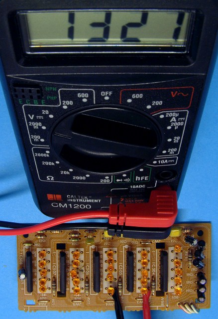
| Strangle angle to the meter. But you know what - I kinda like it. It's different. Good thight crop, but maybe you shouldn't have cropped it quite so close at the top. Good focus. Beautiful colors. To nit pick the material is a little wrinkled on the left = draws you attention to it away from everything else. Good lighting. Over all good shot. Worth a 7. Would have been an 8 but not real "wow" or interest drawing quality. PTL. |
|
|
|
12/18/2002 08:40:15 AM |
| Nice view, good background and pretty sharp. Probably you could have made it more intersting if you would have worked with the light a little better and it would also have been nice if a few of the LEDs were on. |
|
 Photographer found comment helpful. Photographer found comment helpful. |
|
|
12/16/2002 01:52:21 AM |
1)Does the photo fit the theme?(7)
2)Color:(7)
3)Composition:(5)
4)Focus:(6)
5)Background:(5)
6)Lighting:(6)
Overall Score:(6)
Commentary:
I am a little bothered by the composition of this photo graph. Why upside bown. I photo is good in itself. Clear good depth but I need Coke Bottle Glasses to see it correctly.
John (TurboTech) |
|
| Photographer found comment helpful. |
|
|
12/16/2002 12:44:16 AM |
|
Home -
Challenges -
Community -
League -
Photos -
Cameras -
Lenses -
Learn -
Help -
Terms of Use -
Privacy -
Top ^
DPChallenge, and website content and design, Copyright © 2001-2025 Challenging Technologies, LLC.
All digital photo copyrights belong to the photographers and may not be used without permission.
Current Server Time: 03/13/2025 12:52:01 AM EDT.