| Author | Thread |
|
|
08/12/2011 04:56:24 AM |
wow, thanks for the congrats, just got up and catching up with messages. This is an awesome photo, got a 9 from me, well done... anna x
Message edited by author 2011-08-12 04:57:03. |
|
 Photographer found comment helpful. Photographer found comment helpful. |
|
|
08/08/2011 09:02:16 AM |
Message edited by author 2012-02-02 14:27:31. |
|
Comments Made During the Challenge  |
|
|
08/07/2011 09:21:03 PM |
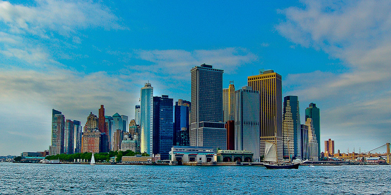
| the best looking city on the planet!!! |
|
| Photographer found comment helpful. |
|
|
08/07/2011 05:38:26 AM |
| Nice, though saturation and sharpening are above the limit IMO |
|
| Photographer found comment helpful. |
|
|
08/06/2011 02:42:26 AM |
| Beautiful composition. Ruined by too much post processing. |
|
| Photographer found comment helpful. |
|
|
08/03/2011 07:30:27 AM |
| Governor's island? looks great with that boat. |
|
| Photographer found comment helpful. |
|
|
08/02/2011 04:02:42 PM |
A classic view (and not the only version of this iconic skyline in this challenge) and Im torn on the processing. On one hand I like the candy colored old timey postcard feel, but it looses some of the depth in the image. The brig's fore mast is almost lost against the buildings, and the towers that make up the skyline are flattened out, and the yellow on the building on the left is jarring against the overall blue tone. If you had brought up the black point, it might separate the two tones a bit more.
I know it sounds like Im picking on the image, but I really like it and given the direction you went, I think it works. Top five |
|
| Photographer found comment helpful. |
|
|
08/01/2011 11:53:24 AM |
| Wonderful colors in a skyline that you just don't see all that colorful often. I really enjoy this. |
|
| Photographer found comment helpful. |
Home -
Challenges -
Community -
League -
Photos -
Cameras -
Lenses -
Learn -
Help -
Terms of Use -
Privacy -
Top ^
DPChallenge, and website content and design, Copyright © 2001-2025 Challenging Technologies, LLC.
All digital photo copyrights belong to the photographers and may not be used without permission.
Current Server Time: 04/26/2025 05:14:17 AM EDT.