| Author | Thread |
|
|
08/25/2004 09:17:38 AM |
| I really liked this photo... The composition is clean and simple. I also enjoy the lighting you used for this shot. I'm really surprised it didn't score better - I gave you a 9 as I felt you met the challenge in a very creative way. But alas, the numbers don't matter one wit and I certainly hope you don't let the final score discourage you. Great shot - looking forward to seeing more great work from you. |
|
 Photographer found comment helpful. Photographer found comment helpful. |
Comments Made During the Challenge  |
|
|
08/24/2004 11:08:09 PM |
| You've inspired me to try to recreate this, I have a feeling it will be more difficult than I think it will be, but will undoubtedly teach me a little more about lighting. Great composition. |
|
| Photographer found comment helpful. |
|
|
08/24/2004 09:06:16 AM |
| This is a nice shot. I wonder what it would have been like if you had used a different coloured container. |
|
| Photographer found comment helpful. |
|
|
08/22/2004 01:58:41 PM |
| Good lighting, composition and colours. |
|
| Photographer found comment helpful. |
|
|
08/21/2004 04:50:17 PM |
| I love this, I wish I knew why it is so good! |
|
| Photographer found comment helpful. |
|
|
08/20/2004 03:38:31 PM |
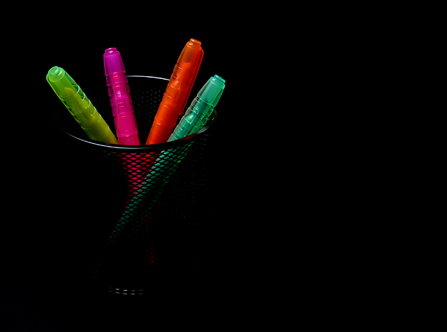
Simple, clean & effective.
Good detail level. I mulled around wondering if the slight hint of the bottom of the cup was necesary or a distraction. Jury's still out on that one.
Well Done - ((7)) |
|
| Photographer found comment helpful. |
|
|
08/20/2004 02:50:00 PM |
| Might have been better outside the stand |
|
| Photographer found comment helpful. |
|
|
08/20/2004 07:53:34 AM |
| The colors are great and attract my eye - after the initial wow facto of the bright colors on blackr, I lose interest pretty quickly. |
|
| Photographer found comment helpful. |
|
|
08/18/2004 09:11:07 PM |
| Original, nearly perfect pic, just too much neg-space on the right side. I like the black-on-black pen holder. 7 |
|
| Photographer found comment helpful. |
|
|
08/18/2004 08:58:42 AM |
|
|
|
08/18/2004 07:47:08 AM |
| Nice composition. For this challenge probably you should enhance the gamma of the colors.. |
|
| Photographer found comment helpful. |
|
|
08/18/2004 04:34:39 AM |
| Theme of work and school was a real downer for me. Neon pens are great for the challenge but tough on moral. You get a few points but don't forget...some of us are still on vacation. Thanks! |
|
| Photographer found comment helpful. |
|
|
08/18/2004 01:52:27 AM |
| Simple and great lighting, I like it. I would like to see the highlighters a tad more brighter/saturated. |
|
| Photographer found comment helpful. |
Home -
Challenges -
Community -
League -
Photos -
Cameras -
Lenses -
Learn -
Help -
Terms of Use -
Privacy -
Top ^
DPChallenge, and website content and design, Copyright © 2001-2025 Challenging Technologies, LLC.
All digital photo copyrights belong to the photographers and may not be used without permission.
Current Server Time: 03/12/2025 08:09:20 AM EDT.