| Author | Thread |
|
|
04/08/2012 10:44:18 PM |
| look at those teeth!!!!!! 0_0! awesome |
|
 Photographer found comment helpful. Photographer found comment helpful. |
|
|
01/09/2012 05:42:18 PM |
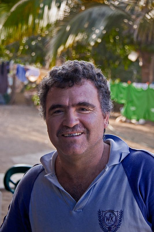
Personally I don't find this a bad portrait at all, for sure Jorge has an interesting face and the surroundings give some context.
Postprocessing could have improved the colours considerably. Also, but I am not sure it would work in this case, if you work with lightroom acting on the greens (desat, hue shift, luminance) could have diminished the prominence of the chair without compromising your main subject.
Given that acts on the whole image, it's probably legal as per advanced editing. |
|
| Photographer found comment helpful. |
Comments Made During the Challenge  |
|
|
01/08/2012 09:23:13 PM |
|
| Photographer found comment helpful. |
|
|
01/07/2012 06:15:58 PM |
| A little too much headroom maybe. |
|
| Photographer found comment helpful. |
|
|
01/04/2012 03:04:20 PM |
| Background is distracting. Nice natural light though. |
|
| Photographer found comment helpful. |
|
|
01/03/2012 11:46:52 AM |
this photo... is amazing.. the detail in his shirt, perfect. fabulous bokeh,
editing suggestion: clone out the picture... dont you dare dq yourself oz!!!!!! |
|
| Photographer found comment helpful. |
|
|
01/02/2012 07:25:51 PM |
| This definitely needs a crop to get rid of all the space above the head. Good choice using a shallow DoF to blur the busy background. Try to find a simpler background to let the subject stand out more. He does seem to be darker than the background. Possibly using a reflector could help him to be lit better. |
|
| Photographer found comment helpful. |
Home -
Challenges -
Community -
League -
Photos -
Cameras -
Lenses -
Learn -
Help -
Terms of Use -
Privacy -
Top ^
DPChallenge, and website content and design, Copyright © 2001-2025 Challenging Technologies, LLC.
All digital photo copyrights belong to the photographers and may not be used without permission.
Current Server Time: 03/14/2025 11:31:54 PM EDT.