| Author | Thread |
Comments Made During the Challenge  |
|
|
08/31/2004 02:54:51 PM |
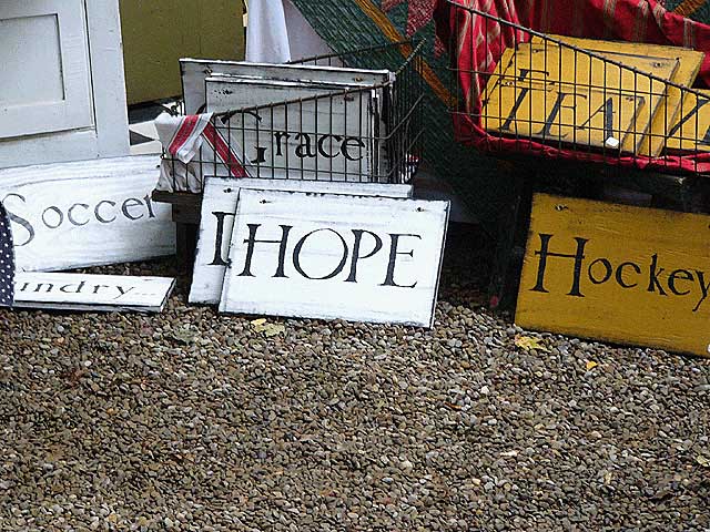
| Should have out *more* of the signs in the pic and less of the gravel. Would have made it a bit more dynamic. Good shot, though. One of the few I have actually liked in this challenge. |
|
 Photographer found comment helpful. Photographer found comment helpful. |
|
|
08/26/2004 07:40:16 PM |
|
| Photographer found comment helpful. |
|
|
08/26/2004 06:41:26 PM |
| Very clever title. Straight to the point. The lower half of the frame is a bit dull. |
|
| Photographer found comment helpful. |
|
|
08/25/2004 04:49:29 PM |
| Don't know that all the gravel on the bottom is necessary, you probably could have cropped this closer. |
|
| Photographer found comment helpful. |
|
|
08/25/2004 04:32:24 AM |
|
| Photographer found comment helpful. |
|
|
08/25/2004 02:01:14 AM |
| I like the harry potter font sign. I don't feel that it is really provocative. I would have liked to see the sign, almost burried, as if it were being discovered. I've been to a ton of little stores in California and Oregon that had hidden treasures. The one common thing, however was that the good things always hid. They were there, but only if you looked. That's what I want to feel in this picture. It's there, but I want more. |
|
| Photographer found comment helpful. |
|
|
08/25/2004 01:05:16 AM |
| I think this is nice, but would be better with a little more of the gravel cropped so that the sign isn't exactly center. |
|
| Photographer found comment helpful. |
Home -
Challenges -
Community -
League -
Photos -
Cameras -
Lenses -
Learn -
Help -
Terms of Use -
Privacy -
Top ^
DPChallenge, and website content and design, Copyright © 2001-2025 Challenging Technologies, LLC.
All digital photo copyrights belong to the photographers and may not be used without permission.
Current Server Time: 03/12/2025 05:32:43 PM EDT.