| Author | Thread |
Comments Made During the Challenge  |
|
|
08/31/2004 07:30:14 PM |
| really like but needed a little less light |
|
|
|
08/31/2004 06:20:46 AM |
|
|
|
08/29/2004 05:00:49 PM |
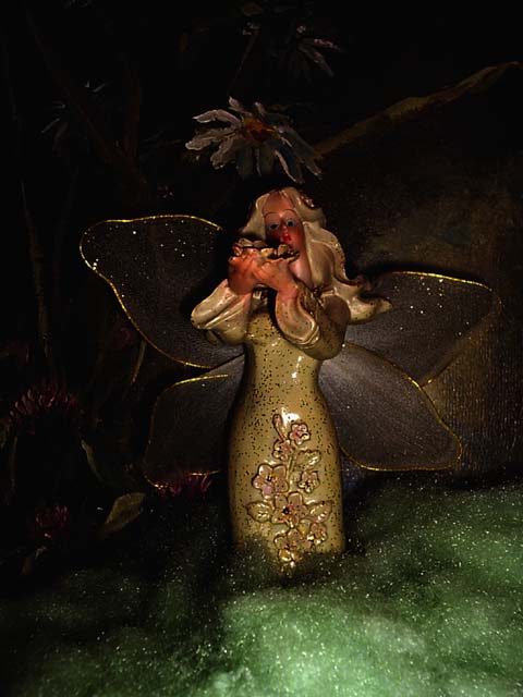
| I was OK with this image until I started concentrating on the green tinsel at the bottom. If that were cropped out, it would make a much better image. I kinda like the top portion, with the contrast of the reflective golds, the black background and the hints of flesh tones. The tinsel just makes it seem so cheap. But, that could be just me. |
|
|
|
08/28/2004 08:11:50 PM |
| Cute pic. But isn't that a fairy? Close enough for me. |
|
|
|
08/25/2004 05:39:59 PM |
| getting close to breaking the 'artwork' rule, but at least there is some background on this. |
|
 Photographer found comment helpful. Photographer found comment helpful. |
|
|
08/25/2004 01:55:32 AM |
| I like the creepy angel. she needs better lighting. she reminds me of my grandmothers house, and the strange girl who lives in a drawer of moth balls. also, what's up with her eyes. I like the idea though, and I think better lighting would have been more effective. |
|
| Photographer found comment helpful. |
Home -
Challenges -
Community -
League -
Photos -
Cameras -
Lenses -
Learn -
Help -
Terms of Use -
Privacy -
Top ^
DPChallenge, and website content and design, Copyright © 2001-2025 Challenging Technologies, LLC.
All digital photo copyrights belong to the photographers and may not be used without permission.
Current Server Time: 03/12/2025 06:42:59 PM EDT.