| Author | Thread |
|
|
02/25/2012 04:28:34 PM |
| Top ten on your first try! Congrats. |
|
|
|
02/22/2012 07:35:12 PM |
| Congrats on your first submission! I found your photo very touching. |
|
|
|
02/22/2012 01:11:01 AM |
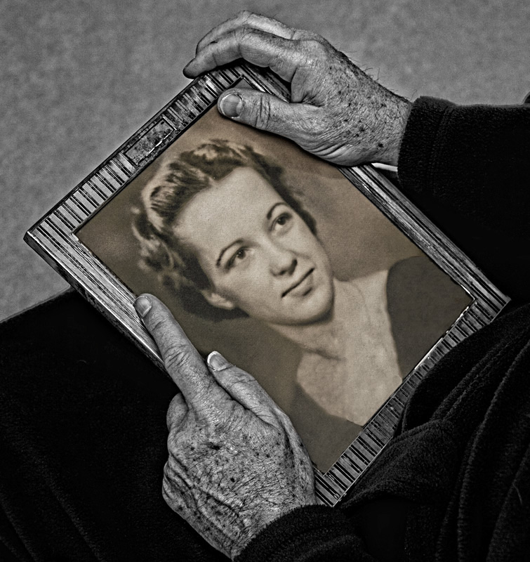
| Congrats on 10th place in your first challenge. This very moving image was one of my top picks and I gave you 9. |
|
Comments Made During the Challenge  |
|
|
02/17/2012 02:14:03 PM |
| This is a great concept, and nicely done. I'm not sure I like the sepia and monochrome combination, but it does help differentiate between the old photograph and current day. |
|
|
|
02/17/2012 12:51:24 AM |
| I think I would like it better if it was all in color or all b&w. Not sure about the mix here, maybe it's just that the hands look cold compared to the warm color of the picture (in my opinion). Sorry! |
|
|
|
02/16/2012 11:29:32 PM |
| although not crazy about the processing, I love the comp and sentiment about this one. Very nice! |
|
|
|
02/16/2012 09:01:32 PM |
| I think the shot is such a great idea, but I really think the desat ruined it, imo. I can't put it into words very well, but it even seems to change the emotion, making it colder instead of a warm, loving yet poignant shot. |
|
|
|
02/16/2012 08:22:50 AM |
| love this idea. but I have to say, the pp is a tad to much here |
|
|
|
02/16/2012 01:44:09 AM |
| I love the impact of this shot. However, it took me a few seconds to realize that it was a man holding the picture. Maybe it was because of his long thumb fingernail, but it threw me. With voters only giving a second or three to review a shot I think it may hurt your score. I hope not because this is a great shot. Not voting... |
|
|
|
02/15/2012 10:33:56 PM |
| This is a strong image, but I think the sepia toning on the picture doesn't really mesh well with the B&W in the rest of the photo. |
|
|
|
02/15/2012 07:48:16 PM |
| Arrangement of the composition elements is fantastic! This is a image with a story to tell and it does a great job of telling the story. It captures your thoughts and begs you to have questions! Technically great exposure, contrast, DOF. I did notice a slight fringe glow next to the right hand. |
|
|
|
02/15/2012 06:45:01 PM |
| I like the idea very much, a bit uncertain about the high contrast BW. Selective desaturation works well in conveying the concept, but if it's fading memories which are portrayed, a softer processing might have worked better, even if it enhances the time passed. |
|
|
|
02/15/2012 12:08:00 PM |
|
|
|
02/15/2012 10:50:49 AM |
| I like the story you are portraying. I'm just not a fan of the coloring. Make the hands look like a corpse, which isn't appealing to me. |
|
|
|
02/15/2012 12:12:50 AM |
| I wish it weren't de-saturated. |
|
Home -
Challenges -
Community -
League -
Photos -
Cameras -
Lenses -
Learn -
Help -
Terms of Use -
Privacy -
Top ^
DPChallenge, and website content and design, Copyright © 2001-2025 Challenging Technologies, LLC.
All digital photo copyrights belong to the photographers and may not be used without permission.
Current Server Time: 03/10/2025 10:35:53 PM EDT.