
| You are not logged in. (log in or register) | |
|
|
|
Tutorials :: Watching & Waiting
Watching & Waiting by Judi
NOTE � The written version is meant as an addition to the video tutorial and can be read along with the imagery in the video.� The snapshots included in the written version are purely to help guide you in your progress of the tutorial.
Welcome to the tutorial on the processing steps of a candid image of mine called �Watching & Waiting�.� In the photographic world there are many different styles out there, no two styles are the same, and therefore I want you to look at this image and the processing steps as experimental only.� Apply them in whatever way you like to your own images, but do not be upset if they do not come out looking exactly like image.� The whole idea of a style is to show your image, the way you have to show it, not the way someone says it has to be shown.
In this tutorial I will take you from scratch, that is, from RAW.� I will take you through Digital Photo Professional as well as through HDR, Photo Matrix and then into Adobe CS2, to take you through every step that I used to create this image. __________________________________________________________________________
RAW � Digital Photo Professional
Here we are in DPP also known as Digital Photo Professional.� This is the programme I use for all of my Canon RAW images.� On the left you can see my tree and all my different folders that I have been working on at the moment.� On the right you can see all the thumbnails of the images from this particular shoot.� You can see there is quite a few of them there.
We are going to be working on one particular one.� All I will do is select this one.� I am quite happy with the way this particular image is.� Normally I would only adjust the brightness adjustment slider and alter anything on these other menus/sliders, depending on what I see necessary.� Sometimes I will have a play around with the White Balance, but in most cases it is pretty much okay.� In the newer edition of DPP you also have the Noise Reduction which I find quite helpful but not necessary in all cases.
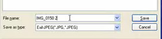
With this particular image I know I want to take it into HDR, therefore I will actually save 9 different exposures from this one RAW image.� I will start by reducing my Brightness Adjustment slider by sliding it all the way to the left at -2.00.� I will save that in a folder that I have made especially for it called �HDR�.� At the end of the image file name I will put a �1� and then click Save.� There are probably easier ways to do this but this is the way I find it better for what I want.
__________________________________________________________________________
HDR � Photo Matrix
We are now at the next level and here you can see it does look quite shocking.� But if you put your cursor over certain areas you can get a general idea of what you are going to be presented with.� From here we will go into HDR/Tone mapping.� You can see it here.� Some people will say that it looks very much like the original.� Yes it does, but it has tweaked a couple of the tones to my liking.� So generally I will have a play with these sliders, but I am happy with the way it is, so I will click okay.� This takes a little while.
So now the image is completed in HDR, so we will go to File/Save As and we will save it as either a JPEG or a TIFF, whichever you prefer.
__________________________________________________________________________
PHOTOSHOP � Adobe CS2
I have now taken it into Adobe CS2.� There is a lot I can do with this image but I am just going to show you the steps I have used to get it to the result you have seen.
Now for this particular layer I am going to go to �Still Life� which is down in the black and white section.� So you can see the preview there. But I am going to liven it up just a tad.� Hit process and let it run through.� I like to name all of my layers so it makes it a little bit easier to locate them later on.� So I will name that layer so I am aware of which effect I have used on each of them.�
Now I am going to hide that one for a minute and go to the next layer.� Click on it to make it active (showing blue).� On here I am going to go to the same plug in, but I will be using the �Hollywood� effect.� Again, let�s lighten it up a little bit.� Hit Process.� Don�t forget to name the layer.
For the third layer we will use the same plug in but using the �Character� effect.� Hit process and name that layer.
So the three effects I have used are all roughly the same but they have different effects on different areas.� From here we will start masking out the areas we don�t want�but because the background is still in color, that can have a completely different effect.� So add a new layer between �Background� and �Character� by making the Background layer active [Step 1] (showing blue) and then clicking on this icon [Step 2] and choosing Hue & Saturation [Step 3] and then moving the Saturation slider all the way to the left.� Now that hasn�t made any physical difference at all because the top three layers are still in Normal blend mode and are therefore not transparent.� Once we start changing the blend modes you will start to see the difference.
__________________________________________________________________________
MASKS AND MODES
So we will start with the �Character� layer.� If you put the Blend of this layer onto �Darken� mode you will see the effect.� Now if I didn�t have the Hue & Saturation Adjustment layer there you would see how some of the color would start to show through.
For the �Hollywood� layer, I chose to put that onto �Lighten� mode.� You can have lots of different effects throughout it, but it�s what you prefer.
For the �Still Life� layer, I kept it in the Normal mode but here is where I started to bring in the masks.� So we will add a mask on to this layer.� I cheated a bit here and brought in the masks from the original PSD file for this image but I have blanked them out for now until I get to that stage of showing that step to you.� Now for masks, remember Black � hides and White � shows.� So in this instance, for �Still Life�, I blacked out the area over his legs and his face, so that allows for those areas beneath to show through.� Without it I find it a bit dark.
So then with the �Hollywood�, I added a mask and you can see the areas it has affected.� So I removed those areas from that particular layer.� So it gave it a bit more of a natural effect.� Those areas were initially blown out quite a bit because of the effect on that layer.
So now I go to the �Character� layer.� And again I have masked out different areas.� Now that does look a bit strange.� It generally over his sleeve and his legs.� I didn�t like the effect over those areas, so I hid it.� I found it was too dark and I wanted to lighten it up.� But in doing so, I lost some of the color.
So now we are going to concentrate on the areas that have this funny, ghostly grey color on them.� We need to be able to remove all the colors from those effected areas to be able to control the final coloring of them.� Control+click on your �Character� mask and you can see it has brought up those areas.� Select/Inverse so it only concentrates on the grayed areas.
Now there is one other area that I want to correct and that is underneath his hat.� You can see it is quite dark.� We are going to combine all the visible layers into one without losing any of the current layers. Shift+Ctrl+Alt+N and then Shift+Ctrl+Alt+E.� On this new combined layer I am going to apply a Shadow/Highlight effect.� So name that layer for future reference.� Now I am only concerned about the under the hat area, so I am not worried about how this will effect the rest of the image. Image/Adjustments/Shadow Highlight.� Make sure the �Preview� is ticked.� Can you see the effect it has there?� Play around with the sliders until you get the desired effect.� As I said before, don�t worry about the surrounds�just concentrate on the effect over the darkened area under the hat.� Click okay.�
Select your paintbrush with white as your foreground color and opacity set at 100%.� Choose a good size soft brush and paint over the �under the hat� area that you really want to highlight.� You can see the difference that has made.� You can neaten up the detailed areas by zooming right in and working with a smaller brush over the trickier areas.
So now we are going to concentrate on the color of these grayed areas.� Make another Solid Color Adjustment Layer and selecting a nice brown color.� For this image I used #574737.� Click okay and set the blend mode to �Color�.� I only want that color to affect certain areas, so again we need to flood fill the mask with black to hide everything on that layer.� Using your white paintbrush paint over the grayed areas to allow those areas of that layer to show.
Now there are still some areas that need a bit of help with. Underneath the brow of the hat I still find it too dark for my tastes, so I am going to apply a little trick that a friend showed me once.� I think they call it Contrast Masking.� Use Shift+Ctrl+Alt+N and then Shift+Ctrl+Alt+E again and you will see you have merged all the visible layers into one layer without touching the current layers.� Go to Image/Adjustments/Invert and change the blend mode to �Overlay�.� It looks pretty yuck but give it time.� We will now go to Filter/Blur/Gaussian Blur and we will slide it all the way up to 98.6 for this particular image.� Click okay.� Now I am only really concentrating on the area under the brow of the hat, so we will add a mask and flood it with black paint.� Then with your white paintbrush, pain under the hat area.
Now here is where we get to have a bit of fun with the Burn & Dodge.� So again�merge all the layers into a new layer and name it Burn and Dodge.� So using your Burn and Dodge tools have a play on the image bringing up the areas that you want to accentuate.� For example, the whites of the eyes,� the dark areas over his arm.� Just using the Burn tool on Shadows at 5% in the Tool Bar and work on bringing up different areas.� Keep going with the Burn & Dodge tools until you have the image how you like.� As you can see it has brought up areas around the hat, the arm and the fingers.
So now I still want to add bit more color.� So duplicate the Color Fill layer and drag the new layer all the way to the top.� Now that doesn�t seem to make much difference to the average eye but when you zoom in you can see the difference.� It just gives that little bit more warmth.� I�m now going to add a Levels Adjustment layer to give that punch.� So go to Adjustments/Levels.� I know what settings I used for this particular image.� So I will type in 3, 0.97, and 247.� Click okay.� You can see the effect�although minor�still beneficial to the image.
We are also going to add some Curves.� Go to Adjustments/Curves and add a shallow S curve on the grid.� Click okay.� I only wanted this to effect certain areas so add a mask and paint out the areas you don�t want it to effect.� In this case, only affecting the man, the pole and so forth, so it brings him out from the background that little bit more.
Now when you zoom into this image it doesn�t look that good, but I have actually had this printed out large and it has come up quite well. From here I am going to save it as a JPEG flattened version.� You can also save it as a TIFF if you like.� So save it in the folder of your choice.� Don�t forget to save your layered version as a PSD file so if you want to work on it later you can always access the layers.
Depending on what you image will be used for will also determine the strength of the Sharpening you apply.� For example a print image would require a stronger sharpen then a web image�especially as the size of the image is quite different also.
So that basically brings us to the end of this tutorial. You can see the image in front of me shows the unedited original image and beneath it the edited version to show you the difference.� So you can see what can be achieved from a standard looking photo.
I hope you enjoyed this tutorial and I look forward to our next one.
Bye. ����������������� |
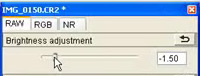 I will then take the slider up in increments of .5(point
5).� So the next one will be -1.5.� And I will save that in the same folder but
with a 2 at the end of the image file number.� I will continue in this manner
until I have 9 images from the same file number.� Some of the images will look
tacky but once we take it into HDR it will look a lot better.
I will then take the slider up in increments of .5(point
5).� So the next one will be -1.5.� And I will save that in the same folder but
with a 2 at the end of the image file number.� I will continue in this manner
until I have 9 images from the same file number.� Some of the images will look
tacky but once we take it into HDR it will look a lot better.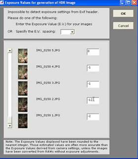 So here we are in Photo Matrix.� You see this quite a lot
on different sites and it is like �Infrared�, you either like it or you hate
it.� If you use it to the best of your ability to the way you like it then
there is no problem.� So we are going to start by going into HDR/Generate and
we are going to browse for our 9 images.� You can see them � 1 through to 9.
Highlight the 9 images and then click Open.� Once this goes to the next stage,
the programme will ask me for the different exposures of each of the 9 images.
So I will type in what I know them to be.� Some people prefer to leave
them�that is quite okay.� Click okay.
So here we are in Photo Matrix.� You see this quite a lot
on different sites and it is like �Infrared�, you either like it or you hate
it.� If you use it to the best of your ability to the way you like it then
there is no problem.� So we are going to start by going into HDR/Generate and
we are going to browse for our 9 images.� You can see them � 1 through to 9.
Highlight the 9 images and then click Open.� Once this goes to the next stage,
the programme will ask me for the different exposures of each of the 9 images.
So I will type in what I know them to be.� Some people prefer to leave
them�that is quite okay.� Click okay.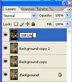 Now I am going to duplicate this layer 3 times.� You will
understand why shortly.� Now each of those 3 new layers are exactly the same as
the background layer.� I am going to apply a filter to each of those layers.
So we go to Filter/Optikverve/Virtual Photographer.� This is a free plug-in
that you can get via this link -
Now I am going to duplicate this layer 3 times.� You will
understand why shortly.� Now each of those 3 new layers are exactly the same as
the background layer.� I am going to apply a filter to each of those layers.
So we go to Filter/Optikverve/Virtual Photographer.� This is a free plug-in
that you can get via this link - 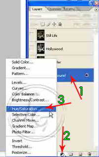 This is a great Plug-in.� It has many different effects
within it.� I do find it can make, especially the Black and Whites, a little
bit too noisy, so do be aware of that.� But used in moderation and the way you
want and not necessarily the way it shows on the plug in and you get some
incredible results.� I do like using this for some of my Black and Whites.
This is a great Plug-in.� It has many different effects
within it.� I do find it can make, especially the Black and Whites, a little
bit too noisy, so do be aware of that.� But used in moderation and the way you
want and not necessarily the way it shows on the plug in and you get some
incredible results.� I do like using this for some of my Black and Whites.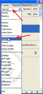
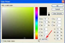 Make a new Solid Color Adjustment Layer.� Put in #060702
into the Hue number box on the bottom of the pop up window.� Click okay and
change the blend mode of that layer to �Color�.� That doesn�t seem to have made
a great deal of difference, as you can see it is only a slightly different
shade, but it does allow us to control the area a bit more.
Make a new Solid Color Adjustment Layer.� Put in #060702
into the Hue number box on the bottom of the pop up window.� Click okay and
change the blend mode of that layer to �Color�.� That doesn�t seem to have made
a great deal of difference, as you can see it is only a slightly different
shade, but it does allow us to control the area a bit more.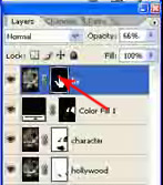 Now we will add a mask by clicking on this icon
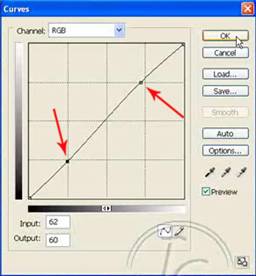
 Now once I have my JPEG version open again, resize it down
to whatever size you want, whether it be for a print or for a website.� In this
case I resized it down to 640 on the longest side.� I then applied a sharpening
just by using the Filter/Sharpen/Smart Sharpen.� Now I only wanted the
Sharpening applied to certain areas of the image�so again using a mask I masked
out the unwanted areas. By applying Sharpening you open your image up to halos
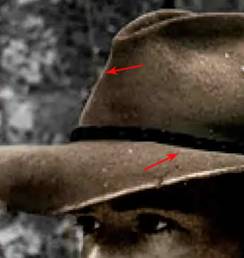
which you can see when you zoom in.� You can see them more obviously around the
hat edges and so forth.� So duplicating the layer and applying the mask (right
click on the layer/apply mask) and using my clone brush with a small size of
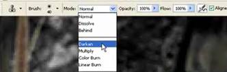
about 2 pixels.� I set the blend mode (in the Tool Bar) to Darken and start to
clone out the halos.�
Now once I have my JPEG version open again, resize it down
to whatever size you want, whether it be for a print or for a website.� In this
case I resized it down to 640 on the longest side.� I then applied a sharpening
just by using the Filter/Sharpen/Smart Sharpen.� Now I only wanted the
Sharpening applied to certain areas of the image�so again using a mask I masked
out the unwanted areas. By applying Sharpening you open your image up to halos
which you can see when you zoom in.� You can see them more obviously around the
hat edges and so forth.� So duplicating the layer and applying the mask (right
click on the layer/apply mask) and using my clone brush with a small size of
about 2 pixels.� I set the blend mode (in the Tool Bar) to Darken and start to
clone out the halos.� 