| Author | Thread |
|
|
04/29/2006 08:12:33 AM |
| I think that overall it could have been better if on a differnt floor such as an old looking road. also the bit in the corner could ahve been cropped out. |
|
Comments Made During the Challenge  |
|
|
04/24/2006 04:26:05 PM |
| Poor focus and I am not sure about the colour either - nice idea though |
|
|
|
04/24/2006 11:00:15 AM |
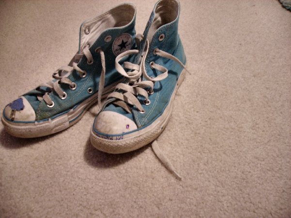
| Nice kicks you got there! could have done better cropping the top right corner where there's a slight distraction.. |
|
|
|
04/23/2006 04:45:24 PM |
| Cute shoes, reminds me that we'd get in trouble for writing on them at school. Unfortunately carpet just never seems to make a nice background, buy a couple of neutral colored posterboards for future set-ups like this. |
|
|
|
04/22/2006 12:22:23 PM |
| The light here is somewhat dull (lacking in intensity, not boring), and I don't like the shoes being cut off at the top of the frame. Also, that little bit of something in the upper right corner is distracting...more of it, or none, would have worked better IMO. Love the Chucky T's [and I'd say you still got 1000 more miles before that pair is totally spent :) ]. |
|
|
|
04/21/2006 09:11:31 PM |
| The toe is too close to the left edge. There's something to be cropped out of the upper right corner. Needs to be brighter, sharper, more contrast. As is, this looks like nothing more than a bad snapshot. |
|
|
|
04/21/2006 02:05:45 PM |
A bit Out of focus.
The "thing" in the upper right corner too. |
|
|
|
04/21/2006 06:37:41 AM |
| you could do so much with theese ,with a litle bit more imagination and the right place ,try and use a litle bit more creativity next time 5 |
|
|
|
04/20/2006 08:34:09 PM |
| Good topic idea but lacking a bit in the execution. A different background and moving the item in the top righthand corner out of the way would help this to look less like an accidental shot of the first thin you saw. Looks slightly out of focus as well. |
|
|
|
04/19/2006 08:52:07 PM |
| carpet is not a very intresting background |
|
|
|
04/19/2006 04:18:55 PM |
| Nice subject. Seems slightly soft and possibly slightly out of focus. Would like to see this closer up on a solid colored background... |
|
|
|
04/19/2006 08:07:41 AM |
| Good idea, however a different background and more subtle lighting would have improved this enormously. |
|
Home -
Challenges -
Community -
League -
Photos -
Cameras -
Lenses -
Learn -
Prints! -
Help -
Terms of Use -
Privacy -
Top ^
DPChallenge, and website content and design, Copyright © 2001-2024 Challenging Technologies, LLC.
All digital photo copyrights belong to the photographers and may not be used without permission.
Current Server Time: 05/19/2024 07:42:32 AM EDT.