| Image |
Comment |
| 11/23/2003 02:35:50 AM |
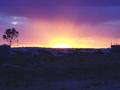
Prospecting for goldby Pop_in_OzComment by TooCool: From the Critique Club
This picture almosts looks like a painting. I'm trying to figure out if I think that is a good thing or a bad thing. The colors looked very nice at first but the more I look, the more (if slightly) un-natural they look. Perhaps from oversaturation? One cool effect is that the sun is so bright that I keep finding my eye wanting to avoid it, just like the real thing!!!
The biggest downfall of this image is the foreground. There is a lot of it (half the shot) and you cannot really pick out any good details for your eye to rest on after it is driven away from the sun. You can tell that there are tents and things there, but can't really see what they look like. Possible solutions, a fix in PS with levels or maybe contrast/brightness, or even better is a different crop with much less ground in the final composition.
All in all a very nice image that with a little work could make a great one! Keep shooting 'cause I want to see more of your work!
TC |
 Photographer found comment helpful. Photographer found comment helpful. |
| 11/18/2003 12:48:08 PM |
|
| Photographer found comment helpful. |
| 11/17/2003 09:16:07 PM |
|
| Photographer found comment helpful. |
| 11/16/2003 09:28:29 PM |
|
| Photographer found comment helpful. |
| 11/15/2003 10:34:28 PM |
Prospecting for goldby Pop_in_OzComment by blindjustice: I love that Big big sun! The foreground is an eerie gray blue, but the starkness of this shot lies in the contrast. I like how you managed to keep the detail in the foreground while showing shadow on the tree and the big sunrise. Perhaps you could put the horizon lower in the shot and show more beatiful sky and less foreground. Message edited by author 2003-11-23 15:48:00. |
| Photographer found comment helpful. |
| 11/14/2003 03:44:49 PM |
Prospecting for goldby Pop_in_OzComment by e301: Now if you'd called it The Manhattan Project, this would have been a scary photo. Neat trick of light though, and intriguing image. My eye is drawn to the blank foreground space though, and i don't find anything of interst there - the tents and rubble seem too high in the frame to gain emphasis, but not insignificant enough to be ignored.Would love to see it cropped an inch or so from the bottom, not least to get the horizon out of the middle of the frame, which really doesn't seem to suit this shot. |
| Photographer found comment helpful. |
| 11/14/2003 02:35:46 PM |
Prospecting for goldby Pop_in_OzComment by amazoneea: Splendid. There are no words for such a scene. The colours are wonderful and in total the sky makes you feel so insignificant compared to it's greatness. 10 |
| Photographer found comment helpful. |
| 11/14/2003 01:39:10 PM |
Prospecting for goldby Pop_in_OzComment by adine: nice complementary colors. You;ve pushed the saturation a bit too far - see the pink pixels int the blue cloud. I like the blue light on the landscape - very monotone. Looking for gold in a barren land. |
| Photographer found comment helpful. |
| 11/14/2003 06:01:32 AM |
|
| Photographer found comment helpful. |
| 11/13/2003 08:00:31 PM |
Prospecting for goldby Pop_in_OzComment by Rooster: I like the rainbow effect in the sky and the deep blue tint for the foreground. Perhaps some of the left & right side could have been cropped but that is just my subjective viewpoint. Nice shot! |
| Photographer found comment helpful. |
Home -
Challenges -
Community -
League -
Photos -
Cameras -
Lenses -
Learn -
Help -
Terms of Use -
Privacy -
Top ^
DPChallenge, and website content and design, Copyright © 2001-2025 Challenging Technologies, LLC.
All digital photo copyrights belong to the photographers and may not be used without permission.
Current Server Time: 03/13/2025 07:25:05 PM EDT.