| Image |
Comment |
| 03/05/2009 02:30:11 PM |
|
 Photographer found comment helpful. Photographer found comment helpful. |
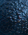
| 03/04/2009 03:03:55 PM |
Gatorby BurgyBoyComment by cptpoland: Interesting texture, but you will get voted down on the size of the shot. |
| Photographer found comment helpful. |
| 03/04/2009 04:06:03 AM |
Gatorby BurgyBoyComment by WriteHeart: I understand what you were going for here, but it doesn't seem to have a lot of visual interest for me. It may be the angle of the lighting. |
| Photographer found comment helpful. |
| 03/04/2009 01:41:10 AM |
|
| Photographer found comment helpful. |
| 03/07/2004 04:17:15 PM |
Silent Voicesby BurgyBoyComment by willem: A good job in chosing the endless gray rows with the position of the two graves with the flowers and flag. Could maybe have been even stronger, to emphase the huge numbers, by cropping out the trees at the back and/or a slightly tilted point of view. |
| Photographer found comment helpful. |
| 03/07/2004 03:34:10 PM |
Silent Voicesby BurgyBoyComment by blueswolf58: The subject of the shot are the headstones, so the trees at the top are distracting from that goal, crop 'em. With only the headstones now left, my attention is drawn to the grave with the flowers, but it's too far away to actually be the subject. You could either shoot that in the foreground, leaving the non-decorated headstones as background, or just shoot all non-decorated headstones with no emphasis on any of theme. Right now there's nothing special about the closest headstone which might have been your focal point. B&W could also help with the overall mood you're trying to capture. Just my opinion, it's free, so it for what's it's worth. ;) |
| Photographer found comment helpful. |
| 03/06/2004 10:30:51 PM |
Silent Voicesby BurgyBoyComment by lightpro1: This has nice leading lines, but I feel they are too centered. Change your angle a little to lead more on a diagonal. This will keep from giving the feeling of dividing the image in half. |
| Photographer found comment helpful. |
| 03/04/2004 04:46:44 AM |
|
| Photographer found comment helpful. |
| 02/24/2004 04:33:27 PM |
d'orangeby BurgyBoyComment by andywightman: Poor focus and too shiny to properly bring out the feel of this subect.Use a tripd and experiment with focus and exposure and lighting to see how this can be improved. |
| Photographer found comment helpful. |
| 02/23/2004 07:46:17 PM |
|
| Photographer found comment helpful. |
Home -
Challenges -
Community -
League -
Photos -
Cameras -
Lenses -
Learn -
Help -
Terms of Use -
Privacy -
Top ^
DPChallenge, and website content and design, Copyright © 2001-2025 Challenging Technologies, LLC.
All digital photo copyrights belong to the photographers and may not be used without permission.
Current Server Time: 03/12/2025 02:55:55 PM EDT.