| Author | Thread |
Comments Made During the Challenge  |
|
|
02/24/2004 05:52:16 PM |
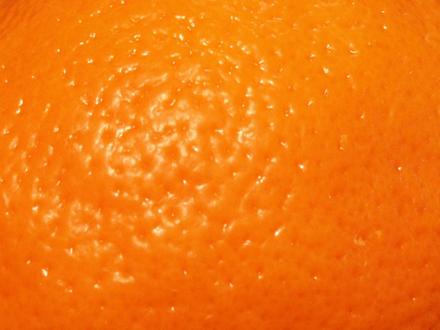
| It's a nice texture, but it's not interesting and not well taken. |
|
|
|
02/24/2004 04:33:27 PM |
| Poor focus and too shiny to properly bring out the feel of this subect.Use a tripd and experiment with focus and exposure and lighting to see how this can be improved. |
|
 Photographer found comment helpful. Photographer found comment helpful. |
|
|
02/24/2004 08:39:01 AM |
The idea is great, but you used the wrong light for my taste. (flash?)
Harm |
|
|
|
02/23/2004 07:46:17 PM |
|
| Photographer found comment helpful. |
|
|
02/23/2004 10:57:41 AM |
| ouch! too close that it's gone soft/ |
|
|
|
02/23/2004 09:14:04 AM |
| too close to actually appreciate details |
|
|
|
02/22/2004 07:11:51 AM |
|
|
|
02/21/2004 06:37:44 AM |
| the hilight is in a nice strong location in the frame, and the color and surface are appealing... but there's not much to it. |
|
| Photographer found comment helpful. |
|
|
02/19/2004 09:39:23 PM |
| The texture is good, but the exposure is too much in some places, and not enough in others, making it appear "flat" and without a main focus of attention. |
|
| Photographer found comment helpful. |
|
|
02/19/2004 04:05:32 PM |
| Yuo could have played with the light a bit more on this one - may be taken half the orange or something like that. |
|
|
|
02/19/2004 11:51:35 AM |
| too bright in the center...glare takes away from the rest of the image. |
|
| Photographer found comment helpful. |
|
|
02/19/2004 12:25:29 AM |
| I see the texture, but the subject and composition just don't hold my interest. |
|
|
|
02/18/2004 09:48:20 PM |
| A lot of the detail in the texture is lost, don't know if the problem is focus, DOF, or lighting. I like how you didn't center the light in the frame, but put it of to the side. |
|
| Photographer found comment helpful. |
|
|
02/18/2004 07:24:29 PM |
| such a great idea... I'd like to see a lower light level to bring out more of the texture |
|
| Photographer found comment helpful. |
|
|
02/18/2004 11:54:54 AM |
| Good orange color but not all that interesting of a macro. The light glare is a little harsh. You did meet the challenge but the interest factor is low. |
|
| Photographer found comment helpful. |
|
|
02/18/2004 10:04:48 AM |
|
|
|
02/18/2004 09:34:34 AM |
| Lighting doesn't help, really doesn't show the feel of the surface. Other than thst, very little interest here. |
|
Home -
Challenges -
Community -
League -
Photos -
Cameras -
Lenses -
Learn -
Help -
Terms of Use -
Privacy -
Top ^
DPChallenge, and website content and design, Copyright © 2001-2025 Challenging Technologies, LLC.
All digital photo copyrights belong to the photographers and may not be used without permission.
Current Server Time: 03/12/2025 02:20:51 PM EDT.