| Image |
Comment |
| 08/04/2004 12:17:26 PM |
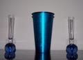
good ol' blueby CrAcKpOt 909Comment by skylen: Nice balanced composition. Main problem is the lighting, it's not very interesting coming from the front like that. Too flat and harsh. Is it on-camera flash? (The round shadows made on the wall above the bases of the skinny vases are funny, made by the flash's reflection in the table.)
If lit by natural window light or some nicely diffused indirect lighting, it could be much better. The right vase has some cracked out chunks up top that are distracting. |
 Photographer found comment helpful. Photographer found comment helpful. |
| 08/03/2004 05:43:12 PM |
|
| Photographer found comment helpful. |
| 08/02/2004 02:35:57 PM |
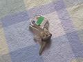
Order of the Keysby CrAcKpOt 909Comment by Bassie: Definately an everyday object but not a very appealing picture to me. The table cloth seems to have better focus than the keys. 5 |
| Photographer found comment helpful. |
| 08/02/2004 12:40:00 AM |
Order of the Keysby CrAcKpOt 909Comment by photom: Keys turned into a pretty common theme for the challenge. I like the inclusion of the state key ring. Composition is boring - too centered. |
| Photographer found comment helpful. |
| 08/01/2004 09:46:49 AM |
|
| Photographer found comment helpful. |
| 07/30/2004 08:08:40 AM |
Order of the Keysby CrAcKpOt 909Comment by mandyp: The background is a little distracting. It would help you to adjust the colour levels so that black is really black - you'll find it makes all the difference. |
| Photographer found comment helpful. |
| 07/29/2004 08:15:46 PM |
Order of the Keysby CrAcKpOt 909Comment by thomasheany: This is a terrible shot. I don't think you have really woked on it. C'mon, you can do better. Move the keys around and look from different angles. I am sure you can find a better angle, background and arrangement than this. It's not even in focus. Did you really try for this? |
| Photographer found comment helpful. |
| 07/29/2004 12:46:36 PM |
Order of the Keysby CrAcKpOt 909Comment by mffnqueen: focus needs a little bit of work, everything here is blurry.. try to avoid putting things in the dead center of the photo - use the rule of thirds, or at least take it from a more interesting angle. the background needs to go, too.. stick with solid colors, so they don't detract from your focal point |
| Photographer found comment helpful. |
| 07/28/2004 10:58:37 PM |
|
| Photographer found comment helpful. |
| 07/28/2004 07:00:46 PM |
|
| Photographer found comment helpful. |
Home -
Challenges -
Community -
League -
Photos -
Cameras -
Lenses -
Learn -
Help -
Terms of Use -
Privacy -
Top ^
DPChallenge, and website content and design, Copyright © 2001-2025 Challenging Technologies, LLC.
All digital photo copyrights belong to the photographers and may not be used without permission.
Current Server Time: 03/13/2025 02:10:05 AM EDT.