| Image |
Comment |
| 05/01/2003 03:31:23 PM |
Bud ~ Yellow Tulipby ladpupmoeComment: Neat series, very bright! The white background works very well with the green bud, but not as well for the yellow open tulip, it seems on the stark side. I think I would have liked the leaves more evenly portrayed, too. 7 Rob the Swash |
 Photographer found comment helpful. Photographer found comment helpful. |
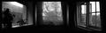
| 05/01/2003 03:29:35 PM |
Dreams of a Bay Windowby mbardeenComment: Well constructed series...first glance, this could be a single photo, scene changes nicely "hidden". As I write this critique, the depth of this image is growing on me. Score upgrade from 7 to 8. Rob the Swash |
| Photographer found comment helpful. |
| 05/01/2003 03:27:22 PM |
Alishaby sherryk471Comment: Neat series, lovely child. The watercolor filter is nicely applied here (never seen it used so well!). That said, the effect used takes this series much closer to good artwork and less like photos. The egdes of the images are very nicely blended.
7 Rob the Swash |
| Photographer found comment helpful. |
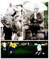
| 05/01/2003 02:32:09 PM |
At the soccer gameby jjbeguinComment: This is an interesting series, each in a different style (double edged sword - adds interest greatly, but the effects may overwhelm the photo/subjects). The all color frame seems dark and overly saturated. The all B&W frame is a bit overexposed, but has good contrast levels. The other frame is just adorable. This must have taken a lot of work to put together. 7 Rob the Swash |
| Photographer found comment helpful. |
| 05/01/2003 02:28:13 PM |
Joy Rideby jenaromComment: Very cute series! I really like the first frame, she's very solid, but the other two have a bit too much motion (for me). The middle frame is a bit low (cut off her poor head). Color seems really good, but once again, I like the first frame's color best. 7 Rob the Swash |
| Photographer found comment helpful. |
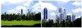
| 05/01/2003 02:21:58 PM |
Financial Districtby KingLokComment: Very well taken city scape. The two pictures work well together, but I'm not seeing a story here (part of the challenge description and worth "bonus" point{s} for this challenge, but it does fit the theme part, so I'll go 1 bonus point). I started this as a 7, but I think it's more of an 8. Rob the Swash |
| Photographer found comment helpful. |
| 05/01/2003 02:17:32 PM |
Narcissusby salparadiComment: It's a good series. The effect used here works, but makes the photos too far removed from photography for my tastes. I also have mixed feelings about the large "negative" space at the bottom. 7 Rob the Swash |
| Photographer found comment helpful. |
| 05/01/2003 02:14:40 PM |
Afternoonby jimmythefishComment: This is a nice set of pictures. I don't understand the connection of the vertical piece (sorry, my bad). The fern and hosta shots are nice, but on the dark side. The fern is a very attractive use of "spot" lighting, but the hosta is much more "random", with one sun spot being a bit over-exposed. The hosta view seems like a difficult shot. Of the three, I do like the fern best. 7 Rob the Swash |
| Photographer found comment helpful. |
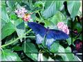
| 05/01/2003 02:10:10 PM |
Butterfly Superposed Imagesby nathaliedooComment: Beautiful butterfly! While I like this technique (it does a very nice job of highlighting ths subject!), it's honestly not what I was expecting in this challenge, there's no story. 7 Rob the Swash |
| Photographer found comment helpful. |
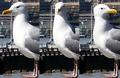
| 05/01/2003 01:07:23 PM |
Am I Good Lookin' or What???by seasawComment: Darn cute! The outline of the seagull is sharp, but still something seems less than really crisp (I just don't know why). White feathers are tough, white balance well controlled. 7 Rob the Swash |
| Photographer found comment helpful. |
Home -
Challenges -
Community -
League -
Photos -
Cameras -
Lenses -
Learn -
Help -
Terms of Use -
Privacy -
Top ^
DPChallenge, and website content and design, Copyright © 2001-2025 Challenging Technologies, LLC.
All digital photo copyrights belong to the photographers and may not be used without permission.
Current Server Time: 04/21/2025 10:07:34 PM EDT.