| Image |
Comment |
| 12/29/2003 03:22:32 AM |
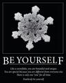
Be Yourselfby EddyGComment: Gorgeous snowflake macro. Love it in b&w. It is simple, but bery beautiful. The only small thing I don't like is that the text is way too big. It could have been a nudge smaller, because it is reversed white on black, it is very powerful even if were smaller. The font you picked is nice for this poster. Overall one of my favourites in this challenge. |
 Photographer found comment helpful. Photographer found comment helpful. |
| 12/29/2003 03:18:24 AM |
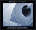
Respect....by willemComment: This is funny. Good shot of an ordinary object. I am glad it has just a simple border which does not distract. I would have picked a simpler font, but you pulled it off OK. Definitely a top contender. |
| Photographer found comment helpful. |
| 12/29/2003 03:16:50 AM |
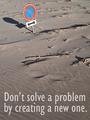
Think Twiceby jjbeguinComment: One of my top picks. I love the humor of this shot. My only suggesion would be to have a tiny big more space on the top and less on the bottom which would bring the text up a bit. The shot has a great perspective and sharpness. Well done. |
| Photographer found comment helpful. |
| 12/29/2003 03:14:47 AM |
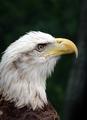
The Power of Oneby jab119Comment: Superb shot. The clarity is... well, eagle sharp :-) You've done great job with this image. It is one of the few textless posters, but the quality of the photo really speaks for itself in this case. Top ten finish I predict. |
| Photographer found comment helpful. |
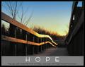
| 12/29/2003 03:12:35 AM |
hopeby ursulaComment: I am really into bridges, so this one is in my top list. Wonderful perspective and the glow it has ads additional touch to the hope. I also like the text very much (the font selection). Very well done. |
| Photographer found comment helpful. |
| 12/29/2003 03:10:14 AM |
Key to successby drydocComment: Very clever idea. LIke the composition and design. The only thing I am not so sure about is the yellowish cast the whole image has. Otherwise well done. |
| Photographer found comment helpful. |
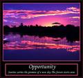
| 12/29/2003 03:09:14 AM |
Opportunityby rcrawfordComment: The photo is absolutely gorgeous. The colours are spectacular and the clarity is very good for en evening shot. But you went way over board with the borders. The thin one around the whole frame is fine, but the shocking pink thick border around the image and around the text could have been totally excluded and you would still have a very powerful poster. It kind of spoiled it for me. |
| Photographer found comment helpful. |
| 12/22/2003 02:08:00 AM |
Shapes of Natureby trainComment: Hi Sally, I just noticed that we finished so close to each other. But my son outscored us both :-)) I think I will monopolize my camera soon, otherwise he will put me out of business... |
| Photographer found comment helpful. |
| 12/09/2003 12:42:14 AM |
Out of Shapeby alanfreedComment: I can't stop laughing, this just cracks me up. You just made my day :-)) Very unique representation of this challenge. I admire people who are pushing the boundries. |
| Photographer found comment helpful. |
| 12/09/2003 12:40:21 AM |
Happy Hoildayby RHoldenSrComment: You might have gone too far with your shallow depth of field. Almost nothing is in focus. Maybe you got too close for your camera to be able to tocus properly. There are lots of hot spots that could have been toned dow. The upper left ornament is overexposed and therefore overpowering the rest of the image. The image could have done better without the border as it is busy enough by itself. |
| Photographer found comment helpful. |
Home -
Challenges -
Community -
League -
Photos -
Cameras -
Lenses -
Learn -
Help -
Terms of Use -
Privacy -
Top ^
DPChallenge, and website content and design, Copyright © 2001-2025 Challenging Technologies, LLC.
All digital photo copyrights belong to the photographers and may not be used without permission.
Current Server Time: 04/22/2025 11:24:21 PM EDT.