| Image |
Comment |
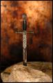
| 11/16/2003 12:34:09 AM |
The Sword in the Stoneby moodvilleComment: Lovely interpretation of this book. Love the mottled background that totally fits with the image. The shallow DOF is great in this shot. Sharpness is good. In terms of composition, I think it either needs to be centered or more off-center. The way it is now, it is kind of in between which makes it a bit less powerful. Othewise great photo. |
 Photographer found comment helpful. Photographer found comment helpful. |
| 11/16/2003 12:30:11 AM |
The Joy Of Cookingby GeneralEComment: This photo really expresses the joy. I can see my kid joining yours in the fun. Love the way you captured the chocolate dripping of the spoon onto her/his clothes. It is very spontanious shot. The only distracting bit is the bottom glare on the pot and the harsh shadow the figure casts. Have you considered using no flash and just sticking to normal lighting of the room with longer exposure to compensate. |
| Photographer found comment helpful. |
| 11/16/2003 12:26:34 AM |
Femme Fataleby magnetic9999Comment: Great photo. Good choice of sepia toning on this. Sorry, but I wouldn\'t change a thing on this. Well done. |
| Photographer found comment helpful. |
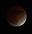
| 11/16/2003 12:18:04 AM |
Goodnight Moonby stargazerComment: Good shot of an eclipse. However it lacks sharpness. Did you use digital zoom? It looks a bit pixelated. Also composition-wise it is dead center which makes this a bit unatractive. Also, you could consider turning it into black and white more dramatic photo, loosing the greenish cast. |
| Photographer found comment helpful. |
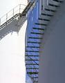
| 11/16/2003 12:14:37 AM |
The 39 Steps (John Buchan)by RobroComment: I wonder how many of us are actually counting the steps :-))
I love the abstract look of this photo, the cool simple colours, and the crisp sharpness. I like the way half of the photo is in the sun and half is in shadow. I would have played with the composition a bit more. But otherwise good shot. |
| Photographer found comment helpful. |
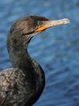
| 11/16/2003 12:11:21 AM |
A Photographic Guide to Birdsby TerryGeeComment: A guide to dead birds? (just kidding :-)) This photo is very well done. Love the shallow depth of filed as it brings emphasis to the bird. The sharpness and detail are amazing. The colours are great - the orange beak with the blue water behind it. The composition is good too. Love the way it curves. This indeed would be a great shot for a book cover. |
| Photographer found comment helpful. |
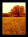
| 11/16/2003 12:06:33 AM |
Grace In Autumnby roy204Comment: Love this image. It has golden peaceful feeling. Good sharpness and composition. But please stay away from those dreadful black overpowering borders. A border half the size would have been much more tasteful. This is an overkill. No points taken off for this as the photo itself it very nice. |
| Photographer found comment helpful. |
| 11/16/2003 12:04:04 AM |
To the Lighthouse by dan_pendletonComment: Gorgeous photo. Great simple colours. Sharpness is amazing and the composition is dead on. I love the soft appearance of the sand on the left side - it ads feeling of time to this photo. So very well done. |
| Photographer found comment helpful. |
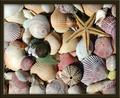
| 11/16/2003 12:01:19 AM |
Gift from the Sea (Anne Morrow Lindbergh)by GrandmomComment: The variety of the sea gifts makes this an interesting photo. The colours are nice and soft - realistically looking. You have some lovely textures. It needs tiny bit of sharpening, but my biggest suggestion is to really stay away from thick brown borders. This border totally kills your beautiful shot. I am not taking any points off for it, but IMO it doesn't add or help your image, it distracts from it. Perhaps thinner cream-coloured border would have been a better choice. |
| Photographer found comment helpful. |
| 11/15/2003 11:55:12 PM |
Old Possum's Book of Practical Cats - by, T.S. Elliotby joannadivaComment: This cat shot is well done. Love the way the cat tilted her head. Her eyes are like two liquid beads. The blue eyes nicely contrasts with the pinkish background. I like the way the parts that are supposed to be sharp are sharp and the rest is nicely soft. My only suggestion would be not to cut her top ear off (I mean in the photo of course). Lovely companion you have. |
| Photographer found comment helpful. |
Home -
Challenges -
Community -
League -
Photos -
Cameras -
Lenses -
Learn -
Help -
Terms of Use -
Privacy -
Top ^
DPChallenge, and website content and design, Copyright © 2001-2025 Challenging Technologies, LLC.
All digital photo copyrights belong to the photographers and may not be used without permission.
Current Server Time: 04/22/2025 03:16:48 PM EDT.