| Image |
Comment |
| 11/15/2003 11:49:46 PM |
"Same Time, Next Year" - a romantic comedyby jefalkComment: I bet this was fun to arrange. Love the whole composition. The simple background and colour scheme, the sharpness, the llighting, they all make it a very professional looking. Well done. |
 Photographer found comment helpful. Photographer found comment helpful. |
| 11/15/2003 11:47:18 PM |
In A Lighter Veinby MWittComment: Beautiful macro. Great backlighting and simple background makes this a very striking photo. My only suggesion woud be the play more with the composition (maybe angle it to follow the leaves' lines...) |
| Photographer found comment helpful. |
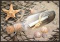
| 11/15/2003 11:45:26 PM |
Message in a Bottleby SharonSComment: This is one of my favs in this challenge. So well composed. I love the way you splashed a bit of sand on the bottle to make it look like it's been sitting there for a while. The net adds very nice touch to the whole image as it frames the bottle. My only suggesions would be to rotate the star tiny bit to make it less obvious that it was arranged, and make the border thinner (it should not compete with the fishnet lines). Otherwise beautiful photo. |
| Photographer found comment helpful. |
| 11/15/2003 11:42:23 PM |
|
| Photographer found comment helpful. |
| 11/15/2003 11:40:48 PM |
Preserving the Taste. The Secrets to Great Salsaby vrphotosComment: Very well shot. Love everything about it. The colours, the sharpness, the composition. The background and foreground were carefully chosen. This would have scored well in the still life challenge as well. Here is illustrates the title very well. The only tiny thing is that your border looks like it got chopped off. Still very good image. |
| Photographer found comment helpful. |
| 11/15/2003 11:38:15 PM |
The Electric Kool-aid Acid Testby grigrigirlComment: Superb piece of art. Just beautiful. The prism colours add life to this image. Her expression is nice and soft. My only suggesion would be to add a tiny bit of contrast to the black portions of the image - it kind of looks a bit greysh (but it could be a monitor calibration issue.) Among my top pics. |
| Photographer found comment helpful. |
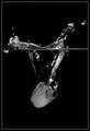
| 11/15/2003 11:30:09 PM |
Cool Cocktailsby EddyGComment: Really like this photo. Good sharpness. Lovely colour. Interesting background. Very well lit. You should have left a tiny bit more breathing space on left and right - it's a bit too tight. Also it could have been even more striking if more of the reflections on the bottom were included. This should score in amongh the top photos. |
| Photographer found comment helpful. |
| 11/15/2003 11:27:31 PM |
The Red and The Blackby MichaelsComment: I don't know what this is, but it is very beautiful. The contrast between the black and red makes this very striking photo. Love the abstract shapes. I hope people appreciate your art, cause I sure do. My only suggestion would be to place a small red squarley in the top right corner fo the photo to balance the composition a bit. Still like it very much. |
| Photographer found comment helpful. |
| 11/03/2003 02:00:32 AM |
Leaves 2by pitsamanComment: Oh, this is just great photo! If that's you, then you are one handsome pitsa dude !! Love the warmness of the whole thing. |
| Photographer found comment helpful. |
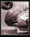
| 11/01/2003 12:36:24 PM |
Touched by Graceby bruskiComment: This is one of the very best shots in this challenge. The composition is very good, love the sepia tone as it ads warmth. The baby's expression is priceless - it's as if the baby was looking up at God. Definitely fits the challenge. The only thing that I think distracts is the thick quadruple border. Why not use a simple line or double line at most. It really takes away from the powerful message of the photo. Still one of my top picks. |
| Photographer found comment helpful. |
Home -
Challenges -
Community -
League -
Photos -
Cameras -
Lenses -
Learn -
Help -
Terms of Use -
Privacy -
Top ^
DPChallenge, and website content and design, Copyright © 2001-2025 Challenging Technologies, LLC.
All digital photo copyrights belong to the photographers and may not be used without permission.
Current Server Time: 04/22/2025 03:19:54 PM EDT.