|
|
|
Showing 271 - 280 of ~742 |
| Image |
Comment |
| 01/30/2005 08:39:49 AM | light of timesby yomanComment: Great idea, but what you have done to the lightbulb stuff is a disaster. The candle is overexposed, too and out of focus... Sorry, but I feel too much useless artifical elements in your photo that doesn't help the story you wanted to tell, evenmore they ruined your photo... :-((( |  Photographer found comment helpful. Photographer found comment helpful. |
| 01/30/2005 08:36:33 AM | Béinchen (1684) & Rout Bréck (1966)by glodaComment: I would like this one with full colours. The natural colours of the stone bridge and nature would be opposing enough with the unnatural reds of the new bridge. Composition is great and the subject is loveable, too. I am very curious about the full-coloured version, because personally I think making pastel colours for the yet desaturated elements would have made your shot better. This way it's a bit agressive for me. If it was the purpose, it works well, but be careful with selective desaturation. I love this technique, too, anyway. :-) | | Photographer found comment helpful. |
| 01/30/2005 08:31:14 AM | Handsby MikeOComment: Wonderful soft photo, with loveable colour tones! My only problem is that the mother's hangd doesn't look that old at all, I think, grandma's hand would have helped the opposite here more. I like the emotions of the photo a much. | | Photographer found comment helpful. |
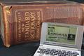
| 01/30/2005 08:29:15 AM | 1927 vs 2003by kenboComment: Great subject! I wouldn't have cropped the bottom of the electronic dictionary, but I might have cropped a bit on the top, because the cover of the books leads my eyes to unused depths of the photo. The background could be better, black velvet would work well with the warm brown tones of the book and the silver metal of the electronic dictionary. I love old and beautiful books like this, and the photo coul dbe even more dramatic if it were a Longman dictionary, too. :-) | | Photographer found comment helpful. |
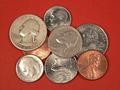
| 01/30/2005 08:20:00 AM | 82 centsby kelstertxComment: Nice idea, but I would have chosen a lower angle. For me, photographing exactly form the top is too direct for such an indirect composition of coins. I would have used a different background as well. Dark green or maroon velvet maybe, silver, gold and bronze hard metal always reminds me to the need of something soft and opposite colour. This might have added another nice element of opposites to the opposite of old and new. Just an idea. | | Photographer found comment helpful. |
| 01/30/2005 08:17:41 AM | Great Grandaughterby SteveJComment: Nice idea, but needs more improvement. B&W usually works well for family photos that show us contrast and opposites, like here, old and young. I would improve sharpness: the baby is out of focus, though, I think it's important for opposites to get both subjects clear and sharp. Very few out of focus opposites work well IMHO. Backround is busy, the door or wall or whatever is too bright and the person with the striped top is distracting, too. Shame you cut off the baby's hands, for me, the composition would be working if I saw her (his?) hands, therefore I would have left more space on the right and bottom. The baby is looking at something in her (his?) hands and I miss this thing a much! And a more homogenic background, and focus on both characters. Maybe lighting didn't help you with this candid shot, but it would have been important. | | Photographer found comment helpful. |
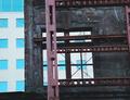
| 01/30/2005 08:12:54 AM | untitledby kevrobertsonComment: Not bad, maybe a bit overexposed (the building in the background), but it helps the opposite. For me, this shot cries for a symmetrical composition. Compose the "window" of the old one to the new to the center, if you feel the shot this way boring, rotate it it a bit, but leave it centered. Simple subjects need simple, but not ad-hoc compositions to work well.
I see you din't give a title. "Window to the new" or something like that came to my mind when I saw your shot. Feel your photo! If you couldn't find a title, you didn't feel it enough. | | Photographer found comment helpful. |
| 01/30/2005 08:07:33 AM | combinationby hossamComment: I would crop from the left (just to keep the sailing boat) and I would show more of the old side. The bridge could be a key element on this photo, to get a semi-diagonal composition, it would divide the photo to the two parts. Old and new are opposites, so halved photo compositions work well with it, if you find a natural or artifical line that halves your photo, use it bravely to help the story you want to tell me! :-) | | Photographer found comment helpful. |
| 01/30/2005 08:04:40 AM | Old & Newby slindenmanComment: I think like this one, though I feel like background is a bit busy. I like the composition, DOF and the subject anyway. With a one coloured background this would be a nice submission, though, I appreciate the individuality of your photo. | | Photographer found comment helpful. |
| 01/30/2005 08:02:34 AM | VHS to DVDby katihComment: WoW! :-) B&W VHS and colourful DVD! Nice implementation of the challenge! :-) The only one thing that distracts me a bit is the light satuff in the top right corner. I covered the top of the photo to get rid of it and I found the result better, try it. :-) | | Photographer found comment helpful. |
|
Showing 271 - 280 of ~742 |
Home -
Challenges -
Community -
League -
Photos -
Cameras -
Lenses -
Learn -
Help -
Terms of Use -
Privacy -
Top ^
DPChallenge, and website content and design, Copyright © 2001-2025 Challenging Technologies, LLC.
All digital photo copyrights belong to the photographers and may not be used without permission.
Current Server Time: 04/22/2025 12:18:29 PM EDT.
|