| Image |
Comment |
| 08/23/2004 07:25:05 AM |
The Two Towersby BassieComment: LOL :-))) Really creative idea. I like B&W presentation a much and the parallel lines of your model and the tower. The plants on the left draw my attention a bit away, I would have cut them. |
 Photographer found comment helpful. Photographer found comment helpful. |
| 08/23/2004 07:22:09 AM |
A subtle patience by heidaComment: Wonderful shot! I love the soft, fine lighting on her, the most important body parts highlighted. Really expressive, a tasty representation of the beauties of pregnancy! I also love the environment. Maybe her expression is a little bit scared, and due to the title she looks a bit impatient, but if it was on purpose, you got the effect well! |
| Photographer found comment helpful. |
| 08/23/2004 07:15:46 AM |
Lukeby biggood53Comment: Okay, he is nude, diagonal composition with the surf desk would be fine, but there are a few issues I would like to mention: You have cut off his feet, and the lighting isn't that well either. Due to the flash you lost colour shades and the red-eye effect in his eyes is harsh (as it's a member's challenge, you could have got rid of them using separate RGB layers and delete the red area on the red layer). It rather looks like a snapshot, than a conscious work, sorry. Next time, try to use diffused lights, and check that everything important is on the photo. |
| Photographer found comment helpful. |
| 08/10/2004 07:12:51 AM |
Dragon Eyes by JackoComment: What a face! :-) I love the eye details. Congrats on the double win, Jacko! :-) |
| Photographer found comment helpful. |
| 08/02/2004 12:42:48 PM |
|
| Photographer found comment helpful. |
| 07/28/2004 03:37:10 PM |
|
| Photographer found comment helpful. |
| 07/28/2004 02:18:44 PM |
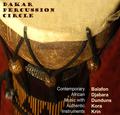
Dakar Percussion Circleby DiamondPeteComment: I love the colours, composition, really moody shot! :-) Though, I am not familiar with the tipography in the left bottom corner. It's so different from the one above (I like that), and the whites are adding too much Contrast IMHO. I would use a smaller font type for the text in the bottom and align it absolutely to the right, I would also use the beige shades instead of the white. Just an idea. (7) |
| Photographer found comment helpful. |
| 07/26/2004 01:08:46 PM |
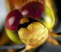
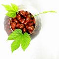
Chocolate Covered Raisinsby artvetComment: Is this a high key shot? I love the composition, the crop, the lighting a much! Few, but effective colours, I love this. :-) I also love the grape leaves, they add a nice colour and shape element to the composition. 10 from me, and good luck! (10) |
| Photographer found comment helpful. |
| 07/26/2004 01:03:57 PM |
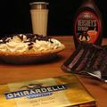
Got Milk!by awpollardComment: I think the composition would be better without the gold bar of chocolate. The background is a bit tilting to the left (the edge of the table), and there are too many thinkgs on this photo. Fewer would be more effective, like the syroup, the cakes, without the glass and the bar on the bottom, or something like that. (4) |
| Photographer found comment helpful. |
| 07/26/2004 12:25:56 PM |
gadiveby fstopopenComment: What's this and what does this have to do with chocolate? (1 - for not meeting the challenge) |
| Photographer found comment helpful. |
Home -
Challenges -
Community -
League -
Photos -
Cameras -
Lenses -
Learn -
Help -
Terms of Use -
Privacy -
Top ^
DPChallenge, and website content and design, Copyright © 2001-2025 Challenging Technologies, LLC.
All digital photo copyrights belong to the photographers and may not be used without permission.
Current Server Time: 04/22/2025 10:14:43 PM EDT.