| Author | Thread |
|
|
10/03/2004 05:14:27 PM |
|
what is this thread you started about a hat? what hat???? :) :) :) |
|
|
|
09/12/2004 04:52:01 PM |
|
very interesting and fun. should have done better. |
|
|
|
08/30/2004 02:21:55 PM |
|
This was one of my favorites, because I thought it was extremely interesting & appealing. It should have placed in the top three! |
|
 Photographer found comment helpful. Photographer found comment helpful. |
|
|
08/30/2004 06:38:55 AM |
|
Congrats, man! I had a feeling this was yours...your pony tail gives it away every time...not that we were looking at your pony tail this time, anyway... ;o) |
|
| Photographer found comment helpful. |
|
|
08/30/2004 12:37:46 AM |
|
Congratulations on your 17th placing. For this contest, top 20 is good. This challenge ran real hot. Very good work and keep hammering away. |
|
| Photographer found comment helpful. |
Comments Made During the Challenge  |
|
|
08/29/2004 01:59:51 PM |
|
Great tones, gravity has it's way here for sure. |
|
| Photographer found comment helpful. |
|
|
08/29/2004 08:44:31 AM |
|
This would have made a good comparison shot. :) |
|
| Photographer found comment helpful. |
|
|
08/27/2004 11:28:26 PM |
|
tighter crop on the sides... awesome shot otherwise |
|
| Photographer found comment helpful. |
|
|
08/27/2004 02:39:07 AM |
|
Very Imaginative, good shot, like your tonal range too. |
|
| Photographer found comment helpful. |
|
|
08/26/2004 07:37:32 PM |
|
Unique idea, definitely shows gravity at work |
|
| Photographer found comment helpful. |
|
|
08/26/2004 10:44:48 AM |
|
interesting, but the border is bit large for me (not distracting enough to lose points over though) |
|
| Photographer found comment helpful. |
|
|
08/26/2004 01:47:18 AM |
|
I like this, but I have one suggestion. centering the two figures in shot would have made this much stronger, compositionally, in my opinion. |
|
| Photographer found comment helpful. |
|
|
08/25/2004 11:27:15 PM |
|
well done! I think the very unique and creative setup makes this shot. |
|
| Photographer found comment helpful. |
|
|
08/25/2004 01:09:07 PM |
Setzler Comment:
Some general ratings (1-10): These are some elements that I look for in great photographs, in no specific order…
Visual Appeal: 9
Subject Appeal: 9
Compositional Appeal: 10
Effective use of color/bw: 10
Creativity: 10
Theme/Storytelling qualities: 6
Title: 10
Additional Comments:
This is definitely an interesting idea and nice use of black and white as well....
|
|
| Photographer found comment helpful. |
|
|
08/25/2004 12:06:39 PM |
|
interesting idea. nice lighting |
|
| Photographer found comment helpful. |
|
|
08/25/2004 03:55:37 AM |
|
excellent concept, perfectly composed and the exposure is great.... i wish you remove the cap im sure this will land in the top 3 position...goodluck |
|
| Photographer found comment helpful. |
|
|
08/24/2004 10:29:50 PM |
|
|
|
08/24/2004 09:23:24 PM |
|
that's a rather unflattering shot .. |
|
|
|
08/24/2004 09:15:08 PM |
|
Good lighting and great sky. I like your composition but don't think I ever want to see a grown man doing a naked handstand again. lol |
|
| Photographer found comment helpful. |
|
|
08/24/2004 06:29:13 PM |
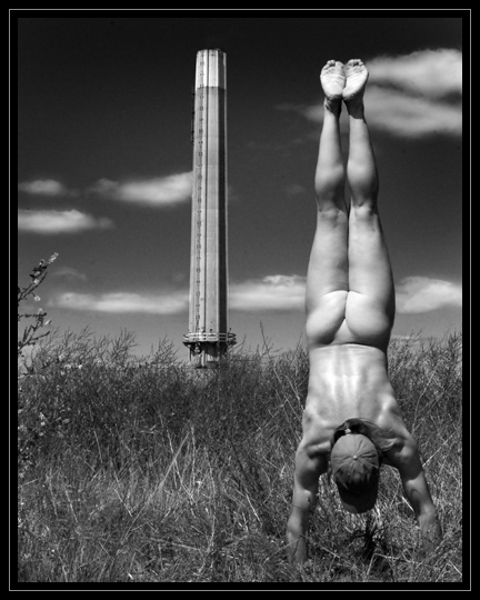
excelent idea and title.
The two towers are bit close togeather, maybe a bit diffrent angle to give a little more pace between. |
|
| Photographer found comment helpful. |
|
|
08/24/2004 05:57:36 PM |
|
Great composition, strong B/W, sense of humor, technically perfect. 10 |
|
| Photographer found comment helpful. |
|
|
08/24/2004 05:56:02 PM |
|
Great interpretation! I like this shot. Why the hat? |
|
| Photographer found comment helpful. |
|
|
08/24/2004 04:43:42 PM |
|
cool concept and very athletic model. I think I would have preferred it without the hat though. Seems to infere with the image. |
|
| Photographer found comment helpful. |
|
|
08/24/2004 11:17:25 AM |
|
This is very artistically done. The b/w image makes it all the more effective. I also like that you can't tell if it is a man or a woman lending to the effect of great artistry. |
|
| Photographer found comment helpful. |
|
|
08/24/2004 08:17:34 AM |
|
This is an excellent photo and is so original and different as well. I hope you go well with this one [8] |
|
| Photographer found comment helpful. |
|
|
08/24/2004 07:45:10 AM |
|
Nice idea and B&W...I like the composition. |
|
| Photographer found comment helpful. |
|
|
08/24/2004 07:12:01 AM |
great tonal range, well exposed and composed. (also a very nice straight handstand sir)
My only gripe is the main focus of the photograph. I can't see why you have included the ugly tower. Your figure takes all the attention because it's well lit and it's at the forefront - so the tower is a secondary thought.
Without that this picture would be a 10. With much nice blank space giving the photo room to breath.
|
|
| Photographer found comment helpful. |
|
|
08/24/2004 05:02:04 AM |
Ingenious and well composed! I love how you and the model did such a good job getting the two "towers" lined up perfectly .. and those clouds scattered in the background make for a nice, subtle touch.
PS. Make sure to tell the model he has a nice butt! ;) :D |
|
| Photographer found comment helpful. |
|
|
08/23/2004 11:56:12 PM |
|
|
|
08/23/2004 11:11:37 PM |
|
|
|
08/23/2004 06:45:55 PM |
|
This would be SO much more powerful without the distraction of the baseball cap... but I can overlook that. I also think an angle more to the right, losing the tree/shrub and putting the tower and the model in vertical thirds would be very nice. Good job, love the B & W tones. :o) |
|
| Photographer found comment helpful. |
|
|
08/23/2004 04:49:39 PM |
|
This reminds me of a game we used to play called "knives, forks, spoons, cut it"... I have no idea what the words meant really... This is wonderfully creative and unusual. I love the choice of black and white and the way the clouds are so pale against the rich darkness of the sky. I love the shadows and light on the muscles and the way that gravity makes the bottom muscles fall into an upside down love heart. I think I'd prefer to have less empty space to the left and just a small touch more to the right but... it works very well as it is. One of my top 3. |
|
| Photographer found comment helpful. |
|
|
08/23/2004 04:34:39 PM |
|
High marks for the composition, tones and effort that went into this image. Simply beautiful! |
|
| Photographer found comment helpful. |
|
|
08/23/2004 01:03:31 PM |
|
Nice idea, but why do you/does he have a hat on your/his head? |
|
| Photographer found comment helpful. |
|
|
08/23/2004 11:14:36 AM |
|
Interesting shot, I'm not sure why a naked guy is doing a handstand near a tower, but the black and white textures are great. The clouds work particularly well. A fun, quirky shot that works nicely. |
|
| Photographer found comment helpful. |
|
|
08/23/2004 10:30:46 AM |
|
|
|
08/23/2004 08:40:38 AM |
|
|
|
08/23/2004 07:25:05 AM |
|
LOL :-))) Really creative idea. I like B&W presentation a much and the parallel lines of your model and the tower. The plants on the left draw my attention a bit away, I would have cut them. |
|
| Photographer found comment helpful. |
|
|
08/23/2004 01:37:20 AM |
|
A for effort, but from the title I automatically make connections to the WTC twin towers and as a New Yorker I find the 'comparison' a bit insulting or rather tasteless. But I will not score you lower because of this, just wanted to point it out. |
|
| Photographer found comment helpful. |
|
|
08/23/2004 12:27:54 AM |
|
would have liked better without the hat, otherwise nice photo |
|
| Photographer found comment helpful. |
|
|
08/23/2004 12:27:23 AM |
|
Good composition. I like the crispness of this shot and the way it makes me laugh because I did not think any of the guy pictures would be good. This one makes me eat my words. Great work! Good luck. |
|
| Photographer found comment helpful. |
|
|
08/23/2004 12:12:58 AM |
|
OMG! My eyes my eyes! LOL Funny! 9 |
|
| Photographer found comment helpful. |
Home -
Challenges -
Community -
League -
Photos -
Cameras -
Lenses -
Learn -
Help -
Terms of Use -
Privacy -
Top ^
DPChallenge, and website content and design, Copyright © 2001-2026 Challenging Technologies, LLC.
All digital photo copyrights belong to the photographers and may not be used without permission.
Current Server Time: 07/18/2026 06:38:50 AM EDT.