| Image |
Comment |
| 05/01/2003 01:43:40 PM |
Untitledby PHOTOCHlXComment: I like the idea. I think you should just do away with the ribbon and move the film roll more to the left. Also try making the film and roll look more distinct - darker colors at least |
 Photographer found comment helpful. Photographer found comment helpful. |
| 05/01/2003 01:42:35 PM |
.by dsidwellComment: I really like the text and the background - esp the light flares... the pixelated camera outline bugs me |
| Photographer found comment helpful. |
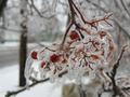
| 04/29/2003 11:38:29 PM |
Ice Stormby sabal5Comment: As for fitting the challenge, you did it. As for taking a high quality photo.. I think it needs a little work. This seems more like a documentary type shot that you'd see in the paper although I'm not sure that they would be able to print it because of the soft focus. It also seems dark, and it is hard to make out what we're seeing due to all the branches.
We had a similar mess on my street during that week with lots of trees downed during a micro burst.
Thanks for sharing. Sometimes just participating and getting some comments is worth more than a score anyway. |
| Photographer found comment helpful. |
| 04/29/2003 11:33:01 PM |
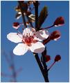
Sun Kissed Blossomby sagestudioComment: You did quite a few things really well in this shot. I like the color and exposure. Looks like a tough lighting situation that you handled well. The dof is nice and helps focus attention on the flower. The flower is almost too centered for my taste. I'd rather have it higher or lower - probably lower since most of the interest is in the upper half of the frame.
The color is nice and the backlit petals really stand out. Maybe almost too well. It's a nice shot, and I think the score is about right. It doesn't really portray weather as well as some other photos, and might have done better in the flora challenge. |
| Photographer found comment helpful. |
| 04/29/2003 11:23:35 PM |
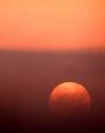
Foggy Sunriseby vtruanComment: This is really cool. I love the simplicity and the color. The opposing light and dark.. having part of the sun brightly showing and the other partially eclipsed in the fog.. it all makes for a very strong image IMO. The play between positive and negative is really interesting.. sort of a ying/yang thing. I think it would be nice if you had some strong silhouettes in the foreground, but then you'd have to change the composition around or just add another image to this one in PS now.
My biggest complaint is all the noise. Is there something to do with it in post processing? I've never tried any of the programs that supposedly clean up stuff like that. Also, the change from light to dark isn't gradual enough although I have no idea what you could've done about that.
Still, it's a decent score. |
| Photographer found comment helpful. |
| 04/29/2003 06:39:42 PM |
|
| Photographer found comment helpful. |
| 04/25/2003 10:42:01 PM |
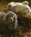
Proud Mamaby cpanaiotiComment: looks like a great picture, but it's too small to really tell :( nice lighting/exposure |
| Photographer found comment helpful. |
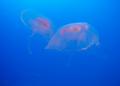
| 04/25/2003 04:00:00 PM |
Floatersby friscaComment: These guys are a lot of fun. Unfortunately, the lighting here wasn't the best and your focus is soft. I think you could've made them a little more visible with some level adjustments. |
| Photographer found comment helpful. |
| 04/16/2003 12:53:04 AM |
Color Under Iceby KimInNBComment: I have to think that this would've scored higher in the weather challenge. There is some color in the shot, but it isn't a very strong element. The photo is a bit drab - which reflects the weather nicely but doesn't help with the colors. I actually like the dof, but the branch still blends in with the bg a bit too much. Maybe you could have used a slightly different angle and avoided the dark, thick branches and telephone pole as they are the most distracting. The black blob in the upper left corner is also a bit bothersome. You might have also tried some fill flash or having someone shine some light on it to help it stand out even more.
Decent shot.. not the best challenge for it though. Blur a bright colored posterboard behind it and it'd fit the challenge and stand out better. |
| Photographer found comment helpful. |
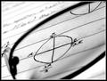
| 04/16/2003 12:37:03 AM |
What's Pi doing in Radian?by AaronComment: Interesting. I like this shot for its technical/graphic aspects more than the artistic/aesthetic. The black and white is nice. So is the composition, lighting, and contrast. I would also prefer the focus to be a little more even - without the shadowy area on the bottom half of the lens. Nice diagonal.
This was a tough topic, and I think that the voters really appreciated creativity just because they had such a hard time coming up with any ideas themselves. Technically, this is good and probably should've scored a bit higher. I think that the idea is as important as the ability. Your ability is good which puts you in about the same spot as a lot of us... just waiting on creativity to strike :) |
| Photographer found comment helpful. |
Home -
Challenges -
Community -
League -
Photos -
Cameras -
Lenses -
Learn -
Help -
Terms of Use -
Privacy -
Top ^
DPChallenge, and website content and design, Copyright © 2001-2025 Challenging Technologies, LLC.
All digital photo copyrights belong to the photographers and may not be used without permission.
Current Server Time: 04/11/2025 07:06:03 AM EDT.