| Image |
Comment |
| 04/16/2003 12:22:58 AM |
Salomon Skisby DCThiessenComment: Hey!
Well, that's some color! Challenge met.
As far as composition goes... I would have no idea what this photo is of without the title. Therefore, it isn't really a good product shot.. it's more of an abstract macro. I do like the diagonals and the layering going on.
Somehow it just seems too bright. Maybe it was overexposed or just really reflective. The focus also seems a little soft (or else it's just the glare making it seem that way).
I find this photo a little hard to look at because the colors are just so "in your face".
I have to agree with the previous comment about it being a decent challenge shot but not necessarily a good photo outside of the challenge. I don't think that it would score very high on photosig or another site that just ranks photos on their merit without a topic.
It's not bad.. I don't have a lot of suggestions... it just doesn't stand out enough to be memorable in 300 shots. |
 Photographer found comment helpful. Photographer found comment helpful. |
| 04/13/2003 05:48:29 PM |
Red leafby xertionComment: Hey!This is a pretty decent score - especially considering how well your other picture did last week.
I really like leaf pictures. It's spring here so most of ours are green now. I like the color and texture in yours. Detail and clarity are really nice.
I guess I agree with the others about the backlight. The only way I can think of to avoid it easily would be to use a lightbox, but I think that the black background looks much better than white would. The geometric circle juxtaposes with the organic outline of the leaf rather nicely. So... I'm not really sure how you could've shot it better. I wish some of those commenters would've made suggestions on how to avoid showing the light source while still keeping a black bakground.
You also did a nice job with the exposure. The area where the veins come together in the leaf looks a bit fuzzy, but focus overall is good.
Overall, it doesn't really have any major problems IMO. It just isn't a standout macro. (congrats on the ribbon btw) |
| Photographer found comment helpful. |
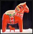
| 04/07/2003 03:02:46 AM |
Dala Horseby MonaComment: Hej! Cool. I have a red and a blue. Putting the sizes together like this really helps the composition. The lighting could be a little softer - did you diffuse it with something? The focus also seems a tad soft, and I think you could've just left the third one out of the shot since it doesn't really show and isn't colorful anyway. |
| Photographer found comment helpful. |
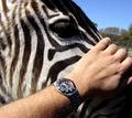
| 04/06/2003 11:33:05 PM |
Zebra Timeby AnachroniteComment: HEY!
First off... this photo doesn't really make me think time. The watch does help, but it's really a zebra shot that would be better if you hadn't put your arm in the way. Lots of dpc voters are really strict on meeting the challenge so I'd say that hurt you some.
Secondly, what really strikes me here is the bright lighting. It's just not good shooting conditions unless you could get that animal in the shade. Otherwise, I guess you just need less exposure to prevent those white-out areas, but then you'll have even more of those dark shadows like you have on the forehead. Focus and color are good.
Composition isn't the best. The eye and watch are lined up and right in the middle of the frame. The diagonal of the animal's head and the arm help some, but the horizon in the background looks really slanted.
I've had those weeks when I'm off taking other shots and just enter a challenge picture to participate. I love zebras, and I'd say you probably got some good shots without the watch which is more important anyway ;P |
| Photographer found comment helpful. |
| 04/03/2003 01:10:49 AM |
6:36by WILDBLUEComment: HELLO!
Hmm.. I like this picture, but I think that it could be better. It's a strong image that received a pretty good score and some nice comments so I'll try to offer some constructive criticism.
I'm usually complaining that there wasn't enough PS work done and the shot is too grey or bland, but I think it was overdone here. The color is just a little too much "in your face" IMO. I see that lots of people like this, but maybe just a tad less wouldn't be so glaringly obvious.
That hot area by the 7 bothers me. I'm sure that it's a reflective surface and difficult to light evenly, but you could've probably used something to diffuse the light reflecting there.
I think there's a tad too much contrast here. That probably adds to the glare problem, and the dark areas have lost some detail. I'm not sure if it's lighting or contrast, but the hour hand is rather hard to see. It blends in with the bg and shadow too much.
My biggest nitpick would be that the 6 is resting on the bottom of the frame.
It's still a stronger shot than most. You did a nice job. |
| Photographer found comment helpful. |
| 04/01/2003 01:48:16 AM |
Symmetry lifeby zerocusaComment: OOOOOooooooooooooh. BUBBLE WRAP! Can I pop it? ;P Cool idea. Symmetry might be stronger if you had cropped down to the bldg cluster on the right though. |
| Photographer found comment helpful. |
| 03/29/2003 11:32:02 AM |
Timelessby DougPazComment: This looks like a hotel in Nashville. hmmm. I like the blue sky and composition, but the sun seems a little too harsh. |
| Photographer found comment helpful. |
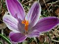
| 03/28/2003 09:19:13 PM |
I'm Looking Over a Six Leafed Croquis.by vtruanComment: Hey!
Hmm. I thought you might be suffering with a low end camera until I checked out your other shots which seem to be pretty good. I'm not sure why the quality on this one seems lacking. The focus is really soft, but it looks like you tried to sharpen it and made it worse. The lighting was pretty harsh which only exacerbates the problem.
It's a very pretty subject. I like the colors of the flower. The ground around it is rather ugly - you might try desaturating the color channels for the background and making it black and white to really downplay the bg more.
I'm not really fond of the cropping. The bottom and right side are just barely cropped and the top is severely chopped off. I would try a really close up that crops most of the petals and really focuses on the center of the flower or else try to get it all in. If you could rotate or have taken it more from the right then those 3 purple petals would make a really nice triangle.
Flower shots tend to do better in a more controlled environment (studio). You need softer, even lighting and a non distracting background. However, I think the quality issue is what really pulled the score down on this one. |
| Photographer found comment helpful. |
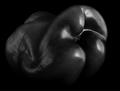
| 03/28/2003 06:55:50 PM |
Pepperby DennisFComment: ...and then you did what? Did you use channels to convert to b&w? I think that another channel might have worked better. I actually do find this a bit too dark. I'd like to see all of the edges, but some are disappearing into the darkness. I'd also like the whole pepper to stand out just a little more. Perhaps you could try some montones or duotones to get different looks. I also think it is cropped way too tightly - feels almost squished inside the frame with no room to move.
I haven't seen Weston's work, but neither have most of the other voters and photographers viewing this.
I like the photo's simplicity. I also like the angle/perspective. I do think that you can do a successful shot that focuses on the lines and texture of the pepper - using only a black background. I just think that the pepper needs to be more visible and the lighting should be more dramatic (especially since everyone has different monitor settings). |
| Photographer found comment helpful. |
| 03/24/2003 10:30:04 PM |
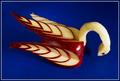
Kitchen Artistryby DougPazComment: HEY!
That's a nifty little party trick - really fits the challenge well!
I think that the score reflects an appreciation for the subject as much as anything else.
The colors work well together. I like that the apple is turned slightly, but I'm wondering what other angles you tried - maybe something from a little lower instead of above. Lighting is good. It's a bit bright on the fleshy neck and that one glaring hot spot on the right side - did you diffuse the lighting? Lighting is really difficult, and you did a good job of avoiding harsh shadows. Somehow, it even seems a bit dark still... I think that more lighting and a different angle would help it seem more 3D. I also don't really understand the anatomy. It seems like the neck should be between the wings... but then there's a 3rd wing? Maybe a different angle would help with that too - so that it would make more sense. Something is just a bit weird with this bird.
Did you use lemon juice? If not, you must've shot fast because I can barely see any discoloration.
I don't think you really needed the frame, but it looks ok. I don't particularly like colored frames, but this one is matches well enough not to detract from the image.
Excellent score! Congrats. I'm gonna go eat an apple now ;P |
| Photographer found comment helpful. |
Home -
Challenges -
Community -
League -
Photos -
Cameras -
Lenses -
Learn -
Help -
Terms of Use -
Privacy -
Top ^
DPChallenge, and website content and design, Copyright © 2001-2025 Challenging Technologies, LLC.
All digital photo copyrights belong to the photographers and may not be used without permission.
Current Server Time: 04/11/2025 07:25:58 AM EDT.