| Image |
Comment |
| 02/10/2003 03:22:42 AM |
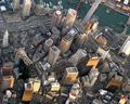
1 Mile from Bostonby av8orboyComment: COOOOL. The area where I used to live is just off to the right of this picture I think. :( I miss Boston. Cool shot. Low enough to still make out everything. |
 Photographer found comment helpful. Photographer found comment helpful. |
| 02/10/2003 03:18:28 AM |
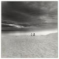
Specks and the Universeby greenem2Comment: I just can't take any more Waldo pics so I'm coming over to the members challenge to treat myself. This is gorgeous. I think it'd look really pretty if you hand colored it and printed on watercolor paper. Gorgeous. |
| Photographer found comment helpful. |
| 02/10/2003 12:40:02 AM |
return of the ghostby billyComment: I see the hidden person, but you do know that you're supposed to have a hidden person in a shot with no people. right? I only subtract one, but I bet it affects your score. Too bad cause it's kinda cool. |
| Photographer found comment helpful. |
| 02/09/2003 06:42:04 PM |
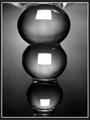
Distorted Squaresby MaYzComment: I really like this picture. Is it glass? It's such a unique way of looking at it AND a great picture. Great lighting and tones. The b&w is great. Even the frame is good. It's very artsy and would look good framed in someone's loft. I'm actually impressed that it did so well with this crowd considering that so many of them are just average folks who like pictures of sunsets and kittens more than anything abstract. I'm sorry that I don't really have more to suggest. I'd actually like to see the white squares a little less bright so that they don't jump out so much. I also don't really think that THE subject is square, but there are squares in the shot. I'm really impressed with this picture and glad that it got a decent score. |
| Photographer found comment helpful. |
| 02/09/2003 02:10:56 AM |
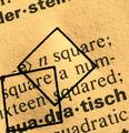
-e> n square;by kiwinessComment: Well, that's interesting! First thought is that I'd crop off the words at the top and make it more of a square crop. The lighting seems a bit strong if you're going for an old feel. It's almost too bright instead of looking faded. I like the texture of the paper. Adding the squares is SO much better than just taking a shot of the words, but it's still a bit bland to me. The juxtaposition of the geometry and english is kinda cool, but there's not a lot more going for it. Good execution. On topic.
and some thoughts from annida:
Very cool idea. I like it a lot. One of the things you could have done was to make the picture actually square, just to add to the squareness of it. It's a lovely abstract, and the lighting on it is very appropriate in my opinion. I think a border wouldn't have gone amiss, to frame the squareness as well. Did you try it with just one of the little squares? I like the one in the middle a lot more than the one on the side. Good work, lovely abstract! |
| Photographer found comment helpful. |
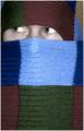
| 02/08/2003 03:50:07 PM |
Pikaboo!by ParentxComment: This is cute, but I thought you spelled it peeeeeeeeeeeeek-a-boo :o)
I like the colors and the idea. I think this is one shot where you could center the face horizontally - it doesn't look right so close to the left side of the frame. I have to agree about the skin color. You need some color adjustment to make it warmer and more alive. Lighting is good. Focus is good. I'd prefer having half of the bottom row of squares cropped, but that's just me. I don't really think the little border helps any so I'd remove it. Overall, this fits the challenge, is creative, doesn't need a lot of technical help. I don't think it should be sub 5 by any means, but I guess that's a reflection of the voters' taste more than anything. I bet that if you had used a girl with some mascara on or a little kid then it might've helped some with the score. If you want people to focus on the eyes then they better be really outstanding (no offense) :) Good Luck in the next challenge. |
| Photographer found comment helpful. |
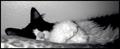
| 02/07/2003 01:22:44 AM |
Caught Nappingby AnnidaComment: This needs quite a bit of technical help. The crop and composition are pretty good. The wall behind the kitty is too shiny. Perhaps you could tack up a little fabric or something less reflective. The lighting overall is too dark, but there are (what appears to be) flash burns on the paws and bottom left corner. If you had even, diffused lighting then the soft focus wouldn't be that big a problem to me. I just can't see the kitty's eyes. |
| Photographer found comment helpful. |
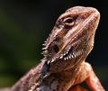
| 02/07/2003 12:55:30 AM |
My Exotic Petby CreativeFlyPhotoComment: Really good focus and dof use. Nice lighting too. Good composition. Not something I'd hang on my wall personally (maybe in b&w) but technically very good. |
| Photographer found comment helpful. |
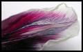
| 02/07/2003 12:53:20 AM |
Petal Graceby shedonistComment: This would be really cool blown up as a huge abstract shot. The soft focus makes me really notice the color and shape. I like it. 7 |
| Photographer found comment helpful. |
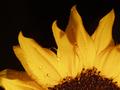
| 02/07/2003 12:48:58 AM |
Sun Rise Cliche'by justineComment: so so cliche :) TONS of water on flower shots. I love the yellow on black. What is it focus is really great, but I'd like a bit more dof. High quality shot.7 |
| Photographer found comment helpful. |
Home -
Challenges -
Community -
League -
Photos -
Cameras -
Lenses -
Learn -
Help -
Terms of Use -
Privacy -
Top ^
DPChallenge, and website content and design, Copyright © 2001-2025 Challenging Technologies, LLC.
All digital photo copyrights belong to the photographers and may not be used without permission.
Current Server Time: 04/18/2025 01:08:18 PM EDT.