| Image |
Comment |
| 10/14/2002 02:49:00 AM |
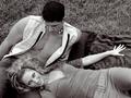
Seductionby AleciaComment: This shot really stands out in the challenge. It's a clear shot of beautiful people. What's not to love? I like the way you posed them, and I like that she's looking at the cam. B&W works for this. Nice lighting. *sigh* If she gets tired I'd be happy to take her place :o) ~indi |
 Photographer found comment helpful. Photographer found comment helpful. |
| 10/08/2002 02:11:00 PM |
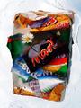
Garbage: It Doesn't Just Look Bad...by JeBComment: Tough lighting situation. I like the composition. It isn't a very attractive shot, but it fits the challenge and is good technically. I also like the title :o) ~indi |
| Photographer found comment helpful. |
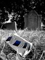
| 10/09/2002 11:50:00 PM |
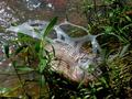
R2-D2by lionelmComment: I really like the colors in the bg. I wish it wasn't so bright back there so they would be stronger (less faded looking). This is a cute idea and title. It's sort of a boring challenge all around, but at least this pic is rather pleasing to look at instead of being gross. The can seems a little too close to the bottom and right edge of the frame. Good saturation in the grass, bad glare on the can lid. Overall, better than most in the challenge. ~indi |
| Photographer found comment helpful. |
| 10/07/2002 09:20:00 PM |
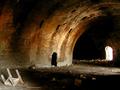
Two Holesby 'PongComment: One of my favorites in the challenge. This is an awesome place. The lighting is interesting, but I would try it a little later in the day (with a tripod and slow shutter speed) so the one hole on the right isn't so bright. Altho, this doesn't look like the sort of place I would want to be too late in the evening ;o) Also, I think the chair (?) on the left is unnecessary. There is enough other garbage, and it distracts a little from the interesting lighting and lines of the shot. 8 ~indigo997 |
| Photographer found comment helpful. |
| 10/07/2002 09:05:00 PM |
Regenerationby KonadorComment: These colors are awesome. Technically, this is a great shot. The lighting and focus are excellent. I especially love the area around the subject. Was it on glass or something? The water really makes the picture more interesting. Even capturing a little more of the blue (like in the upper right corner) would be cool. The flower is the final touch that makes this a 10 and adds that extra wow. Great job! ~indi |
| Photographer found comment helpful. |
| 10/07/2002 09:12:00 PM |
Clearing The Tableby ndsComment: HAHA. I'm surprised you had to get an admin note. I think a lot of ppl are missing the fact that this isn't just an ad shot because it is so good. It's really an awesome shot. I just wish it had a stronger connection to garbage so I could give it a higher score. Awesome. 8 ~indigo997 |
| Photographer found comment helpful. |
| 10/07/2002 09:00:00 PM |
Pizza Hutby sanandanComment: I love this shot. It is by far my favorite of the challenge. Your DOF is awesome. I'm amazed that you caught the girl in such great focus. Her dress makes your eyes go straight to her, but the color in the boxes on the right helps move your eye across the pic. My only suggestion would have been to move whatever is in the extreme foreground and created those very blurry blobs along the bottom of the shot. 10 ~indigo997 |
| Photographer found comment helpful. |
| 10/07/2002 09:14:00 PM |
Tobacco Seriously Damages Healthby SimmsComment: Man, I love when someone uses photographic technique to stump the masses around here ;o) Nice work! It is a strong image that accomplishes what so many others tried in this challenge. Nice DOF and focus. 8 ~indigo997 |
| Photographer found comment helpful. |
| 10/01/2002 09:14:00 PM |
Brothers Rememberedby KarenBComment: I've been a little overwhelmed with patriotism lately, but this is very nice. It's a great reflection that definitely adds to the image. I like the colors in the reflection. The one problem is the frame on the right side. I think it would look better if you could have figured out a way to get rid of that and just shown the glass, but with the sizing restrictions I'm sure it's difficult. Good work. 8 ~indigo997 |
| Photographer found comment helpful. |
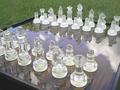
| 10/02/2002 12:10:00 AM |
Reflections on Chessby HBunchComment: Nice set! I think this is a good idea, but you might have executed it more effectively. The grass in the bg and the sky & tree reflections distract from the subject. You could try a solid bg indoors with some dramatic lighting to create the reflections. Wait..someone else did that! But I think the problem with their photo is that they didnt show the whole board. Combine the two and you've got it made. :o) The repetition of the pieces is really nice. You might also try just focusing on one side of the board with the line of pieces since the reflections on the front side are cut off anyway. Just some ideas. I do like the perspective. ~indi |
| Photographer found comment helpful. |
Home -
Challenges -
Community -
League -
Photos -
Cameras -
Lenses -
Learn -
Help -
Terms of Use -
Privacy -
Top ^
DPChallenge, and website content and design, Copyright © 2001-2025 Challenging Technologies, LLC.
All digital photo copyrights belong to the photographers and may not be used without permission.
Current Server Time: 04/22/2025 10:12:04 PM EDT.