| Image |
Comment |
| 06/03/2007 09:52:44 AM |
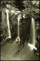
falls2by rider808Comment: This is a good water shot. In that respect, it is better than the previous one. I like the other one better because of all the surrounding life around the waterfall. |
 Photographer found comment helpful. Photographer found comment helpful. |
| 06/02/2007 09:22:53 PM |
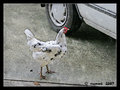
2. Waiting for a rideby suemackComment: So, why did the chicken cross the road? To catch a ride to town! Love the story.
I like the texture. It's not so heavy that it disturbs the basic elements of the picture. |
| Photographer found comment helpful. |
| 06/02/2007 09:17:37 PM |
Day 1 ~ Journalby WriteHeartComment: It looks like it's on a light box. It has that kind of luminance. I'd say you either used a blend mode difference or exclusion. Try it on a fresh picture and see what you come up with. |
| Photographer found comment helpful. |
| 06/02/2007 09:08:16 PM |
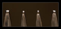
Forkby trevytrevComment: From the thumbnail, I thought this was a set of lights. good job on the focus. |
| Photographer found comment helpful. |
| 06/02/2007 09:01:29 PM |
|
| Photographer found comment helpful. |
| 06/02/2007 08:35:39 PM |
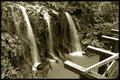
fallsby rider808Comment: It's a shame those pieces of timber are in the frame. What an exciting place to be, but to me, the wood just spoils the whole picture. Maybe it's my monitor, but the toning looks a bit greenish, and while I can understand the choice, I don't like it. That is just a personal preference, though. I keep thinking how it would look if you had stood on one of the boards. |
| Photographer found comment helpful. |
| 06/02/2007 08:16:00 PM |
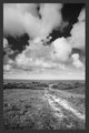
offroadby rider808Comment: same as Matt. I don't really find this interesting. It would be more interesting with a human in the frame. The gray border looks off color compared with the picture. |
| Photographer found comment helpful. |
| 06/02/2007 08:10:58 PM |
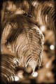
dripping fernby rider808Comment: And to offer an opposing viewpoint, I really like everything about this. The bright bokeh spots only add tension to the composition. They suggest heat and that is reinforced by the drooping posture of the ferns. It's almost like they're sweating from the heat. I like the color, again backing up the idea of heat.
Well, there is one thing I see that could be improved. There is a gray area over on the left center of the frame. I'd drop the art frame. It's strong enough to stand without an added frame. |
| Photographer found comment helpful. |
| 06/02/2007 08:02:59 PM |
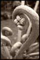
swan fernby rider808Comment: It looks like a weird swan. I like the toning and the details of the head and the dof. Just a couple of things might improve it, imo. The blown out area on the top and the crop. I would have tried to get the full curve of the stem in the frame. I like the curls on the bottom so maybe step back just a tad to be able to get both the bottom and stem more fully into the frame. The blown out area only forces the eyes to see the two light straight things in the background which don't really go with the nice curves in the rest of the frame. |
| Photographer found comment helpful. |
| 06/02/2007 04:37:38 PM |
|
| Photographer found comment helpful. |
Home -
Challenges -
Community -
League -
Photos -
Cameras -
Lenses -
Learn -
Help -
Terms of Use -
Privacy -
Top ^
DPChallenge, and website content and design, Copyright © 2001-2025 Challenging Technologies, LLC.
All digital photo copyrights belong to the photographers and may not be used without permission.
Current Server Time: 04/12/2025 08:52:53 PM EDT.