| Image |
Comment |
| 03/29/2013 07:24:13 AM |
|
 Photographer found comment helpful. Photographer found comment helpful. |
| 03/29/2013 07:21:35 AM |
|
| Photographer found comment helpful. |
| 03/27/2013 07:19:20 AM |
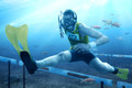
One Too Many by h2Comment: not your best work. the whites are just too blown out for me. the colors and composition are great, but that blown out white i just don't like here. |
| Photographer found comment helpful. |
| 03/24/2013 10:19:16 PM |
|
| Photographer found comment helpful. |
| 03/22/2013 08:01:31 AM |
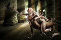
Falling Apart by gyabanComment: while i don't think this effort was one of your better entries (as far as the challenge topic goes) its amazes me the level of effort and time you put into your works.
amazing job. |
| Photographer found comment helpful. |
| 03/20/2013 02:07:10 PM |
Feminam Humanaby MAKComment: i call shenanigans. you cant win the first blue and run TPL
;-P
congrats, btw. |
| Photographer found comment helpful. |
| 03/20/2013 11:09:24 AM |
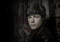
Jacksonby markwileyComment: you did nothing wrong.
i scored it a 7, i thought it was well lit, nice pose, catch-lights in the eyes, interesting but not overpowering background.
unfortunately, its boring. portraits are very hard to garner mass appeal. you do this with a very interesting subject, a very, very photogenic one or compelling light or pose.
you nailed this portrait of this person and i'd be very pleased if i were a paying customer, its just lacks the mass appeal to get high scores. |
| Photographer found comment helpful. |
| 03/20/2013 11:04:13 AM |
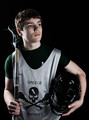
Bring it Onby MarkBComment: the light is too hot, contrast is too strong, its hard to pull out the details of the mask and lacrosse stick. the shirt blends in to the black and as a result the head is floating.
also, eye contact. im not a big fan of staring out into space, sometimes its works but not here.
it also would have benefited greatly from a hair light or small fill on the camera right behind the subject to give him "some" separation from the background. |
| Photographer found comment helpful. |
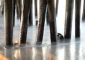
| 03/15/2013 07:24:35 AM |
Under the Boardwalkby docjonnyComment: critique club.
lost to like, the hint of sunlight, the smooth water, the shininess of the wet piles.
its still about to busy as the background piling are distracting and its like to see a bit more texture in the dry area of the piles. |
| Photographer found comment helpful. |
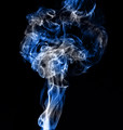
| 03/15/2013 07:22:00 AM |
Smoke of Pandoraby shahulComment: critique club.
i good attempt at the typical smoke shot.
however what makes those other types of images great and this one is that the smoke is way to turbulent, smoke images that do well have very clean laminar flow that slowly transitions to turbulent. yours starts at the end of that transition phase and goes right into full blown turbulence.
there is also not enough negative space, is the composition is dead center leaving an unpleasing composition.
the smoke in my opinion is best used as a back drop to show color and the color is great, the pattern was a interesting attempt, unfortunately the smoke being too turbulent draws you away from that. |
| Photographer found comment helpful. |
Home -
Challenges -
Community -
League -
Photos -
Cameras -
Lenses -
Learn -
Help -
Terms of Use -
Privacy -
Top ^
DPChallenge, and website content and design, Copyright © 2001-2025 Challenging Technologies, LLC.
All digital photo copyrights belong to the photographers and may not be used without permission.
Current Server Time: 04/22/2025 11:57:22 AM EDT.