|
|
|
Showing 211 - 220 of ~1591 |
| Image |
Comment |
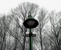
| 03/09/2006 11:32:12 AM | man and natureby tomzinhoComment: Greetings from the Critique Club!
Hello! This photo is interesting in several aspects to me but also bothers me in others. Let's see if I can explain myself in words here, LOL :)
I like the idea, man and nature, an odd coupling to be sure in this respect. So it certainly fits the challenge as they say. I like the stark trees in the background, it adds to the idea of how man might effect nature in ways.
But what bothers me about the shot is the composition. Yes, the lamp is centered and straight but the trees aren't and while it may add to the odd element, it, personally bothers me in that the shot looks crooked but not looks crooked. I guess this can be a good thing in that it made me look at it longer during the challenge to try to figure out what about it that bothered me. It was mentioned in one of the earlier comments that the lamp has the potential with the curves and such to really make this shot work and I'm thinking the same thing. Use the rule of thirds, take the lamp to either side and change your point of view in that you come more from one side or the other, using the curves to help with the continuation of the leaning tree branches, leaving a more subtle line for the viewer to follow rather than the rigid straight line of the pole.
Also if you could get the pole to stand out just a bit more, the color, really show the contrast and oddity of man to nature, colorful to dull type contrast.
If you go back and reshoot this I would love to see the results.
Hope my comments help and good luck in future challenges.
Deannda |  Photographer found comment helpful. Photographer found comment helpful. |
| 03/08/2006 08:05:33 PM | My precious Odd-eyedby MajankaComment: Greetings from the Critique Club!
Hi! Okay, first let me get this out of the way.
Awwwwwwwwwwwwww!! He's so cute!
Okay, now to the critique. From the comments you wrote you already knew this probably wouldn't do well because of the subject. I think it might have done rather well if you had come in from a diffrent angle than you did. The DOF is well done and the paws leading you into the shot is nice but you are trying to isolate the eyes, so the oddness of the colors to each other. The tilt of the head is wonderful and the lighting is also okay, but the eyes get lost in the overall picture and there isn't enough here to make most people stop and really try to find the oddity of the one eye.
If you could get him to look at the camera, head on and really focus on the eyes I know this would have done much better. I love the shot you have of him in your portfolio, made it a favorite. :)
Hope my comments help and good luck in future challenges!
Deannda | | Photographer found comment helpful. |
| 03/08/2006 07:58:25 PM | The odd combination of old and newby abuckComment: Greetings from the Critique Club!
Hello! I see this is your third entry to the challenges! Welcome!
This is a perfect example of the Odd Couple, your idea was perfect. So why didn't you win a ribbon? Well, as most of the comments said, the lighting is a bit off. I thought the same thing when I first saw this. If there was a way you could have put a white backdrop over the record player and really bumped up the lights on this and sharpened the focus just a touch this could have blown the others out of the water. If you ever try to redo this shot I would love to see the results.
Hope my comments help and good luck in future challenges!
Deannda | | Photographer found comment helpful. |
| 03/08/2006 07:48:26 PM | ... And the dish ran away with the spoon by shankswareComment: Greetings from the Critique Club!
Hello! Now honestly, what am I supposed to add to a red ribbon? LOL! :)
I loved the idea, the concept and the colors, the execution of the idea. All very well done. The only thing that bothered me about this shot personally was the angle of the table, it does work for this shot but it was a bit too steep for my personal taste but then again, the voters have spoken and my taste didn't count, LOL :)
Congrats!
Deannda | | Photographer found comment helpful. |
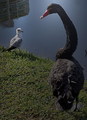
| 03/08/2006 07:44:33 PM | Inter-Aviary Relationshipby LVEComment: Greetings from the Critique Club!
Hello! This is a great shot in the idea and it certainly meets the challenge, you don't get a much odder coupling that this! LOL!
As you already saw in the challenge comments, it looks underexposed, reading your notes you were going for that look of an evening or early morning shot. On my screen it didnt' quite come off that way and it just looks like if you had added a touch more contrast it might have worked. But also there appears to be a halo around the larger bird's head and it's so bright compared to the rest of the shot it tends to be a bit distracting in the end. I think this shot would have done much better if it was a bit brighter, adding a sense of sharpness and clarity to it. Right not it tends to look a bit muddy.
And the building in the reflection of the water, another distraction to me personally. If you could have changed your angle so the building was not being reflected perhaps? The overall composition is well done if you could just change the direction of the shot so you have a clear background or clone the building out. I don't think that would have counted as a major element myself but then I'm not on Site Council either, LOL :)
Again, great shot, love your animal shots in your profile! Hope my comments help and good luck in future challenges!
Deannda | | Photographer found comment helpful. |
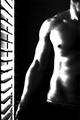
| 03/02/2006 09:45:11 PM | Windowpainby jaykaydComment: Greeetings from the Critique Club!
First, Welcome to DPChallenge! I see this is your first entry and what an entry! I love this shot and I love the composition. Very nice lines leading me in, taking me up the arm and through the body. And a nice body, ;-) ;)
So what went wrong? Well, as said in earlier comments, the high contrast is a bit much for this to me and I like high contrast shots most of the time. But there are too many hot spots where all detail gets washed out. If there was a way to leave the contrast and high lights on the blinds but soften the body somehow I think this shot would just WOW everyone. Being a basic challenge that is very difficult but now outside the challenge maybe, if you want to work it a bit more and see what you could do I would love to see the results.
Hope my comments help and good luck in future challenges!
Deannda | | Photographer found comment helpful. |
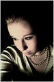
| 03/02/2006 11:33:54 AM | 50's Pearls in The Darkby KrisbyComment: Hi! This is an amazing shot and I'm really surprised it didn't do better. I love the lighting, the colors, the whole set up is very well done. I'm guessing what hurt you in the end is coloration. I think it works well for this period that you are representing but I'm betting others found it a bit off because it's not "in you face" colors, more muted. Also, a slightly tighter crop on the left side might bring a better balance to the shot, leaving the negative space on the right and top. Otherwise, I wouldn't change a thing! :)
Oh, one more thing, don't know about red lipstick, but a slightly brighter or maybe a little darker color might have helped just a bit.
Good luck in future Challenges!
Deannda | | Photographer found comment helpful. |
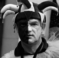
| 03/02/2006 11:25:18 AM | court foollby phoenix46Comment: Greetings from the Critique Club!
What an image! It freaks me out at first because I'm not a big fan of Jesters to start with, LOL but getting past that the expression on the person's face is very candid and telling. I think that despite what most people think, jesters weren't just clowns of old, but the trick for them was to humiliate and point out the faults of others, including royalty, they were the only ones who could get away with it. So his look, the lack of a smile really works well for this for me personally.
The tones are okay, nothing really stands out and jumps off the screen at me and says, "HEY! LOOK AT ME!" much like my 3 year old son does, LOL :) Perhaps just a touch more contrast to really make this shot pop would have brought yours core up. The cropping is okay but could be tighter to me. Using my magic envelopes I brought in the crop on the bottom, cutting out most of the shirt and just a touch, a very small touch on the sides so the very edges of the hat is touching the sides, creating lines to bring me in and out of the shot.
Again, great concept, good shot. Hope my comments help!
Deannda
| | Photographer found comment helpful. |
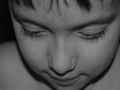
| 03/02/2006 10:30:32 AM | He's So Shyby jaylenComment: Greetings from the Critique Club!
And welcome to DPChallenge! I see this is your first challenge entry and not a bad entry at that. I like the idea and the way the shot is set up is pretty good. The DOF is also good on this, the eyes and nose are in focus while the rest is just slightly out of focus.
So why did it only receive a 4.3? Well, my best guess would be lack of a "WOW" factor in the shot. This is a great idea but to really bring across the idea of shy it might have been better if you could have gotten him to look up at you through his eyelashes. Seeing their eyes is so important to me with kids shots, they will tell you so many stories with just one look. Also the overall tones are very bland, a bit boring, no real distinctions from one shade to another. Not really giving me a sense of duotone but more a monochrome type shot, just different shades of one color.
Also, leaving the camera on Auto is great but you can still get the information if you right click the shot, select properties and then look at the information. I'm guessing a opening the aperture more to let in just a touch more light and also reducing the ISO if it's set hight to take out some grain in the shot.
But again, great idea, beautiful child.
If you redo this shot I would love to see the results! Hope my comments help and GOOD LUCK in future challenges!
Deannda | | Photographer found comment helpful. |
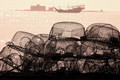
| 03/02/2006 10:08:59 AM | sailing early morningby lolor275Comment: Greetings from the Critique Club!
What a stunning image to look at! I love the lines, the way you are lead in, brought up to the boat in the background and lead back out the other side. The tones are also very warm and inviting. So the questions remains, "Why only a 5.6?"
A couple of tiny things would be my best guess. First, as mentioned before, the horizion is slightly off kilter, just a touch. Makes you think everything is going to slide out the right side of the picture and the taller traps on that side lend to that feeling. If you possibly slightly rotate it back to the left, bringing the horizon back to a level line that might make a difference. And last, the choice of colors for the duotone. It comes off almost as pink on my monitor and it is calibrated. Warmer sepia tones might have really made this shot stand out. If you redo this shot I would LOVE to see the results! Hope my comments help!
Deannda | | Photographer found comment helpful. |
|
Showing 211 - 220 of ~1591 |
Home -
Challenges -
Community -
League -
Photos -
Cameras -
Lenses -
Learn -
Help -
Terms of Use -
Privacy -
Top ^
DPChallenge, and website content and design, Copyright © 2001-2025 Challenging Technologies, LLC.
All digital photo copyrights belong to the photographers and may not be used without permission.
Current Server Time: 04/21/2025 06:32:02 AM EDT.
|