| Image |
Comment |
| 10/06/2004 08:36:05 AM |
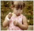
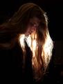
Captivatedby sherComment: Cute girl...but that sepia action has got to go....I think that took away from the image tremendously.
|
 Photographer found comment helpful. Photographer found comment helpful. |
| 09/12/2004 10:41:29 AM |
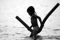
Check Markby connieComment: While I adore this image, and the moment you captured, the subjects face is just too dark....it seems to be almost a silouette. The only thing that makes it NOT a complete silouette is the detail in the underpants. I love the detail in the water, but I wish there was just a bit more exposed face in this image. |
| Photographer found comment helpful. |
| 09/12/2004 10:36:59 AM |
Joyby FyzarlComment: This is the best image that I have seen. Not only did you freeze action, but you captured some great backlighting, and the subjects have great exposure. 10 |
| Photographer found comment helpful. |
| 09/12/2004 10:34:38 AM |
private momentsby pcodyComment: Love the lines that you captured with such an everyday, simple, subject. |
| Photographer found comment helpful. |
| 09/11/2004 10:26:46 AM |
|
| Photographer found comment helpful. |
| 09/11/2004 10:26:11 AM |
Summer Greenby techtraumComment: This is defintiely a image that meets the challenge. I don't the image itself is strong. I would have liked to see more of the road (or what's at the bottom?) then the top of the trees.
The way the image is shown now, makes it very uninteresting. |
| Photographer found comment helpful. |
| 09/11/2004 10:24:44 AM |
Race Dayby CantiqueComment: Gosh, this image is beautiful. However, I don't think it meets the challenge. The lighting is obviously coming from the side. So this is directional lighting, and not true backlighting. If the sun were directly behind the boats, and you still managed to keep the boats (the subjects) properly exposed, this would be a winner...according to the rules of the challenge.
This image does need to be framed huge. |
| Photographer found comment helpful. |
| 09/11/2004 10:22:41 AM |
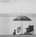
Shade for twoby CamComment: I think this image would be stronger if your midtones were a bit more "ummph" to them. Right now the image looks really flat. You need more contrast. |
| Photographer found comment helpful. |
| 09/11/2004 10:20:53 AM |
|
| Photographer found comment helpful. |
| 09/11/2004 10:19:57 AM |
Brother Rockby taterbugComment: This definitely meets the challenge, but the lighting is too harsh. Especially since it is just shining in |
| Photographer found comment helpful. |
Home -
Challenges -
Community -
League -
Photos -
Cameras -
Lenses -
Learn -
Help -
Terms of Use -
Privacy -
Top ^
DPChallenge, and website content and design, Copyright © 2001-2025 Challenging Technologies, LLC.
All digital photo copyrights belong to the photographers and may not be used without permission.
Current Server Time: 03/12/2025 02:00:03 AM EDT.