| Image |
Comment |
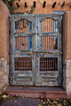
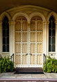
| 11/22/2011 06:00:31 PM |
Santa Feby franktheyankComment: Love this gate. I think the photo could be dark in places, more contrast. I also think the photo would benefit from cropping everything below the step. Still I like it. |
 Photographer found comment helpful. Photographer found comment helpful. |
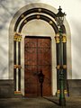
| 11/22/2011 05:48:59 PM |
Knockin’ on Heaven’s Doorby Kevin_FlynnComment: With the lamp right in front of the door its important to choose the right angle to take this photograph, I'm not convinced the artist did, but I'm not convinced he/she didn't. What I'm trying to say is that the placement of the lamp is a little awkward, whilst the angle of the door is good and it doesn't look like there would actually be a better place to take the photo from. I feel the same about the shadow of the lamp. The lighting in the photo is great, only that time of day would produce that lighting, but for me the shadow of the lamp is in the wrong place.
In the end: colours, details, crispness and editing all good. Composition: unsure. |
| Photographer found comment helpful. |
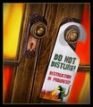
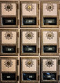
| 11/22/2011 05:43:06 PM |
Do Not Disturbby Art RoflmaoComment: Nice wood, Nice handles. No hole for the lock is a feature that appeals to me. I find the rest hideous. Having said that, the levels and contrast and saturation and such like are good. |
| Photographer found comment helpful. |
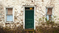
| 11/22/2011 05:39:28 PM |
the door betweenby BrennanOBComment: I really quite like this photo. It's not overly complicated, captures all the details of the paint and lack paint, has pleasant lighting and nicely place shadows. Bravo. |
| Photographer found comment helpful. |
| 11/22/2011 05:29:36 PM |
|
| Photographer found comment helpful. |
| 11/22/2011 05:28:25 PM |
Green-Meldrim House ~ 1833by Ja-9Comment: If I put my hand over the bottom half of this photo I'd probably have scored it higher. The top half has a moody feel, a noisy grain lots of different forms of details. But if you include the bottom half I think the image is over-crowded and a little confused. |
| Photographer found comment helpful. |
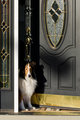
| 11/22/2011 05:24:28 PM |
Welcome Home Dadby rehansComment: Beautiful dog, but I'm not sure if the photo displays the details of the subject (the door) particularly well. The photo itself doesn't do it for me. |
| Photographer found comment helpful. |
| 11/22/2011 05:02:42 PM |
|
| Photographer found comment helpful. |
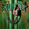
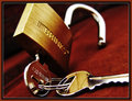
| 11/22/2011 04:45:45 PM |
BRINKSby tfarrell23Comment: Whilst the subject isn't very interesting, the photo makes it interesting (seems to be what the challenge is asking for). Obviously a photo taken by somebody that knows how light works and how to use their camera. The depth of field is very pleasing. The texture of the locks metal is beautifully captured and then contrasted by the smooth and shiney keys. The yellowy gold of the lock works really well with the orangey red of the floor. Great contrast and levels too. |
| Photographer found comment helpful. |
| 11/22/2011 04:38:44 PM |
Neglected Beautyby Tommy_MacComment: Another image with some lovely details. Unfortunately I find the photo flat and lifeless. I touch of editing could have brought the image to life, more contrast maybe, definitely needs some saturation. |
| Photographer found comment helpful. |
Home -
Challenges -
Community -
League -
Photos -
Cameras -
Lenses -
Learn -
Help -
Terms of Use -
Privacy -
Top ^
DPChallenge, and website content and design, Copyright © 2001-2025 Challenging Technologies, LLC.
All digital photo copyrights belong to the photographers and may not be used without permission.
Current Server Time: 04/26/2025 01:10:54 PM EDT.