| Image |
Comment |
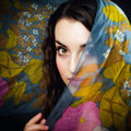
| 05/06/2011 02:39:11 AM |
Jade by NeilComment: this is good. Light is romantic and the colours pop out. I won't change a thing!
Congratulations.:) |
 Photographer found comment helpful. Photographer found comment helpful. |
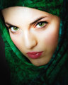
| 05/06/2011 02:37:59 AM |
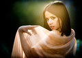
Spring Awakeningby NeilComment: Neil, I gave this a 7.
I actually like this. My only suggestion to further improve this is the lighting. It is a bit flat but with photoshop, it can look more 3 dimensional. Maybe some darkness in the edges. Or a vignette will do.
Alsoi don't really like that it is quite obvious that someone is holding up the veil . Maybe have it falling naturally would look it more spontaneous. |
| Photographer found comment helpful. |
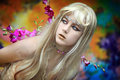
| 03/24/2011 05:52:44 AM |
Librodo Magicby JudiComment: Judi, I gave this a six.
Plus points: the PP work in the face, the lively colors.
Things to improve:
1. I find the placement of the subject a bit centered. The tilt is awkward, imho. I think it is better without the tilt.
2. The styling can be better: the silver dust i the forehead area, which was sharpened looks like "pixellation". Do away with the necklace. The design of the sticker i the forehead does not look good.
3. The flowers in the background look like "sticking out" from her.
4. The background is too colorful it distracts my attention.
Overall, the picture is pleasing to look at. |
| Photographer found comment helpful. |
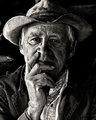
| 03/22/2011 11:58:38 PM |
Windows to the Soulby RmacComment: cool subject. Nice expression. I find him too centrally placed and the background is quite distracting. 7/10 |
| Photographer found comment helpful. |
| 03/22/2011 11:58:04 PM |
UNVEILEDby Breeee123Comment: the best in this challenge. the light and colors are fantastic. I am not sure how you achieved the colors and I wish this is legal. 9/10 |
| Photographer found comment helpful. |
| 03/22/2011 11:56:17 PM |
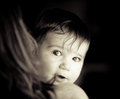
Curiocityby onarComment: i like the candidness. i feel it's a bit bright though on the face of the chuld. 5/10 |
| Photographer found comment helpful. |
| 03/22/2011 11:55:01 PM |
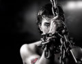
~CAPTURED~by LVicariComment: i wish it is my style. but i couldn't see myself doing this. i wish.:) but this is a very good one though I don't really like the blurring. is it allowed in advanced editing. or maybe this was not blurred in photoshop but was captured on cam. bumped up 8/10 |
| Photographer found comment helpful. |
| 03/22/2011 11:53:22 PM |
Womanby jgoingsComment: well-expose though i find the light a bit flat. There is also lack of drama in the background. 6/10 |
| Photographer found comment helpful. |
| 03/22/2011 11:52:18 PM |
Simply A B E G A I Lby hotpastaComment: the light in her face is a bit uneven and it cast unpleasant shadows in her face. but i like your colors. 6/10 |
| Photographer found comment helpful. |
| 03/22/2011 11:51:56 PM |
|
| Photographer found comment helpful. |
Home -
Challenges -
Community -
League -
Photos -
Cameras -
Lenses -
Learn -
Help -
Terms of Use -
Privacy -
Top ^
DPChallenge, and website content and design, Copyright © 2001-2025 Challenging Technologies, LLC.
All digital photo copyrights belong to the photographers and may not be used without permission.
Current Server Time: 04/01/2025 05:03:23 PM EDT.