| Image |
Comment |
| 02/18/2005 04:14:21 PM |
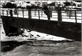
A fisherman reflecting on last summer's catchby HrutsenComment: The high contrast is almost a little blinding, but I like it. The waters below are captured nicely, and though the bridge is very dark the lines of the stone/brick are still visible to give it texture. Nice work! |
 Photographer found comment helpful. Photographer found comment helpful. |
| 02/18/2005 04:13:21 PM |
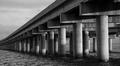
Verrazano Narrows Bridgeby gtroiaComment: This is certainly a bridge, and this shot has a lot of potential. For some reason, though, it just feels too blue - the bridg blends into the sky despite the clarity of its lines. Also, the eye is drawn almost exclusively to the right side because of the strong lines and shadows there. I would like to see this in a high contrast b&w - I think that would really pull the bridge into the foreground rather than allowing it to blend into the background (because the road seems to be the main subject here, as it is isolated by both distance and colour). |
| Photographer found comment helpful. |
| 02/18/2005 04:10:16 PM |
Cape Cod Canal at Duskby WylyWireComment: Very pretty... I would suggest cropping out the very bright light to the left, though. I could do without the tree/bush at the bottom, too - maybe a slightly different angle? Still, very pretty capture. |
| Photographer found comment helpful. |
| 02/18/2005 04:08:44 PM |
Bridge Over Troubled Waterby carotop111Comment: There's a feeling of softness here that I can't quite place, but it looks beautiful. The lighting really makes this one attractive, and the composition is just lovely. |
| Photographer found comment helpful. |
| 02/18/2005 04:07:35 PM |
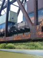
Untitledby fotomann_foreverComment: I like the contrast between natural and industrial that you've shown here - the composition works, but there are a couple of things that take away from the shot to my eyes. FIrst is the sense of movement shown by the trains... the very slight blur is in this case just distracting. My suggestion would be either to use a longer exposure and really blur these well enough to show movement (ND filter maybe? since it seems so bright out?), or just let them be caught in time - stopped but clear. Second, the sky, which is bright white and causing the upper bits of the metal to be quite blue. I realize this is hard to expose for, though, and it does kind of work to contrast between the colour below and the cold industrial tones above. Overall this is an interesting photo with a lot of potential - good effort. |
| Photographer found comment helpful. |
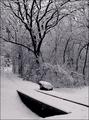
| 02/18/2005 04:01:49 PM |
Winterby BibliophileComment: Gorgeous... your exposure is right on and the toning works to perfection. The clarity and simple dark/light lines make this stunning. |
| Photographer found comment helpful. |
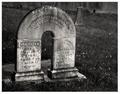
| 02/18/2005 04:00:26 PM |
Conjoinedby sherComment: Wonderful capture, perfectly exposed with excellent clarity and fantastic composition. The background is subtle but really helps to set the mood for this photograph - marvelous work, one of my favourites. |
| Photographer found comment helpful. |
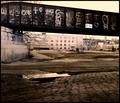
| 02/18/2005 03:58:47 PM |
In the Ghettoby sbeaumontComment: I love this... the DOF is great and the composition is very striking - it draws the eye to the graffiti but not before the viewer takes in the surroundings. Your choice of colours and desaturation works perfectly for the mood you're setting with this - excellent work. |
| Photographer found comment helpful. |
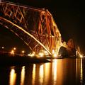
| 02/18/2005 03:46:37 PM |
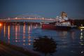
Fifty Thousand Tons of Steelby riotComment: This is a very interesting angle that offers a lot of drama. At first glance it looks a tad oversharpened, but that might just be because of the high contrast between the lights and darks - which I really like. The colours and contrast are fantastic, and I like the way you've composed this photograph - very fun to look at and very pretty. Great balance of reflections, bridge, and sky - overall lovely work. |
| Photographer found comment helpful. |
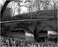
| 02/18/2005 03:44:47 PM |
US Civil War: Battle at Antietam Creek - Link to My Ancestorsby novaComment: I would have liked to see this with a bit more contrast and perhaps some very faint sepia toning. The composition itself is good, but there doesn't seem to be a lot of range in the tones - it'd be nice if the bridge stood out just a bit more from the background. Maybe different lighting? Nonetheless, meets the challenge and the focus is good. |
| Photographer found comment helpful. |
Home -
Challenges -
Community -
League -
Photos -
Cameras -
Lenses -
Learn -
Help -
Terms of Use -
Privacy -
Top ^
DPChallenge, and website content and design, Copyright © 2001-2025 Challenging Technologies, LLC.
All digital photo copyrights belong to the photographers and may not be used without permission.
Current Server Time: 04/17/2025 05:26:56 AM EDT.