| Image |
Comment |
| 04/24/2005 03:31:10 AM |
Heaing Handsby Glen KingComment: I'm not entirely sure what to make of this picture.. it seems like something that would be accompanied by a story or article of some sort. The colour is a bit washed out and there is a lot of overexposure; I think this might really have been more effective in black and white, or with some editing of curves and colour. The background is a bit distracting, and the person in the foreground is also a distraction as they are not fully visible, but the main subject is nicely in focus. Interesting candid. |
 Photographer found comment helpful. Photographer found comment helpful. |
| 04/24/2005 03:28:12 AM |
Spaceby marboComment: Not too sure how I feel about the selective desat, but the effect is interesting. It'd have been great if it wasn't quite so processed, but this is still a great picture. Interesting take (tying the title in with the effect); it's fun to see something different. Focus and such are very good, and the setting is great. |
| Photographer found comment helpful. |
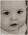
| 04/24/2005 03:26:57 AM |
In the Eyes of a Childby jenesisComment: Awwwwww! This is too precious! I would have LOVED to see this in colour, and maybe with just a tad more brightness, but the close crop is great for this shot, and the focus is excellent. Nice! |
| Photographer found comment helpful. |
| 04/24/2005 03:26:10 AM |
Naturalby elsapoComment: Beautiful portrait - excellent use of colours and background elements here. Focus, colours, lighting - all wonderful. I love the composition... marvelous work. |
| Photographer found comment helpful. |
| 04/24/2005 03:23:23 AM |
Centre of Attentionby naomikComment: This photo, I think, would be so much lovelier if the background and other ladies were not blurred out. I like the choice of sepia tint, and I the shady/sunny spots really give this a nice, warm, fuzzy feel. |
| Photographer found comment helpful. |
| 04/24/2005 03:21:05 AM |
Loving Embraceby Moose101Comment: I like this portrait - the black and white works well here, and the woman's eyes really seem to twinkle. Nice sharpness (maybe a tad too much, but it works for b&w), and I like the crop; the sort of diagonal line is pleasing to the eye. Good job. |
| Photographer found comment helpful. |
| 04/24/2005 03:19:01 AM |
Four Señoritas - Albuquerque NM Tricentennialby jemisonComment: This is adorable - you've captured quite the array of expressions, and I love the colours. It'd be nice if this weren't cropped quite so tight, and the lighting is not quite ideal, but this is still a sharp, interesting picture. Nice job. |
| Photographer found comment helpful. |
| 04/24/2005 03:18:04 AM |
Why don't they look at me?by stphwComment: Clever title for an excellent black and white image. The tones are great in this - I see true blacks and whites, with no detail lost. Nice work. |
| Photographer found comment helpful. |
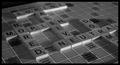
| 03/23/2005 01:00:58 AM |
bored game.jpgby DrewLongComment: I like the idea of this, and the title's clever. Black and white works well for the theme of boredom. A slightly deeper DOF would have been nice, and maybe a little better light to minimize the shadows.. they're a tad distracting (to me) in that they're neither overly obvious nor pleasantly subtle. The black where the edge of the board is also bothers me a tad... but I don't really see any way around that, give the angle, unless it were cropped more closely and framed letterbox style.
I like the overall feel of it, nitpicking aside, and the diagonal composition works nicely. I didn't even consider this sort of take on the challenge. |
| Photographer found comment helpful. |
| 03/16/2005 02:38:53 AM |
|
| Photographer found comment helpful. |
Home -
Challenges -
Community -
League -
Photos -
Cameras -
Lenses -
Learn -
Help -
Terms of Use -
Privacy -
Top ^
DPChallenge, and website content and design, Copyright © 2001-2025 Challenging Technologies, LLC.
All digital photo copyrights belong to the photographers and may not be used without permission.
Current Server Time: 04/15/2025 06:26:19 AM EDT.