| Image |
Comment |
| 05/10/2007 06:31:26 PM |
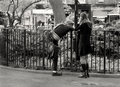
11by sevilduvarciComment: a great candid stret shot.
I'm not sure it would have done too well in the sports challenge though :-) |
 Photographer found comment helpful. Photographer found comment helpful. |
| 05/10/2007 06:05:24 PM |
Day 9 - Millennium Spaceby Bruce_the_RobertComment: Well, I have no idea if this will work, but what about if you stopped your apeture all the way down and left the shutter open for a second or something (depending on the meter reading), anyway, the idea would be for a long exposure, but not too long, and get some blurry people walking by?
That could look pretty cool.
or take several shots from the same position with different shutter speeds and combine them in layers and leave the "clear" people in and erase the parts you don't want?
Understand?
anyway, this is a great shot and I kow exactly where it is :-) |
| Photographer found comment helpful. |
| 05/09/2007 07:36:36 PM |
|
| Photographer found comment helpful. |
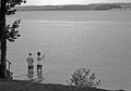
| 05/09/2007 07:35:52 PM |
by boysetsfireComment: great landscape.
good conversion.
lovely tones. |
| Photographer found comment helpful. |
| 05/09/2007 07:34:11 PM |
Day 8by walrus451Comment: excellent black and white conversion for a lego model!
|
| Photographer found comment helpful. |
| 05/09/2007 04:52:11 PM |
Fishingby ElaineComment: i agree, definitely lacking some contrast.
but you have the composite technique down well with your point of view and perspective.
and that is harder to do than to learn photoshop :-) |
| Photographer found comment helpful. |
| 05/09/2007 04:32:00 PM |
Day 09by darnokComment: I agree that black and white helps the blowouts.
they certainly look ok in this picture.
and i think it's a good thing to go back and try something again if it doesn't come out the way you want.
practice makes perfect :-) |
| Photographer found comment helpful. |
| 05/09/2007 11:09:24 AM |
7by mia67Comment: that's just great.
the soft focus and selctive blur (?) are perfect.
If i had to be negative about something, I would say i don't like the top the kid is wearing, it is too high around the neck.
a t-shirt would look better.
In my opinion :-) |
| Photographer found comment helpful. |
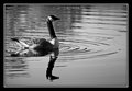
| 05/09/2007 11:07:38 AM |
Day 9 - Ripplesby CapeSailComment: it looks good to me.
the reflection is cool also.
along with the ripples and the composure of the bird. |
| Photographer found comment helpful. |
| 05/09/2007 10:48:43 AM |
B&W - Day 9by mkComment: that's a great portrait.
i keep thinking the middle of her face is nearly blown out.
but then i keep changing my mind.
but, whether it is or not, it works.
you need to do a self portrait like this, as no-one sems to really know what you look like! |
| Photographer found comment helpful. |
Home -
Challenges -
Community -
League -
Photos -
Cameras -
Lenses -
Learn -
Help -
Terms of Use -
Privacy -
Top ^
DPChallenge, and website content and design, Copyright © 2001-2025 Challenging Technologies, LLC.
All digital photo copyrights belong to the photographers and may not be used without permission.
Current Server Time: 04/12/2025 05:54:04 PM EDT.