| Image |
Comment |
| 04/24/2005 11:19:15 AM |
Day's Endby BudComment: Great capture of a wonderful expression! I might have moved the cropping just a bit up (if you frame this, the frame will cut off part of his head while leaving perhaps more chest than you want to see). Love the sharpness with the shallow DOF. 8 |
 Photographer found comment helpful. Photographer found comment helpful. |
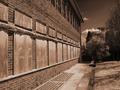
| 04/24/2005 11:11:26 AM |
4H Memoriesby BAMartinComment: It seems like the boy's face is not in focus, or at least not as sharp as it could be (the sign is more in focus, and yet I keep wanting to look at the boy's face). Nice desat and sepia. Good luck in the challenge! |
| Photographer found comment helpful. |
| 04/24/2005 11:10:10 AM |
Easter Joyby dunamisComment: Beautiful image, nice and soft. For some reason, the handle of the basket going across her forhead keeps bothering me. And the motion blur on the hand... I can't decide if I like it (shows excitement) or if it detracts (it keeps drawing my eye to it). The colors are excellent! Good luck in the challenge! |
| Photographer found comment helpful. |
| 04/24/2005 11:05:55 AM |
Flower girlby pitsamanComment: I have to keep remembering to tell my subjects to "open their eyes" just before the shot. This girl has beautiful eyes. I bet just a tad more whites and her eyes would simply be stunning. I wonder if more of a square crop would have done better on this. Maybe take off the left 1/4th of the image. I do like how the flowers come down at an angle, it gives the image some energy. It just feels like there is a little too much of what you don't want to look at. Nice DOF and sharpness. 9 |
| Photographer found comment helpful. |
| 04/24/2005 11:01:58 AM |
Perspective for art classes everywhere.by zarniwoopComment: The title of this image gives it meaning... outside of being a study on perspective, it feels like it lakes "focus" (i.e. something specific to look at). With those leading lines, it would have been perfect to have something at the end, or maybe 2/3rds of the way to the end to look at. Nice sepia tones! |
| Photographer found comment helpful. |
| 04/24/2005 10:51:12 AM |
Reflecting on New Beginningsby SkipComment: This is a really special moment. I like how you've used the lighting on the mother's face to give her depth and form. I've received criticism on my image for blowing the highlights but, similar to your image here, I think it adds to the form. I also like that you can see the mother's eyes, it makes her look thoughtful. And the angle of her head imparts a lot of interest to the image. |
| Photographer found comment helpful. |
| 03/24/2005 10:41:15 PM |
|
| Photographer found comment helpful. |
| 03/09/2005 08:30:15 PM |
Let me See!by melkingComment: Hey, someone dared to try a people picture. Good for you. I like the skin tones and the detail in the eyes. Lighting is good. Depth of field is good. Is it in the style of AA? That's the hard part to decide... Good luck in the challenge! |
| Photographer found comment helpful. |
| 03/04/2005 06:56:55 PM |
Snow whiteby AnastasiaComment: Beautiful model with really nice light on the face. A little overblown on the shoulder, but I didn't even notice until i went looking. The hair highlights work really well. And, for me, the contrast in her eyes makes this image captivating. Good luck in the challenge!
|
| Photographer found comment helpful. |
| 03/02/2005 10:53:20 PM |
Blueby shutterflyComment: I like the idea and think this shot has a lot of potential. I wonder if we aren't destroying our images by getting rid of the contrast just to meet the challenge. I would still have voted this one high even if the colors were a little more saturated and there was a tiny bit more contrast. Good luck in the challenge! |
| Photographer found comment helpful. |
Home -
Challenges -
Community -
League -
Photos -
Cameras -
Lenses -
Learn -
Help -
Terms of Use -
Privacy -
Top ^
DPChallenge, and website content and design, Copyright © 2001-2025 Challenging Technologies, LLC.
All digital photo copyrights belong to the photographers and may not be used without permission.
Current Server Time: 04/23/2025 06:47:27 AM EDT.