| Image |
Comment |
| 02/14/2005 10:44:30 AM |
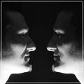
Face 2 Faceby alien2thisworldComment: Highlights are overblown for my tsates; all texture is lost on the neck area. Needs a bit more balance between the top and bottom. |
 Photographer found comment helpful. Photographer found comment helpful. |
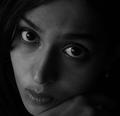
| 02/14/2005 10:43:23 AM |
Down thereby heidaComment: Hard to be anonymous in a self portrait. As usual, very creative technically excellent work. How long until you put out your first book? Seriously though, this is one of the first portraits I critiqued that uses a lot of negative space, but does so in harmony with the subject. Your exporession is perfect for the vast frame, and subtle shading in the backdrop. I expect to see this near the top. |
| Photographer found comment helpful. |
| 02/14/2005 10:40:04 AM |
this is me [i hope]by whiteroomComment: I like the grain and high key effect - cretes a unique mood to the image. Your expression is intriguing as well. This is excellent. |
| Photographer found comment helpful. |
| 02/14/2005 10:39:03 AM |
|
| Photographer found comment helpful. |
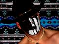
| 02/14/2005 10:37:24 AM |
Did someone say rodeoby Prime_TimeComment: The background really overpowers the subject in this image... Doesn't feel like it's giving me insight into the subject's essence. |
| Photographer found comment helpful. |
| 02/14/2005 10:36:22 AM |
Grandma-Mother- Friend- that's meby trainComment: Great pose, and a very natural look. You've captured emotion in this shot, which is commendable. I think the high-key ecceft might be a touch overdone as your cheek and hair are completely blown out on the left. A subtle photoshop edit and this would be an amazing shot. |
| Photographer found comment helpful. |
| 02/14/2005 10:33:42 AM |
VERY Shy About Self-Portraitsby SandyPComment: Beautiful eyes, and the hair is nicely arranged. You have a bright, wide smile, but I think you weren't relaxed enough in this one - it feels a bit forced. The pose in general is flattering though, so you chose well. It looks like you may have not had the camera on a steady mount, or possibly the focus wasn't set quite right as this image is very soft; it seems that texture is nearly lost in some of the shirt. You might try this shot with sidelighting from a hardware store work light - nothing fancy. Just something to bring out your features more. It may also work well from behind by illuminating your har to create contrast from the background. |
| Photographer found comment helpful. |
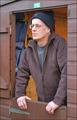
| 02/14/2005 10:28:52 AM |
Every man needs a shedby BilberryComment: Perhaps composed from the other side you could have avoided having distracting elements near the head (those blue pouches on the interior wall). But AMEN to every man needing a shed. |
| Photographer found comment helpful. |
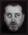
| 02/14/2005 10:27:34 AM |
Flatteringby WarbyComment: Whoa! Stop that!
Great head shot (ignoring the whole eye contact issue!)... A nice background and conservative lighting. I'd like to see a bit more depth from sidelighting to bring out your features, but this is solid work. |
| Photographer found comment helpful. |
| 02/14/2005 10:25:57 AM |
Boxesby utroComment: Very creative! Overall the image feels like it needs some sharpening, but I love the concept! |
| Photographer found comment helpful. |
Home -
Challenges -
Community -
League -
Photos -
Cameras -
Lenses -
Learn -
Help -
Terms of Use -
Privacy -
Top ^
DPChallenge, and website content and design, Copyright © 2001-2025 Challenging Technologies, LLC.
All digital photo copyrights belong to the photographers and may not be used without permission.
Current Server Time: 04/11/2025 01:04:31 AM EDT.


![this is me [i hope]](https://images.dpchallenge.com/images_challenge/0-999/308/120/Copyrighted_Image_Reuse_Prohibited_144919.jpg)