| Image |
Comment |
| 01/19/2006 10:45:04 AM |
Soft Coralby eiffelComment: This is really cool. The colors just jump right off the screen. |
 Photographer found comment helpful. Photographer found comment helpful. |
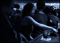
| 01/18/2006 01:47:33 PM |
You better move that...by Nikolai1024Comment: That's a great expression you've captured. Overall, though, I'd like to see her legs; there's just this black trunk going down where they should be. I'll ignore the pole sticking out of her head since it's out of focus, but the whole shot (including her) seems grainy. |
| Photographer found comment helpful. |
| 01/18/2006 01:44:17 PM |
In Thoughtby JutildaComment: love how assymetrical this is - really helps give this photo an interesting vibe |
| Photographer found comment helpful. |
| 01/18/2006 01:41:59 PM |
Le Bleu Nuitby pawdrixComment: I like how she's centered in the frame; great use of the blue tones. Her expression is so at odds with her surroundings, it sets her apart even more. Nice shot! |
| Photographer found comment helpful. |
| 01/18/2006 01:40:46 PM |
Focusedby L1Comment: Good choice to put this at an odd angle. How would this look in black & white? |
| Photographer found comment helpful. |
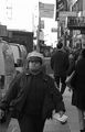
| 01/18/2006 01:39:30 PM |
Faith Aloneby muur88Comment: I'd rather see your subject left of center instead of right. I like how the background color helps to frame him. You've captured a great look on his face, too. |
| Photographer found comment helpful. |
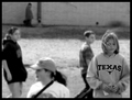
| 01/18/2006 01:36:52 PM |
Handicapping the Poniesby mpetersComment: great minimalist approach. I might have liked to have more room on the left for balance; I like you gave your subject space. |
| Photographer found comment helpful. |
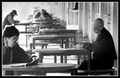
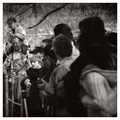
| 01/18/2006 01:35:10 PM |
Line of Sightby JPRComment: It's great that everyone in the foreground is looking toward that one kid. But what is everyone else looking at? B&W is a good choice to remove clutter and help focus the viewer. |
| Photographer found comment helpful. |
| 01/18/2006 01:32:45 PM |
|
| Photographer found comment helpful. |
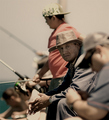
| 11/28/2005 12:29:19 PM |
Seventy-Fourby moviemanComment: I like the square shape, but I'd move the crop down so his head is closer to the top and there's more space below. |
| Photographer found comment helpful. |
Home -
Challenges -
Community -
League -
Photos -
Cameras -
Lenses -
Learn -
Help -
Terms of Use -
Privacy -
Top ^
DPChallenge, and website content and design, Copyright © 2001-2025 Challenging Technologies, LLC.
All digital photo copyrights belong to the photographers and may not be used without permission.
Current Server Time: 04/21/2025 10:05:34 PM EDT.