| Image |
Comment |
| 01/11/2006 03:58:29 AM |
|
 Photographer found comment helpful. Photographer found comment helpful. |
| 01/10/2006 09:18:03 AM |
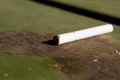
The Dreadful Wasted Smoke - Lighting the WRONG end!by BurgComment: *Greetings from the Critique Club*
Ahh, being a smoker myself I can say I have done this more than once in my life, but normally when intoxicated. :p
First thing that hits me here is that the cigarette is blown out a bit. The rings separating the butt from the tobacco disappear too much and to me that is a major indicator that IT IS the wrong end. With having the cigarette the main point of focus it really needed to be spot on. I would of also liked to have seen more light on the burnt end to get some detail there. Maybe if it had of been turned slightly more towards the camera?
I'm also seeing that the focus on the cigarette is a tad soft. Not too much but just a little. I'm not sure if you used any USM in Photoshop before you saved it but it may of just been enough to reduce that.
The texture of the background the cigarette is sitting on is great in my opinion. It's obviously a park bench or something similar? The 'spots' in the foreground I find a little distracting. If it was an advanced rules challenge I would of cloned them out but as it stands you may of tried just moving the cigarette further back and bring the camera in a bit to drop them off the bottom of the frame.
The overall composition is great and the placement of the cigarette in relation to the frame is good. I like it. Well done on your first entry. If you have any questions please don't hesitate to PM me.
Best of luck in future challenges.
Neil |
| Photographer found comment helpful. |
| 01/08/2006 10:56:38 AM |
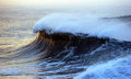
cliff waveby MacDonaldComment: I really love this photo. There's just something about the awesome power of that wave. I love the composition of this and think it works really well. |
| Photographer found comment helpful. |
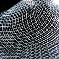
| 01/08/2006 02:33:09 AM |
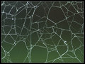
A Web of Polygonsby MeeraComment: *Greetings from the Critique Club*
The first thing that strikes me about this photo is the fantastic graduated background. I might of just added a slight bit of saturation to it just to really highlight that green. Even though it is the background it really is an integral part of the image because it works well to make the main subject stand out and with the DOF you have used the blur has worked perfectly. The composition and crop is very good also!
The web itself looks like it's made by a not so very house proud spider and so offers some wonderful shapes and patterns. It is a great subject that you have chosen. I just feel that the actual web could of been slightly sharper than what it is. It has me leaning into the screen checking and double checking. I'm not sure if you ran it through USM with your editing software or not but it may of helped just to tweak it that little bit more.
I'm a fan of borders on photos but I find this border a bit too heavy for the delicate subject you've captured. It just distracts slightly from the photo. Maybe at half the thickness would of worked slightly better but this is always a personal choice thing.
There were mentions in your comments from voters about there not being a focal point and that it needed something, like a spider to add this to it. I guess there are two ways of looking at this in my opinion. The challenge topic was 'Pattern' and this is what your photo represents and does it well. To me the pattern of the web is the main focal point if that makes sense. Then again, the photo would of worked great still if there had of been a spider in the web but I think for the challenge it doesn't really matter. Knowing how nature works if it had of offered up a spider it probably would of been a dull grey coloured one which wouldn't of added anything to the photo anyway.
Well done with your placing and best of luck with future challenges.
Neil Message edited by author 2006-01-08 02:41:46. |
| Photographer found comment helpful. |
| 01/07/2006 12:38:19 PM |
Reticello (a blown glass technique)by lindesComment: *Hi From the Critique Club*
This strikes me as a nice piece to photograph to suit this challenge. You have chosen it well. The main distraction for me when I immediately look at this photo is the blown out highlights at the top centre and right and it begs the question of whether you needed to crop it a bit more or not. Then again, cropping the top out may of reduced the impact of the photo by removing the top curve of the subject. Perhaps even if you had of tried some different angles with the light so that it wasn't so much directly on the glass it may of helped reduce it slightly but that would also come down to the surroundings.
Some people aren't great fans of borders. I myself don't mind them when subtley done and I think just having a slim border around this would of helped complete this photo and maybe even tidied up the overall look of it.
Overall, you have captured the challenge topic well and used a fantastic subject. It would of been very easy just to hit this photo with a standard flash and a much shorter exposure but trying with a long exposure using the small light was a great way to try something different. Despite the blow outs the voters definately looked beyond it and scored this photo very well. Congratulations on the result.
Neil :) |
| Photographer found comment helpful. |
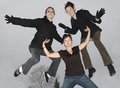
| 01/03/2006 11:46:38 PM |
|
| Photographer found comment helpful. |
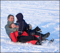
| 01/03/2006 11:18:21 PM |
A Mother A Super Heroby ColeyComment: Why isn't she wearing some sort of super hero costume...like a bikini or something? :p This is really well done. Looks like they had fun doing it too. The framing works really well with the tree in the background. Well done! |
| Photographer found comment helpful. |
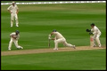
| 01/03/2006 08:57:08 PM |
Dropped Catch !!by millsaComment: This looks like a great Aussie cricket photo! Well captured and well timed. The colours are great and you've framed perfectly to the action. Good work! |
| Photographer found comment helpful. |
| 01/02/2006 10:30:22 PM |
best friendsby suemackComment: This would of been a good photo but the focus looks all out to me. Sorry! |
| Photographer found comment helpful. |
| 01/02/2006 11:40:22 AM |
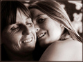
Maternal Magic by LindaLeeComment: Beautiful high key shot. Really well done. A different border would work better for me though. I feel it's a little heavy for this. Great work! |
| Photographer found comment helpful. |
Home -
Challenges -
Community -
League -
Photos -
Cameras -
Lenses -
Learn -
Help -
Terms of Use -
Privacy -
Top ^
DPChallenge, and website content and design, Copyright © 2001-2025 Challenging Technologies, LLC.
All digital photo copyrights belong to the photographers and may not be used without permission.
Current Server Time: 04/19/2025 04:05:12 AM EDT.