|
|
|
Showing 14831 - 14840 of ~15274 |
| Image |
Comment |
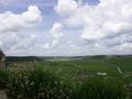
| 06/20/2004 01:17:02 PM | Sight from the castleby lsmartComment: From the Critique Club:
A beautiful and delicate image which meets the challenge head on. The sparse sprouts in the foreground give this image great delicasy. The composition is superb and satisfying and indeed it imparts a soothing feel. A lot of the beauty inherent in this image is due to the clouds masking the sun, however, here is where the image shies off perfection. This is another difficult shot to execute because we are going from the lower zone, skipping 7 and 8 and into the 9 and 10th.
This spells a bit of trouble for its final execution. Yet the photograph has enough quality to remain as is, like those times when the sun is suddenly blocked and we go through the transition of regaining the light value balance.
To conclude, the image meets the challenge, it is above average and its only defect os the ultra bright sky contrasting against a very subdued green. If I had no knowledge of curves, I would have certainly used levels to bring a little more luminosity to the shadowed area. Rated from 1 to 10 I give it 8+. Worked over with curves it can easily attain a 10. Nice work. dan |  Photographer found comment helpful. Photographer found comment helpful. |
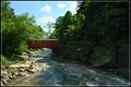
| 06/19/2004 05:16:09 PM | Downstreamby MaverickComment: From the Critique Club:
A shot that will benefit by the Zone System. Yet, I am at a disadvantage to truly judge it because I am certain the shadow area has more detail than allowed by the internet resolution. Ansel Adams would have cringed to see his photographs displayed so. In the old days of film this was a simple shot to process. Once you get the right enlarger exposure to satisfy the shadow area, we burn in the lighter side. In digital, this can done even easier. You simply take two pictures, each exposure to satisfy the light and dark and then combine them. However, challenges, unfortunately do not allow this. So this remains one of the most difficult shots to execute.
The dof is good and the composition pretty strong. the eye winds up gently up the river or rivulet. Also, the exposure is just right because it preserves the detail in the light side. Many of these shots wind up with hot spots eliminating all detail. Also your sky is nice and rich. If I had to go and take the same shot with the same rules, I would simply reduced the shadow side a bit more by moving closer to the first boulder. Of course, such a change would change the balance and possibly change the mood. That is, I like the placement of the overpass.
Leaving it as it is, the other way to improve the balance is by the use of curves, but the tweaking must be done just right, because the dark-light relationship can be impaired.
I can not truly find any other fault than the subdued shadow area. It seems that for such a beautiful day there should be more reflected light, but cameras are subject to this shortcoming. Keep your eyes open for these dark-light scenes and re-examine them at different times of the days, each one will be favored by a different Sun setting. I like the picture and the mood it conveys. dan | | Photographer found comment helpful. |
| 06/18/2004 01:02:29 PM | Fields On Fireby frumoazniculComment: From the Critique Club:
First: the red in this picture has enough strength to be its essence. The distance village frames the flower field nicely. I believe you short changed your effort by the extreme tilt of the horizon. It challenges the eye and competes directly with flowers. Be very careful when taking artistic license to tilt, the move is so important that it brings with it many new problems. The main object of the tilt is to create tension. I think this image had enough going without this alteration.
You do have a very nice image here and I would go back and realize its' full potential. You will not need to worry about rules. The minor changes I would correct are as follows. Look at the halo atop the village buildings. This is caused by extreme oversharpenning. If you use PS I would suggest you use the high-pass filter on a copy of the background. Then apply it in overlay mode. This will yield the same result as the unsharp mask, but you can always go back and adjust the opacity until you are satisfied. This is not allowed in basic editing in challenges. Next: since red is the heart of the picture be careful not to over saturate. Red is very strong and can easily tilt towards a vermillion.
In conclusion, I see a very strong picture here that can be a winner image. It has good dof; beautiful comp and that wild red to entice the eyes. dan | | Photographer found comment helpful. |
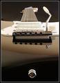
| 06/17/2004 10:27:11 PM | Fender Stratocaster by ChrisW123Comment: This picture is one of the best guitar shots I have seen. Even if one does not care about guitars it is great because the colors are subdued and the detail is followed on lock step from foreground to top nut. very impressive work. Congratulations and kudos. dan | | Photographer found comment helpful. |
| 06/17/2004 10:09:31 PM | From here to Infinityby peeceeComment: From the Critique Club:
This is a very wholesome image. The colors are vibrant, the dof has been well executed and the sky is filled with life. This picture would look nice upside down! Well, I exagerate a bit. What I mean is that you can take artistic license to tilt the horizon and the picture has enough character ro survive it. Let us examine the horizon element, because it is a factor that you will need to defend. This picture is almost perfect. So if any one seeks for a pleasant serene scene, this is it with a level horizon. Once we tilt the horizon, we are adding tension to an otherwise static image. It is not right or wrong to tilt or not tilt the horizon, but when we do, it no longer retains its innocence or its soothing feel. We intentionally invite the viewer into a very active communion. Those pre-dispose to this tension will love it, otherwise they may even pass up this picture if the horizon was straight. Those seeking sweet harmony will not understand the tilt. Of course, you will never please everybody, but once you tilt you will actively challenge the viewers sight and feelings. It is your call.
Regarding the composition I note that the fence coming from the left at the distance merges with the main fence on the left. If I were painting this picture, I would improve the composition by separating the two a little more. In your case, it may mean rising higher to create a higher vantage point, but this is not too critical. Think of all the variables involved and pat yourself in the back for a job well done.
Continue on your quest and keep up the nice work. dan Message edited by author 2004-06-18 12:02:19. | | Photographer found comment helpful. |
| 06/16/2004 10:18:12 PM | Into the great yellow open, under the skies of blueby artvetComment: from the critique club:
Congratulations on your wonderful shot. The composition is above reproach. The only fault I find is on the technical end, however, you may have lacked the tools. Let me explain. A shot like this is a very big deal and can easily overtax the capabilities of a regular camera. You see, the eye expects the foreground to be sharp. I assume that your camera is a fixed lens and that f8 is the smallest you can close it. A shot of this magnitude requires the smallest possible aperture along with a bigger sensor and of course, a super wide angle lens.
You did fantastic with what you had and despite its minor flaw, I would not hesitate to show it off. Outside of that, the picture is warm and imparts a good feeling of plenty and of course, the colors are just nice. I have the Canon 10D and I can close my lens to f22, yet I would still need a good wide angle. Great dof go together with wide angles.
And read the comments you received, they are mostly positive. You have a wonderful camera and there are many shots you can take to perfection. Take full credit for pulling off a wonderful image that many would have ran away from. dan | | Photographer found comment helpful. |
| 06/16/2004 01:20:35 PM | Upper New York Bayby dimitriiComment: from the critique club:
This is more an artistic mood photograph because the haze is editing the visibility and as such the viewer receives more of a suggestion as opposed to a stark sharp image. You did very good in the composition. I like the way the fog reveals the distance of the vessels. I would leave the image as it is, with the vast white sky, after all it is part of the mood. The only thing I would do is to have use the burn tool to darken the foreground water a bit to help the transition from edge of the image to the first silhoette vessels. Otherwise, the image and execution is nice. dan | | Photographer found comment helpful. |
| 06/16/2004 12:30:30 PM | Passin' Throughby OneSweetSinComment: From the critique club.
This is a classic composition. A touch of foreground, good angles and the necessary negative space. It is the style used by postcards. Do not feel bad about this, we all take this kind of shot and we often question when is the best time to capture the image.
Yet your selected time has worked because the picture has an up quality with its pleasant sky and the pleasant reds in the building. The only thing I would have done different is that I would have shot this at f8 to increase the doa. The angle would have allowed a slower shutter speed. I would have cropped the red spec on the right because the eye keeps going back to determine whether it is a person or not. Yet, the picture stands as it is. You are certainly on the right track. Now go and shoot some more. dan | | Photographer found comment helpful. |
| 06/16/2004 12:09:54 PM | | | Photographer found comment helpful. |
| 06/16/2004 12:09:35 PM | | | Photographer found comment helpful. |
|
Showing 14831 - 14840 of ~15274 |
Home -
Challenges -
Community -
League -
Photos -
Cameras -
Lenses -
Learn -
Help -
Terms of Use -
Privacy -
Top ^
DPChallenge, and website content and design, Copyright © 2001-2025 Challenging Technologies, LLC.
All digital photo copyrights belong to the photographers and may not be used without permission.
Current Server Time: 04/21/2025 10:37:16 PM EDT.
|