| Image |
Comment |
| 11/17/2004 02:51:31 AM |
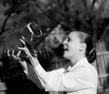
First Impressionby Rando D300Comment: I'm sorry but it appears it's been run thru a heavy pass in NeatImage, it just doesnt fit for this picture. All the detail in the dog's fur has been lost.
Cute picture and love the composition and contrasts begtween the whites and blacks. |
 Photographer found comment helpful. Photographer found comment helpful. |
| 11/17/2004 12:35:22 AM |
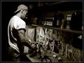
i doby sacredspiritComment: I think this needs to be a bit brighter to help bring out the form a bit more. Also the bra marks on the skin are distracting. Still a nice photo (6) |
| Photographer found comment helpful. |
| 02/16/2004 12:44:59 AM |
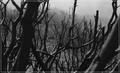
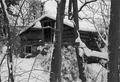
Black Saturdayby melongrindComment: In my opinion, the border distracts from the image but I am voting on it as if it wasnt there.
Nice image as it stands but I think it will be more powerful if you could higher and take the picture from above. 7 |
| Photographer found comment helpful. |
| 02/16/2004 12:39:16 AM |
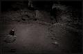
In The Cave of my Soul by heidaComment: I could sit here and type a story on how how I interpret this picture and how it effects me emotionally but even then, I feel that I could not explain it effectively.
I'm speechless or would it be typeless? :) I give it a 10 though, without a second thought.
|
| Photographer found comment helpful. |
| 02/04/2004 03:46:42 PM |
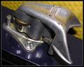
My Inspirationby goinskiingComment: I really like the idea, but it appears the light bulb shape was cut out of the background. There are what appears to be some jagged or rough lines, a cleaner cut or somehow a lighbulb it self would have made it more interesting to me. |
| Photographer found comment helpful. |
| 02/04/2004 02:34:56 PM |
|
| Photographer found comment helpful. |
| 02/04/2004 02:27:45 PM |
|
| Photographer found comment helpful. |
| 12/15/2003 06:57:53 PM |
Nestledby OneSweetSinComment: I love pictures like this. Giving it a 9, 10 if the black and white was a bit 'richer'. Deeper black...know what I mean? |
| Photographer found comment helpful. |
| 12/15/2003 05:54:14 PM |
|
| Photographer found comment helpful. |
| 12/15/2003 05:43:27 PM |
The odd one outby tomlewis1980Comment: Personally, I think the two glasses on each side that are just out of frame are distracting. Still like the photo though. Focus and lighting are excellent. 9 |
| Photographer found comment helpful. |
Home -
Challenges -
Community -
League -
Photos -
Cameras -
Lenses -
Learn -
Help -
Terms of Use -
Privacy -
Top ^
DPChallenge, and website content and design, Copyright © 2001-2025 Challenging Technologies, LLC.
All digital photo copyrights belong to the photographers and may not be used without permission.
Current Server Time: 04/25/2025 06:40:11 PM EDT.