| Image |
Comment |
| 07/14/2004 03:44:48 PM |
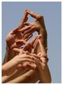
Talking Handsby jcordinaComment: I had a simalar idea (but fewer hands available) and I'm glad to see someone thought of this. Your DOF is off, though, you need to bring the image completely into focus, and you might have done better to spread out the signs, it looks very busy right now, and hard to read. It's also kind of confusing since some hands are aiming in totally different directions. |
 Photographer found comment helpful. Photographer found comment helpful. |
| 07/14/2004 01:36:32 PM |
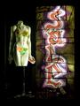
Saleby banmornComment: If you did this setup yourself, I think it's a 10. If you saw it and took a picture, it's an 8. Since I don't know, you get a 9 :) Nice use of light and shadow. Very thought provoking image, it makes you want to look at it for a while to get all the nuances. |
| Photographer found comment helpful. |
| 07/14/2004 01:16:34 PM |
Phrases ot the worldby mykolearyComment: Need to find more uniform lighting. Not sure this meets the challenge, since you just took a picture of someone else's art. |
| Photographer found comment helpful. |
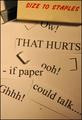
| 07/14/2004 01:15:19 PM |
Different bodiesby Prime_TimeComment: I can't read the text, which kind of defeats the purpose of the challenge. Try focusing more on the text and maybe less compression, your panoramic crop may have hurt your quality. |
| Photographer found comment helpful. |
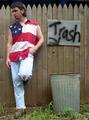
| 07/14/2004 01:13:16 PM |
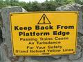
WARNING WORDSby JACKIE BIRDComment: Ok, but how is this *your* art? Work on capturing interest using your camera, not just taking pictures of things. I could go to wherever this is and see the exact same sign, so why do I need your picture of it? Use creativity and composition, and I'm sure you'll score higher next time. |
| Photographer found comment helpful. |
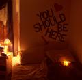
| 07/14/2004 01:10:25 PM |
You Should Be Hereby cinamnshortcakeComment: A nice idea, but your lighting is too low, and the camera was unable to capture the detail and sharpness necessary for the image. Try more ambient light with the same exposure length, or lengthen the exposure some but shade the visible ligt sources so you don't get spots of bright white. I might suggest cropping the nightstand out as well, it's a little out of place. |
| Photographer found comment helpful. |
| 07/14/2004 01:04:30 PM |
to tell a story as another has related itby nordicComment: Check your screen settings. This looks really terrible on my mac, but ok on my PC. Interesting rainbow effect, but not sure it meets the challenge. How are the words vital to the photo? |
| Photographer found comment helpful. |
| 07/14/2004 09:46:55 AM |
|
| Photographer found comment helpful. |
| 07/14/2004 09:38:27 AM |
Wordsby yukiComment: Very cute, might adjust your WB a bit. Picture looks very brownish. A bit sharper focus would help too, but I like the image alot and your idea is very fun and creative. |
| Photographer found comment helpful. |
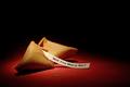
| 07/14/2004 09:34:08 AM |
Surprise Proposal by tyt2000Comment: Cute idea, nicely done pic, too bad so many people did the fortune cookie. I think the proposal sets you apart (and it made a great hint for my boyfriend for romantic ideas in the future!). A little blur along the top right edge of the cookie, maybe a DOF issue. |
| Photographer found comment helpful. |
Home -
Challenges -
Community -
League -
Photos -
Cameras -
Lenses -
Learn -
Help -
Terms of Use -
Privacy -
Top ^
DPChallenge, and website content and design, Copyright © 2001-2025 Challenging Technologies, LLC.
All digital photo copyrights belong to the photographers and may not be used without permission.
Current Server Time: 04/18/2025 04:57:24 PM EDT.