|
|
|
Showing 851 - 860 of ~1136 |
| Image |
Comment |
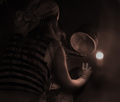
| 12/13/2005 11:12:03 PM | The pearlby marvinComment: I think I would have gone a touch "warmer" with the tones, because this doesn't appear candlelight. Since I'm not a DNMC enforcer, that's okay. I bet it does score lower than it should. 7 |  Photographer found comment helpful. Photographer found comment helpful. |
| 12/13/2005 11:09:08 PM | Scrubbin' the Deckby ShermyComment: Dunno if I'm just generous or if the first three images I've scored are really good. I LOVE the tones here. The curvature of the arm is a touch "wrong" for some reason, but this is a great shot. 8 | | Photographer found comment helpful. |
| 12/13/2005 11:05:46 PM | Tulips in a Pitcherby banmornComment: The lighting seems a little white for candlelight, but I'm not scoring that, I'm assuming it's a given. I really like this shot. 8 | | Photographer found comment helpful. |
| 12/13/2005 11:03:08 PM | Enlightenedby laindComment: Wow. Can't decide if the blur is intentional or not, but this is cool in some way that I can't explain. 9 | | Photographer found comment helpful. |
| 12/13/2005 04:51:21 PM | Forgedby kennytComment: Greetings from the Critique Club! :)
Composition
Overall, I like this, but it's a bit static, even with the fire, since the focal point that my eye naturally goes to is the flame, which is in the center. The attempt at leading lines is nice, but they tend to lead me away from the focal point, which is the flame. That said, the effect is overall still a pleasing one.
Exposure
Typically I don't critique exposure as a separate issue, but here I know how crucial it was, and I know the difficulties you faced. The flame from the torch here is so hot that the foreground is somewhat underexposed. I would really like to see the torch itself in more clarity. If I were to try to shoot this shot myself, after seeing yours and trying to learn from it, I would have used a diffused flash to eliminate the torch from the left side in an effort to show some detail there. I think that is probably the greatest opportunity for improvement in this shot.
Camera Work
The only additional suggestion I would have would be a smaller aperture in an effort to extend the depth of field to include the entire torch.
Post Processing
There's not a lot of need for excessive PP here, and what you have done is appropriate and realistic, I think. There is a slightly "greenish" cast that I can't decide whether to blame on white balance or just the color of the surrounding area.
My Opinions
This is an appealing shot to me, since I work in metalworking / machining myself (in a fashion), and I've seen this kind of thing very often. The flame is very hot, and I know this is indeed a tough subject to capture in perfect fashion. I congratulate you on a job well done.
I hope these thoughts are helpful and informative. If you have any questions or comments, please PM me at any time. Thanks for submitting! | | Photographer found comment helpful. |
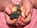
| 12/13/2005 09:31:42 AM | Her Preciousby TwylaComment: Greetings from the Critique Club! :)
Composition
I find the composition here intriquing, especially when combined with the title. The totally centered composition makes the photo a bit static, and it's very obviously a "look at these" presentation. There's nothing wrong with that, but I wonder if a slightly angular presentation would have helped created some depth. I find the dirty fingernails to be consistent with the message, even though some commenters didn't like them. It would seem ridiculous to me to have a child picking up rocks and not having dirty fingernails or hands. Someone missed the message, but if these comments were made during the challenge, they didn't have the benefit of your comments to explain the "collecting" nature of the shot. Remember, all they have during voting is the title and the photo, and that probably hurt your score quite a bit here.
Background
Your background is limited to the pink check pattern, and it's very "flat". Again, some type of angle to lead the viewer's eye around and create some depth would probably help quite a bit.
Camera Work
This looks like you used a fill flash, and the light is a little bit harsh. I think simply doing this in good daylight would have been better. The flash has created some glare here that makes for unnatural skin tones.
Post Processing
This appears to have limited post processing, just from my observations. I would think that some curves adjustments (or a simple contrast boost, depending on your software) would darken the background just enough to improve that feeling of depth that I keep harping on. The image is also rather pink in cast, and I did a color balance adjustment that made it seem more "natural" to me, which helped quite a bit. After that, I personally like to do an edge preserving smooth to eliminate noise and then do an unsharp mask to bring the "edges" back to life.
My Opinions
Normally I don't do this, but I've taken your shot and done some of the edits I discussed. I personally think this is an improvement, but I definitely understand that you may not think so and I will not be offended by that. I hope you find my thoughts to be helpful and informative, and I hope this critique helps you in the future.
Here's my version, if you are interested...

| | Photographer found comment helpful. |
| 12/11/2005 10:03:40 PM | The Industrial Look!by vikasComment: Greetings from the Critique Club! :)
This is a scene that I see many times daily, as I work in the machine shop industry. I hope my insights are helpful.
Composition
Personally, I really like your composition here. I like the tight crop, and I like the fact that you've moved my eyes away from the nearest machinist by not showing me all of his head. It is a little bit "busy", simply due to all the knobs and handles on the mill, which makes it a little confusing. If there could be some way to simplify and not show quite so much, I think it would strengthen the image a good bit.
Background
I also like the way you've shown another "worker", slightly out of focus, but it's not out of focus quite as much as I think is necessary for the shot. I'm kind of surprised by this, at f/2.5, but I don't think you could ever get as much background blur with a G5 as an SLR would provide, just due to the sensor size limitations.
Camera Work
The shot is focused nicely, and the lighting is very even. I think a little foreground lighting to bring out the details of the digital readout on the mill and the dark area on the front of the mill would have been an improvement. Those are pretty well buried in the shadows.
Post Processing
I only have one minor complaint, and that is in reference to saturation. The reds seem really dominant, and I think that makes the shot a bit more "garish" than you intended. The machinist's face is a little red, and all the red lights,etc., are really emphasized by the color. My mention of foreground lighting, above, might have been wrong; you may have just gotten a little bit heavy with the contrast adjustment and pumped up the blacks too much.
My Opinions
In general, this image strikes a familiar chord with me, and I realize how difficult this was to pull off in a manufacturing environment. However, there is an element of "punch" or "wow" that is somehow missing from the shot. It feels a bit "two-dimensional", and normally that's a lighting thing combined with contrast adjustments. There are other "tricks" to induce a feeling of depth, but I'm not sure of how to advise you to "fix" it, I just see a bit of room for improvement.
I hope these thoughts are informative and helpful. Thanks for submitting! | | Photographer found comment helpful. |
| 12/10/2005 12:22:32 AM | Finaléby TejComment: Greetings from the Critique Club! :)
Wow! This is a very nice image, and I'm hard pressed to find any helpful hints. I will, however, attempt an analysis that might help you in the future.
Composition
This is a beautiful composition. It's not an exact rule of thirds, but it's off center just enough to create a dynamic in the midst of what is a very "still" image. The image looks peaceful, restful, and yet purposeful. The image supports the title in an excellent manner, rather than the title "proving" the image.
Background
I'm sure you would have liked a little more color here, but you've done a very nice job of presenting good tones that please the eye while focusing our attention on the workmen.
Camera Work
Aperture is not critical, and you have used a shutter speed that works very well for a handheld shot. Focus is a bit difficult to detect, but it typically doesn't matter at this distance unless it's terribly wrong, and I don't think it is here.
Post Processing
The adjustments you list are very typical adjustments to a photo, and you've done a great job of compensating for the white balance problem. I probably would have worked really hard to find some red or yellow to emphasize.
My Opinions and Impressions
This is an excellent shot, weakened only by the lack of color, and many viewers like it just as it is. Don't give up on this spot - there are many more excellent shots awaiting you there!
Overall, this is an extremely good shot. Congratulations on a great score. Thanks for entering, contact me by PM if you have any questions about this critique.
nards656 | | Photographer found comment helpful. |
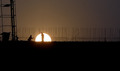
| 12/10/2005 12:07:42 AM | Cleveland Public Powerby joycobbComment: Greetings from the Critique Club! :)
Composition
While I understand the difficulties of shooting at 60 MPH, this shot is really weakened by the fact that the building doesn't "do" the same thing on both sides of the image. If it were either cut off on both sides, or had a blank space on both sides, I think the image would be more powerful. I would speculate that a small amount of space on both sides would be best. Perhaps this was an intentional crop, but I suspect you were victim of a "drive by shot". :)
Background
I'm really impressed at the fact that the sky is a very consistent white without appearing blown out. It almost makes this look like a studio shot in front of a sheet of muslin or something. Your exposure was very accurate in this regard.
Camera Work
It's difficult to really do much camera work in a "drive by", but the exposure is very good in general. The building paint scheme is very unfamiliar to me, so I can't analyze whether you were able to record the details or not. Some of the shadows seems a bit dark, and the entire picture seems just a bit noisy. If that's just your camera and not the fault of anything you have done, I understand. It is also possible that the car window caused some difficulties.
Post Processing
This seems to be minimally processed, but you have done a good job of setting levels and managing your colors.
My Opinions and Impressions
This is a shot with a lot of potential, and you've done well with what you were given. Given the opportunity to approach the building with a tripod, I'm sure you would make a very impressive image. Good shot!
Thanks for submitting: feel free to PM me if you have any questions about this critique.
nards656 | | Photographer found comment helpful. |
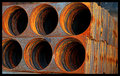
| 12/09/2005 11:10:06 PM | Industrial tunnelsby M&MComment: Greetings from the Critique Club! :)
Composition
This image has several interesting compositional features. Obviously the circles are dominant. The fact that one of the circles is "cut off" seems a little bit distracting and weakens the image a bit. You've chosen a good perspective from which to emphasize the "tunnel" idea.
Background
There is very little visible background in the shot, but I suspect you've made a wise decision to crop out some distracting elements.
Camera Work
The depth of field seems to be fairly deep, which is surprising at the f/6.3 setting you used. It's difficult to determine your lighting setup, due to the saturation you've emphasized, but the shot seems to be lit well. Exposure is perhaps a bit dark, but I believe you may have done that intentionally to use the colors the way you have.
Post Processing
The shot appears to be the recipient of some fairly heavy saturation boost and a good bit of sharpening. To me, this yields a fairly "artsy" look while strongly emphasizing the industrial qualities of the subject.
My Impressions and Opinions
This photo doesn't really tell me a story, and it isn't clear what it is. I would almost call this a shape based abstract. You've scored well, and many viewers comment that they like the shot. That in itself is a strong indication of its appeal. You've used colors and shape to catch and hold the viewer's eye, and that is a good success story.
Congratulations and thanks for your submission!
nards656 | | Photographer found comment helpful. |
|
Showing 851 - 860 of ~1136 |
Home -
Challenges -
Community -
League -
Photos -
Cameras -
Lenses -
Learn -
Help -
Terms of Use -
Privacy -
Top ^
DPChallenge, and website content and design, Copyright © 2001-2025 Challenging Technologies, LLC.
All digital photo copyrights belong to the photographers and may not be used without permission.
Current Server Time: 04/08/2025 05:26:10 PM EDT.
|