| Image |
Comment |
| 02/01/2007 08:49:01 PM |
eleganceby hopperComment: Very nicely done!!! I would like to see the background a bit darker, but other than that I wouldn't change a thing. |
 Photographer found comment helpful. Photographer found comment helpful. |
| 02/01/2007 08:43:58 PM |
Soft Silhouetteby ivale28Comment: A different spin on a classic shot. Although not a true silhouette, interesting nonetheless |
| Photographer found comment helpful. |
| 02/01/2007 08:42:55 PM |
|
| Photographer found comment helpful. |
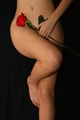
| 02/01/2007 08:42:21 PM |
Roseby spaceman spiffComment: The image itself is pretty good, the cliche is far too overdone for my taste. |
| Photographer found comment helpful. |
| 02/01/2007 08:40:43 PM |
|
| Photographer found comment helpful. |
| 02/01/2007 08:28:39 PM |
Trappedby KenComment: Excellent take on the challenge. I really like the way you have "boxed" in your model with perfect cropping. I would like to see more contrast. |
| Photographer found comment helpful. |
| 02/01/2007 08:27:34 PM |
The Black Dahliaby ChinabunComment: Something about this image strikes me as a bit odd. It seems very artificial and I can't explain why. |
| Photographer found comment helpful. |
| 02/01/2007 08:26:26 PM |
Still Life With Lemonsby De SousaComment: LOL... this is probably the most entertaining image I've seen in this challenge. The lemons are well chosen. I particularly like the pierced lemon. Bravo!!! |
| Photographer found comment helpful. |
| 02/01/2007 08:24:02 PM |
It Was Different For Leonardoby raishComment: The lighting on this is very harsh and the pose uninteresting. I'm assuming (based on your title) that you are doing a parallel to Leonard Da Vinci's "Vitruvian Man". The only thing that leads the viewer to this conclusion is the title. The background totally removes any indication of what you are attempting. Perhaps if this was shot on a white background and done in a high key nature and then toned down in post-processing with some sepia tones, you could better achieve your vision. |
| Photographer found comment helpful. |
| 02/01/2007 08:19:11 PM |
Pureby thegrandwazooComment: A very nice figure study and an interesting silhouette, but something seems a bit offish. I think maybe it's the light catching the back of her neck right beside her right arm and the light on her left arm and thumb. This is potentially a very good shot, but the pose could be improved I think. |
| Photographer found comment helpful. |
Home -
Challenges -
Community -
League -
Photos -
Cameras -
Lenses -
Learn -
Help -
Terms of Use -
Privacy -
Top ^
DPChallenge, and website content and design, Copyright © 2001-2025 Challenging Technologies, LLC.
All digital photo copyrights belong to the photographers and may not be used without permission.
Current Server Time: 04/11/2025 07:29:46 PM EDT.