| Image |
Comment |
| 05/08/2005 06:04:03 AM |
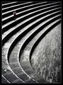
Subsidenceby ktlovehugsComment: I'd have included a bit more of the ground and less of the sky. Looks interesting, I like the houses in the background. 6. |
 Photographer found comment helpful. Photographer found comment helpful. |
| 05/04/2005 09:50:05 AM |
Bad Aphidsby GringoComment: This is too funny. I think the composition would have been even stronger if the bug was in the upper right hand corner: it would have put emphasis on the bug running out of the frame. Should be easy to do outside of the rules, since your bug is isolated.
Good shot, and congrats on your top 20 scoring! |
| Photographer found comment helpful. |
| 05/04/2005 09:36:47 AM |
Repetition with variations for small childby e301Comment: This is so cool! I like the almost floating, surreal feeling about your image. I've seldom seen lines that string in any image. The various textures and patterns along with a great tonal range make this an absolute favourite. Congrats on your green ribbon, I think it should have been a blue one. |
| Photographer found comment helpful. |
| 05/04/2005 01:00:13 AM |
Skiff at Sunset — Stage Harbor by Bear_MusicComment: Wow, finally you've been rewarded for all the efforts you put into our community. A gorgeous picture, you deserve your ribbon well! Congrats, Robert. |
| Photographer found comment helpful. |
| 04/26/2005 01:18:34 PM |
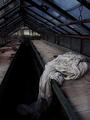
The Shroudby jjbeguinComment: I like the dramatic leading lines and the strong image tilt. The moodyness immediately catches one's eye, and the little sparkle of yellow the flowers bring in gives it an interesting touch. I enjoy looking at this a lot, and I'm trying to learn from you. |
| Photographer found comment helpful. |
| 04/25/2005 03:49:39 PM |
Tranquil Rocksby twm122Comment: Lol. This is funny because of tranquil.dpchallenge.com . Is the hommage intended? |
| Photographer found comment helpful. |
| 04/24/2005 03:23:03 PM |
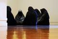
IMG_0564-Edit.jpgby GeocideComment: I enjoy this photograph. It's creepy how that one cloak facing the viewer is looking straight into the camera, even though you cannot see a face, or maybe just because of that. I feel the ground should be either completely clean or plain dirty and rough. A filthy, uneven ground would have fit the group best, but I guess you couldn't chose the location. Very interesting. |
| Photographer found comment helpful. |
| 04/22/2005 11:06:25 AM |
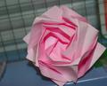
Ceci n’est pas une roseby NordlysComment: I think you didn't understand Magrittes thoughts behind his image 'Ceci n'est pas une pipe'. It shouldn't have been used for this picture. Nice origami though, if you had chosen a decent background and softer lighting this image would have come out really well. 5. |
| Photographer found comment helpful. |
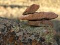
| 04/21/2005 04:03:02 PM |
Balanceby SammieComment: Good DOF, nice textures. The composition of the big stone against the background is too stable for my taste. I would rotate the image 30° clockwise, if cropping allows that. You'd get much more dinamic lines and the stones would look even less stable, thus more difficult to balance. 5. |
| Photographer found comment helpful. |
| 04/21/2005 04:01:09 PM |
Rock in its naturally Sittingby Crafty SueComment: Your picture is out of focus and blown out on some parts of the rock. Switch your camera to 'macro' mode for close-up photographs. Reduce the exposure time or decrease your aperture to make your picture darker, in order to avoid areas of pure white.
I think a lower perspective would have improved this shot, as if a bug or an ant was seeing the stone. 3. |
| Photographer found comment helpful. |
Home -
Challenges -
Community -
League -
Photos -
Cameras -
Lenses -
Learn -
Help -
Terms of Use -
Privacy -
Top ^
DPChallenge, and website content and design, Copyright © 2001-2025 Challenging Technologies, LLC.
All digital photo copyrights belong to the photographers and may not be used without permission.
Current Server Time: 04/21/2025 10:52:20 PM EDT.