| Image |
Comment |
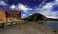
| 02/07/2005 05:34:32 PM |
Are We There Yet? by bruskiComment: A beautiful landscape. I like the strong blue sky and the clouds. Your image is well composed, the sign fits in very well. It belongs there. |
 Photographer found comment helpful. Photographer found comment helpful. |
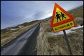
| 02/07/2005 05:33:21 PM |
Kids on the highway !by eirasiComment: Strange sign for this place. Did you place it there os is it always on that road?
I like the tilted horizon and the vanishing point 8even though it's not perfect). The colours are okay, but not that apppealing. Better than b&w nonetheless. |
| Photographer found comment helpful. |
| 02/07/2005 05:25:43 PM |
Where's......?by sbeaumontComment: I think you're a cpuple of weeks late ;) Nice idea. Unfortunately, the picture in itself is not that interesting. 6. |
| Photographer found comment helpful. |
| 02/07/2005 05:24:18 PM |
Couldn'tby GolferDDSComment: Wohooo! This is definately my favourite for this challenge, no matter what pictures are still to come. Reminds me of graphicfunk's "Ouch, no servicable parts inside". Funny, well executed, dynamic, well composed. 10. |
| Photographer found comment helpful. |
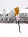
| 02/07/2005 05:15:57 PM |
Caution: Drive Slowlyby cardmaverickComment: You used a strange resizing method. This is what I get when I use 'pixel resize' instead of 'smart resize' in Paint Shop Pro'. You get those broken oblique lines on the sign. Your shot is an average picture, I guess you know that. Nothing special, but okay. 5. |
| Photographer found comment helpful. |
| 02/07/2005 05:08:23 PM |
Morning Potsby Joey LawrenceComment: LOL! Took me a moment to get it. So funny, very creative. Oves you some extra points. The electricity cables in the sky are a little distracting. 8. |
| Photographer found comment helpful. |
| 02/07/2005 04:56:42 PM |
|
| Photographer found comment helpful. |
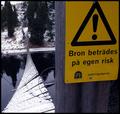
| 02/07/2005 04:52:51 PM |
The road signby LevTComment: Nice interpretation of the challenge. Something new, finally. Not that interesting for what concerns composition etc but the subject is well chosen, obvious, and it might be the only 'road sign' understood everywhere in the world. 10. |
| Photographer found comment helpful. |
| 02/07/2005 04:45:59 PM |
'Never Again'by crabappl3Comment: Fits the 60th 'anniversary' (I don't know a more fitting word) of the shoa. Where was this taken? The Netherlands? Belgium? Nice duotone. I like the symmetry. 7. |
| Photographer found comment helpful. |
| 02/07/2005 04:43:48 PM |
Perfect Measurement 36-24-36 ;)by trademarxzComment: That'd be a slim one...I'm used to the metric system: 90-60-90 :) Funny. I don't like the crop though. Why didn't you show all of the sign? You might also have placed a girl in front of the sign. 6. |
| Photographer found comment helpful. |
Home -
Challenges -
Community -
League -
Photos -
Cameras -
Lenses -
Learn -
Help -
Terms of Use -
Privacy -
Top ^
DPChallenge, and website content and design, Copyright © 2001-2025 Challenging Technologies, LLC.
All digital photo copyrights belong to the photographers and may not be used without permission.
Current Server Time: 04/23/2025 08:56:12 PM EDT.