| Image |
Comment |
| 11/19/2004 04:45:30 PM |
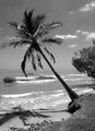
Sea breezeby NodeComment: I know it's B&W for the challenge, but if you get the chance to display this in color, I'd love to see it.. nice shot! |
 Photographer found comment helpful. Photographer found comment helpful. |
| 11/18/2004 12:47:21 PM |
|
| Photographer found comment helpful. |
| 11/10/2004 11:20:12 PM |
|
| Photographer found comment helpful. |
| 11/10/2004 10:09:09 PM |
|
| Photographer found comment helpful. |
| 11/10/2004 05:02:33 PM |
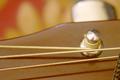
The Strain on 'E'by VictorsMindComment: I love the idea, but I don't love the background. I would have liked to have seen a darker background to contrast the lighter wood and really pull in the tension on the string. Also looks like the tip of the peg is more in focus than the string. Hey, it's digital - take 20 of the same shot - different focuses, different backgrounds - you're not wasting a thing by overkill. (and what's the braided thing in the corner?) ..Just keep plugging away - I like where you're going, just do more.. keep the good ideas coming.. |
| Photographer found comment helpful. |
| 10/30/2004 02:39:29 PM |
|
| Photographer found comment helpful. |
| 10/30/2004 02:37:09 PM |
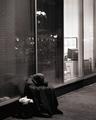
A World Upside Down¿by mrwaffles989Comment: hmm.. I wanted to rate this lower, because I didn't like the upside-downness. Then as I was writing a comment about it making me dizzy, and it is hard to look at, I realized poverty is hard to look at too, and maybe that's the point. If this were 'rightside up' it would look like every other picture here, but you did something unique, and I've got to respect that. Also, I like the splatter on the wall that goes 'up'. Good job! |
| Photographer found comment helpful. |
| 10/29/2004 12:45:27 AM |
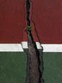
Fault Lines - Broken Courtsby Army of nOneComment: I really really enjoy this photograph as a photograph. I love the colors, the lines, the texture, I like the touch of green in the plant up in the red-zone. It's very balanced, and to me, a very good shot. Unfortunately, I don't see how it fits in the 'poverty' challenge. I can't rate it as high as I would like to, but I wanted you to know I really enjoy this photo. |
| Photographer found comment helpful. |
| 10/29/2004 12:39:31 AM |
... in poor taste ...by basia03Comment: I was showing my girlfriend this site and the photo I submitted, and she loved this one most of all. She loved the irony, I love the colors and the contrast between the zebra and leopard print. Good focus, very vibrant. Kudos! |
| Photographer found comment helpful. |
| 10/29/2004 12:35:52 AM |
Poverty among the wealthyby houwelingenComment: Thank you for the lesson in symbolism, I had forgotten. I enjoy all the colors and the texture of the green surface. To me this is a great way to get the point across without taking the picture of someone less fortunate or their home. I like how the green grapes are plump and round, like they are fat and bursting in their opulence. I also like the lines and the thought it reveals you put into it.
I'm also glad the impoverished grape is red and sort of deflated, and you didn't just thow in a raisin. :) |
| Photographer found comment helpful. |
Home -
Challenges -
Community -
League -
Photos -
Cameras -
Lenses -
Learn -
Help -
Terms of Use -
Privacy -
Top ^
DPChallenge, and website content and design, Copyright © 2001-2025 Challenging Technologies, LLC.
All digital photo copyrights belong to the photographers and may not be used without permission.
Current Server Time: 04/26/2025 05:59:10 PM EDT.