| Image |
Comment |
| 11/14/2005 04:15:46 PM |
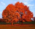
Urban landscapeby bjvermeulenComment: Sorry to be harsh, but my scoring is:
2/2 � Subject suitability
0/4 � Technical & artistic skill = intesting colour but lacks detail/lack if focus makes it look very busy/confusing,
0/3 � Overall appeal = no interest or attraction
0/1 � Extra merit = no wow factor
|
 Photographer found comment helpful. Photographer found comment helpful. |
| 11/14/2005 04:09:25 PM |
Damby theflyComment: Sorry to be harsh, but my scoring is:
2/2 � Subject suitablilty
0/4 � Technical & artistic skill = blurred & lacking detail, poor composition,/no focal point
0/3 � Overall appeal = no interest or attraction/confusing
0/1 � Extra merit = no wow factor
|
| Photographer found comment helpful. |
| 11/14/2005 04:03:14 PM |
Flowerby mineru_forgarduComment: Sorry to be harsh, but my scorring is:
1/2 � Subject
0/4 � Technical & artistic skill = blurred & lacking detail, poor composition
0/3 � Overall appeal = no interest or attraction
0/1 � Extra merit = no wow factor
|
| Photographer found comment helpful. |
| 11/14/2005 03:39:08 PM |
Where is my landscape?by helderComment: I only gave this shot the minimum score for the following reasons: I do not consider it to be a landscape. The horse and fence are blurred and lacking detail. The composition is week and the picture as a whole is not "engaging". Sorry. |
| Photographer found comment helpful. |
| 11/14/2005 01:04:04 PM |
In the valleyby alithenakeComment: This is a stunning picture by any standards. The composition is excellent; using lines, focal points and colour to guide the viewer around the landscape. The image also has an amazing ethereal quality. My only advice would be to make posters and start selling them! 10 :-) |
| Photographer found comment helpful. |
| 11/09/2005 06:02:37 PM |
Sunset on the other side of the riverby HVGB_photosComment: I think this picture would have been much stronger (and met the challenge better) if it had been cropped much lower, i.e. from just above the bright cloud on the centre/right. This would have added much more emphasis & impact to the main subject area. |
| Photographer found comment helpful. |
| 11/09/2005 04:23:09 PM |
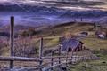
Midwestern Iconby Rook3000Comment: Even though this picture is 90% sky and only 10% land I think it works really well. The buildings do seem a bit blurred though. |
| Photographer found comment helpful. |
| 11/09/2005 04:09:32 PM |
Seatng for Sixby dpjerryComment: I like the strong colours, but think the blurred trees let the picture down. |
| Photographer found comment helpful. |
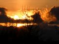
| 04/20/2003 05:39:15 PM |
An Icelandic fire skyby sissiComment: This is a lovely shot with heaps of atmosphere and interest in the clouds. However I think it would have been enhanced further by cropping off the bottom two thirds of the dark foreground. |
| Photographer found comment helpful. |
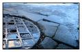
| 01/29/2003 02:42:48 PM |
Circle of squaresby vjozComment: This is a simple but very effective photograph. The reflection of the sky in the manhole cover matches perfecly with the colouration of the damp road/path. My only concern is with the bright edge along the top of the picture, which I find distracting - it interrupts the even tone and calm mood of the rest of the image. (I also wonder how the photo might have looked had it been cropped square; creating squares within a circle within a sqare - not a criticism by any means - just a thought - as I guess it might have made the crop too tight. A really excellent capture - well done. |
| Photographer found comment helpful. |
Home -
Challenges -
Community -
League -
Photos -
Cameras -
Lenses -
Learn -
Help -
Terms of Use -
Privacy -
Top ^
DPChallenge, and website content and design, Copyright © 2001-2025 Challenging Technologies, LLC.
All digital photo copyrights belong to the photographers and may not be used without permission.
Current Server Time: 03/12/2025 03:02:26 AM EDT.