| Image |
Comment |
| 06/14/2006 12:00:18 AM |
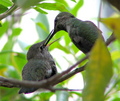
Baby Hummer's feeding timeby electinaComment: Last minute bump!
Really like the photo - the leaves up front are the reason this is not a 10 but a 9 image. The find is great, focus and sharpness just right. Good luck!
Edit: FYI - The bump did get in on time, the comment didn't! Message edited by author 2006-06-14 00:20:28. |
 Photographer found comment helpful. Photographer found comment helpful. |
| 06/13/2006 11:28:26 AM |
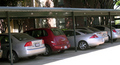
Non-Conformistby GKPhotosComment: Ha! This is a nice find. Compositionally, it feels like it could have been tilted more, (on purpose, I'm not saying that it is crooked or anything), to balance it. |
| Photographer found comment helpful. |
| 06/13/2006 11:26:18 AM |
|
| Photographer found comment helpful. |
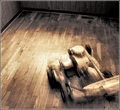
| 06/13/2006 11:25:08 AM |
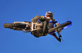
I found a Motorbike above my head!!!by JudiComment: What a cool image!
I would have scored this with a 10 in a number of challenges, but this time it feels like it just does not belong here... points off for that but- adding as a favorite. |
| Photographer found comment helpful. |
| 06/13/2006 10:45:06 AM |
|
| Photographer found comment helpful. |
| 06/13/2006 10:42:39 AM |
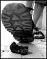
Shit happens!by mimoComment: Great point of view, and even more gross than mine! Extra point for that! Hate the blown left side, though. Could have done much better if you paid more attention to the harsh lighting, perhaps using a flash to illuminate the turd some more? |
| Photographer found comment helpful. |
| 06/11/2006 04:59:10 PM |
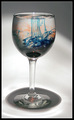
Magic Potionby javamooseComment: Greetings from the Critique Club!
First impression: Interesting shot, but not the greatest. Where does the light come from?Oh, yes, from above. That creates nice concentric circles at the bottom.
But... what's up with the shade on top? Not symmetrical, and its off-center position does not improve the composition. Also, the orange and blue look more like a smudge (especially orange) then like a something that makes this image interesting. What would have helped here?
-composition: have it centered horizontally, but have more negative space above the glass.
-lighting: if you attempted to create more shade in the background, so that there is higher contrast between the glass and the background. This way the lighter portions of the background mull the glass that was supposed to be the main object.
-setup: since this was a set up shot, you could have come up with a more interesting swirling colors in the glass. Since the whole scene is grayish, some warmer colors could have been a better choice (orange is OK, but blue is too cool.)
I hope this helps. 5.7 is a reasonable score for this shot. If you have any questions about this comment, please feel free to PM me. Best of luck in the future challenges here at DPC!
-Serge |
| Photographer found comment helpful. |
| 06/11/2006 06:02:35 AM |
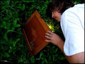
Finding Worldsby SebiComment: Good idea, but would have been much better if you waited for some more darkness outside to produce a better effect of light from underneath illuminating your face. This is not a terribly good execution of a brilliant idea. Good luck! |
| Photographer found comment helpful. |
| 06/11/2006 06:00:48 AM |
|
| Photographer found comment helpful. |
| 06/10/2006 09:10:34 AM |
|
| Photographer found comment helpful. |
Home -
Challenges -
Community -
League -
Photos -
Cameras -
Lenses -
Learn -
Help -
Terms of Use -
Privacy -
Top ^
DPChallenge, and website content and design, Copyright © 2001-2025 Challenging Technologies, LLC.
All digital photo copyrights belong to the photographers and may not be used without permission.
Current Server Time: 04/16/2025 10:02:03 AM EDT.