| Image |
Comment |
| 11/02/2005 11:52:43 AM |
Raindrops keep falling on my headby alexgarciaComment: Lower left part is messy - while I understand the attempt to keep the whole statue in the photo, it would have probably been a better choice to leavethe bottom out and concentrate instead on the head. It also hurts that the top is cut off. The stream above the horse's head is more spectacular than the bottom, plus it is easier to capture these drops as the velocity is much smaller up there than at the bottom.
Also, by not having such elongated photo, you could make better use of 640 limit, by making your image wider.
If you can, you should re-shoot this with the above in mind, and post it to the forums for discussion. |
 Photographer found comment helpful. Photographer found comment helpful. |
| 11/01/2005 12:01:55 PM |
Erica Bridal Portrait 4by joannsComment: Wonderful! The only thing here is either she had too much powder on her chin or you over-neatimaged the photo. It looks too plastic to me.
The eyes came out perfect. |
| Photographer found comment helpful. |
| 11/01/2005 10:17:04 AM |
SAY CHEESE DPC!by TransitComment: Wow! The best one of the day so far. The only thing taking away from it is the black, feels unnatural and prevents me from scoring this with a 10. |
| Photographer found comment helpful. |
| 11/01/2005 10:14:37 AM |
So happy I could just hurl...by notesinstonesComment: lighting is not the best. The flare, and the blown highlights take away from the image. Should have used some fill light to reduce the necessary exposure time. |
| Photographer found comment helpful. |
| 11/01/2005 09:59:54 AM |
Partners in Crimeby karmatComment: The big pumpkin appears to be OOF, or is just too soft. Wouldn't be a problem normally, but the lines in the background are tack sharp and take away from the main object(s). |
| Photographer found comment helpful. |
| 11/01/2005 09:57:02 AM |
All Dressed Upby dwolffComment: Nice carving job. Highlights do appear blown, this might have benefited from some fill light. |
| Photographer found comment helpful. |
| 10/23/2005 03:25:41 AM |
|
| Photographer found comment helpful. |
| 10/23/2005 03:18:52 AM |
cori at 24by parrotheadComment: 24mm I suppose:-) You've got the angle, got the interesting subject, wrapped it all into a nice photo. Lighting should have been better. The shadows on her face are disturbing to me, and the reflection on her tummy ruins the photo for me. There is also some undefined glare/softness in the top-right area that also negatively affects the photo quality. |
| Photographer found comment helpful. |
| 10/23/2005 03:14:10 AM |
Apocalypseby TerramarComment: I think that this could have been more effective if you cropped out more at the bottom. The photo also suffers from somewhat blown highlights in the middle (no pun intended, hehe). |
| Photographer found comment helpful. |
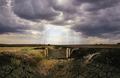
| 10/23/2005 03:12:30 AM |
Looking Through The Cloudsby KitaComment: Something is missing here... the setup is great, you have great colors, wide angle for the challenge is here, but there is a subject missing in this photo (in my opinion) and that's why I can't score it too high. 6. |
| Photographer found comment helpful. |
Home -
Challenges -
Community -
League -
Photos -
Cameras -
Lenses -
Learn -
Help -
Terms of Use -
Privacy -
Top ^
DPChallenge, and website content and design, Copyright © 2001-2025 Challenging Technologies, LLC.
All digital photo copyrights belong to the photographers and may not be used without permission.
Current Server Time: 04/16/2025 10:02:00 AM EDT.