| Image |
Comment |
| 07/01/2005 03:09:29 AM |
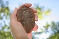
Evidence of Natural Selectionby oOWonderBreadOoComment: OK, Darwin, here you go:
you would have done much better if you didn't hold the fossil in your hand. You have seriously blown highlights near your little finger, and I don't believe that it was intentional. Maybe placing the subject in some sort of natural environment would have been better? This way the hand takes too much of an attention from the main subject - the fossil imprint. 5. |
 Photographer found comment helpful. Photographer found comment helpful. |
| 06/30/2005 04:17:05 PM |
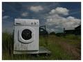
Slightly Damaged - May Leakby agwrightComment: I think that you should have focused more on that crack in the door. This way it looks like a perfectly good washer sitting on the side of the road, just delivered on the pallete to someone's home. |
| Photographer found comment helpful. |
| 06/30/2005 04:14:44 PM |
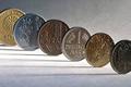
Resting in piecesby armelleComment: A very nice collection of EU coins! It took me a second or two to realize that Euro had replaced all these...
Nice lighting, good composition and nice DOF. 8. |
| Photographer found comment helpful. |
| 06/30/2005 02:14:44 PM |
Out to Pastureby RolandBComment: Very nice photo. Technically, it could have been better (IMO) if you did not have that lens flare at the bottom, and if you did not blown up the sky (upper right) and the ground (lower right corner)
Nice non-standart perspective. Another suggestion (although I am not sure what was to the right) would be to add more negative space to the right instead of cutting it off like this. |
| Photographer found comment helpful. |
| 06/29/2005 10:44:25 AM |
Four Centuries of Abandonmentby SCI 009Comment: Only four centuries? I would have imagined much more than that... but maybe I've mistaken the location.
In any case, the border could have been thinner, and the whole image is on a softer side than usually required for such landscapes. 5. |
| Photographer found comment helpful. |
| 06/29/2005 10:39:07 AM |
Rusting Awayby ShamanComment: Nice photo. I'd love to see it with slight desaturation, not completely b&w but just with less colour to it. Nice composition, with the space on the right giving the impression of the time stopped for this vehicle, and the remoteness of evrything else. 8. |
| Photographer found comment helpful. |
| 06/29/2005 10:34:06 AM |
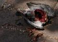
The Gory End of a Feral Pigeonby benhurComment: Lighting could have been better on this one. The shade would be good to accentuate death, but the streaks of sunlight spoil the image. Not sure about meeting the challenge, though. Yes, title indicates usefulness but who read the title with a such powerful image? 5 |
| Photographer found comment helpful. |
| 06/29/2005 10:31:54 AM |
"Analogue"by briphotoComment: I actually like the grainness in this photo - it may not do very well in general, but it seems perfect choice for this challenge.
Composition is good, as everything in this image is obsolete. However, the total effect is of lacking focal point, main object. That's where you could have done better. 7. |
| Photographer found comment helpful. |
| 06/28/2005 06:06:43 PM |
I wish this was Beer!by aKiwiComment: My pick for a blue! The only imperfection that caused a 9 instead of 10 was the blown reflection off the faucet. There is also something unreal about the water coming out that I could not put my finger on, probably there is a tube that is feeding the faucet with the water and the amount of water is not sufficient to cover it.
Also, there is a halo around the faucet from oversharpening. All this and still a 9 - that's how strong effect this had on me. Good luck! |
| Photographer found comment helpful. |
| 06/28/2005 05:58:49 PM |
|
| Photographer found comment helpful. |
Home -
Challenges -
Community -
League -
Photos -
Cameras -
Lenses -
Learn -
Help -
Terms of Use -
Privacy -
Top ^
DPChallenge, and website content and design, Copyright © 2001-2025 Challenging Technologies, LLC.
All digital photo copyrights belong to the photographers and may not be used without permission.
Current Server Time: 04/14/2025 09:48:14 PM EDT.