| Image |
Comment |
| 06/11/2006 07:09:24 PM |
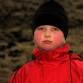
Tired after the hiking tourby GunnsiComment: Greetings from your own critique club.
First Impression
Very Nice shot with good shallow DOF.
Composition:
Very good composition. Nice eye contact.
Subject:
Very nice environment portrait. Nice eye contact. I would not comment on meeting the challenge, I am sure you must have already on the same.
Technical (Colour and light):
Color and lighting is very good. I would like to see more light in the BG.
Improvement:
Only imrpovement is try to meet the challenge in order to please DNMC police.
Summary:
Nice image, would have scored higher any other challenge.
Cheers!! and keep shooting. [/quote] |
 Photographer found comment helpful. Photographer found comment helpful. |
| 06/11/2006 07:03:41 PM |
|
| Photographer found comment helpful. |
| 06/11/2006 07:02:02 PM |
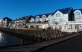
New "Old" housesby GunnsiComment: Greetings from your own critique club.
First Impression
Nice colors, image is bit flat.
Composition:
The composition is okay.
Subject:
Not probably the best subject for the challenge. It looks like point and shoot kind of image of houses.
Technical (Colour and light):
Colors are good. Lighting needs little improvement. The front is too dark to give it 3D look.
Improvement:
Too busy for the Architecture challenge. Light in the front side. May be some dodging would have helped.
Summary:
Nice colors, but image kind of flat point and shoot. Message edited by author 2006-06-11 19:02:24. |
| Photographer found comment helpful. |
| 06/11/2006 06:49:40 PM |
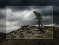
Fool On The Hillby GunnsiComment: Greetings from your own critique club. Sorry, I was off the track for a while.
First Impression
Very Nice shot.
Composition:
Very good composition.
Subject:
I really like the subject. Nice take on the challenge. Actually one with the same theme(song) won the blue ribbon, amazing!!
Technical (Colour and light):
Color and lighting is good after the processing.
Improvement:
The processing has helped the sky and the hill. But adversly affected the man. It's either sharpening or NI gave the man plastic look. I don't like the border. I would have processed whole picture.
Summary:
Nice image, would have scored even higher if the edges where not so sharp on the man.
Over all very nice image. Congrates and Keep shooting. |
| Photographer found comment helpful. |
| 06/07/2006 12:16:30 AM |
She Loves You by MayaMComment: Really Nice. Congratulations Maya, another Red!!! That big lense is worth the money, right? |
| Photographer found comment helpful. |
| 05/31/2006 12:22:58 AM |
|
| Photographer found comment helpful. |
| 05/25/2006 08:49:35 PM |
|
| Photographer found comment helpful. |
| 05/25/2006 08:38:45 PM |
Cezanneby JutildaComment: This one is really nice Judy!! Lighting, composition everything is excellent. |
| Photographer found comment helpful. |
| 05/21/2006 02:01:28 PM |
Vogue, 1969by JutildaComment: Nice one Judy. Good lighting, B/W is perfect choice. I like the negative space too. Good Luck. |
| Photographer found comment helpful. |
| 05/21/2006 01:57:45 PM |
|
| Photographer found comment helpful. |
Home -
Challenges -
Community -
League -
Photos -
Cameras -
Lenses -
Learn -
Help -
Terms of Use -
Privacy -
Top ^
DPChallenge, and website content and design, Copyright © 2001-2025 Challenging Technologies, LLC.
All digital photo copyrights belong to the photographers and may not be used without permission.
Current Server Time: 04/19/2025 05:06:03 AM EDT.